Screen Adaptation
Introduction to different screens
The screen shape and size of each device can be found in the Device Basic Information.
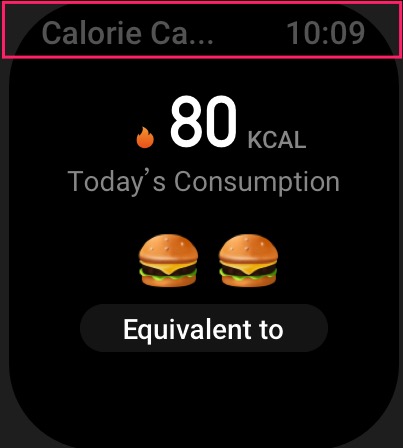
The entire area of the round screen is available for developers to draw, while a status bar is pre-drawn on square screen devices for application uniformity, as shown in the following image.

The height of the status bar is 64 px, the text is displayed on the left and the current time is displayed on the right. The text defaults to the appName field in app.json, and if the appName field is configured in i18n, the configuration in i18n is used first.
There are the following APIs related to the status bar
- hmUI.setStatusBarVisible(visible)
- Can be used to control the hiding and displaying of the status bar
- hmUI.updateStatusBarTitle(title)
- Can be used to set the text to be displayed on the left side of the status bar
Adaptation scheme
For developers who want a single piece of code that can run on every device, at this stage we have given two options:
pxbuilt-in functions: use the built-inpxfunctions to scale the screen to the same shape- Style code is organized by shape: different screen shapes are suggested to be organized separately by screen shape, and the screen shape is judged at runtime to read the corresponding style
px global functions
framework in the global implementation of a tool function px.
The designWidth of each model in the targets object in the Mini Program Configuration is used as the base for scaling.
As an example, the targets in the app.json of an application are configured as follows.
{
  ...
  "targets": {
    "gtr-3-pro": {
      "designWidth": 480
    },
    "gtr-3": {
      "designWidth": 480
    },
  }
}
As we can see above, the width of the GTR 3 PRO model is 480 and the width of the GTR 3 model is 454.
In the following, we use DEVICE_WIDTH to refer to the real size of the device, so the result of the px(x) function is Math.ceil(x / designWidth * DEVICE_WIDTH)
On GTR 3 PRO, the value of designWidth is configured in app.json as 480, and the size of the model above this document is queried to find the DEVICE_WIDTH value of 480, the result of px(100) is Math.ceil(100 / 480 * 480) = 100
On GTR 3, the value of designWidth is configured in app.json as 480, and the model size above this document is queried to find the DEVICE_WIDTH value of 454, and the result of px(100) is Math.ceil(100 / 480 * 454) = 95
// in GTR 3 PRO
console.log(px(100)) // 100

// in GTR 3
console.log(px(100)) // 95
It is recommended to use 480px as the base for round screen design, and the rest of round screen devices can be scaled equally.
At the coding level, you only need to configure the scaling reference designWidth field in app.json and wrap the px function in an appropriate place in the code to achieve layout adaption.
const textStyle = {
  x: px(96),
  y: px(40),
  w: px(288),
  h: px(46),
  color: 0xffffff,
  text_size: px(36),
  align_h: h.ALIGN.CENTER_H,
  align_v: h.ALIGN.CENTER_V,
  text_style: hmUI.text_style.WRAP
}

const text = hmUI.createWidget(hmUI.widget.TEXT, textStyle)
Style code is organized by screen shape
Compared with a round screen, a square screen has a little more room to play in UI layout, allowing an application's UI to be partially different on a square screen and a round screen, for which a code organization idea is given.
The core idea is to store the style files independently from the logic, with a separate styles.js, to get the shape and size of the device at runtime, and to export different style variables according to the different screen shapes
Get screen-related information through the hmSetting.getDeviceInfo API
const deviceInfo = hmSetting.getDeviceInfo()
const { width, height, screenShape } = deviceInfo

// 0 - square s
// 1 - round r
const DEVICE_TYPE = DEVICE_SHAPE ? 'round' : 'square'

const processVal = (valObj = {}) => {
  return valObj[DEVICE_TYPE] ? valObj[DEVICE_TYPE] : 0
}

const HOME_TITLE = {
  round: {
    attrs: {
      text: 'Hello World Round'
    },
    x: px(96),
    y: px(40),
    w: px(288),
    h: px(46),
    color: 0xffffff,
    text_size: px(36),
    align_h: h.ALIGN.CENTER_H,
    align_v: h.ALIGN.CENTER_V,
    text_style: hmUI.text_style.WRAP
  },
  square: {
    attrs: {
      text: 'Hello World Square',
      x: 32,
      y: 11,
      w: 232,
      h: 42,
      color: 0x666666,
      text_size: 32,
      align_h: h.ALIGN.CENTER_H,
      align_v: h.ALIGN.CENTER_V,
      text_style: hmUI.text_style.NONE
    }
  }
}

export default {
  HOME_TITLE: processStyles(HOME_TITLE)
}