Illustrations
As an important part of the product's visual experience, illustrations can express information graphically, improve legibility and aesthetic experience to a certain extent, and shape the brand image.
Design principles
Zepp OS illustrations follow the "lightweight", "friendly", and "effective" design principles. Use lightweight and concise graphics, reduce excessive modeling combinations, convey friendly and appropriate emotions, and express the meaning in a clear and easy-to-understand manner to ensure efficient operation for the user.
Types
Illustrations of status descriptions
The type of illustration that clarifies the state of the page, with certain illustrative, soothing and decorative qualities.
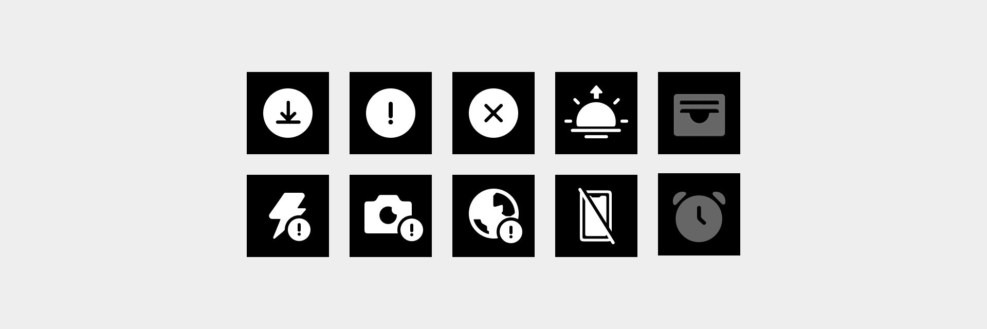
User-guided illustrations
Guide the user to carry out the corresponding operation or explain the current way of using the function, with certain explanatory and guiding nature.

To ensure the clarity of the illustration, user-guided illustrations often use dynamic representations.

Notification and reminder illustrations
Communicate to users the content of application notifications with time information or physical condition alerts, with a certain motivational, decorative and illustrative nature.

Third-party app illustrations
The illustration performance of third-party apps is relatively flexible. Appropriately add colors, modify the shapes, and increase the emotional and brand elements based on the brand features of third-party apps.

Rules for use
- The basic visual style of system illustrations is white graphics ①.
- Use gray graphics ② in empty page status illustrations for apps.
- For the empty pages of quick access apps (indicating that connection to mobile application is required for operation), use color graphics. To ensure that the user understands, the app icon is usually used ③.
- In guidance and feedback illustrations with animations, you can add full-screen animations to decorate the background layer.
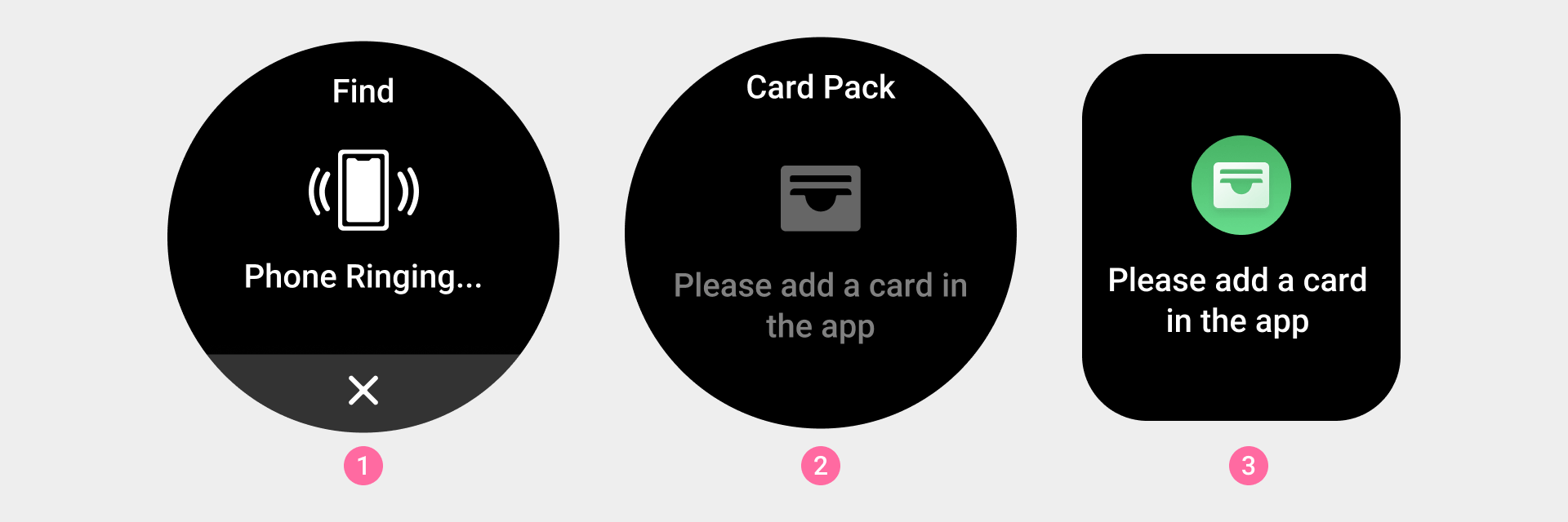
① Basic visual style of system illustrations
② App empty page illustration
③ Illustration on an empty page of a quick access app (indicating that connection to mobile application is required for operation)
- Consider the presence of status bars for square screen devices. No titles are required for page illustrations within an app.
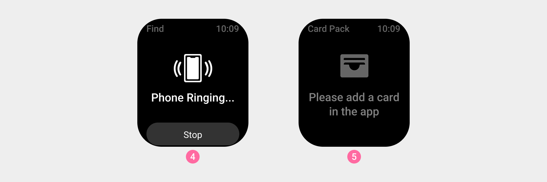
④ Basic visual style of system illustrations in a square screen device
⑤ App empty page illustration in a square screen device
Visual specifications
The size of the main slice of the illustration is ③, and a blank and transparent safe area should be reserved inside.
The illustration graphics area is ①, and the drawing area should generally be kept within the range of ②. If the graphic needs extra visual weight to ensure consistency with other icons, the drawing area can be extended to the reserved area (note: a 2px safety distance must be maintained around the edge when making the slice).
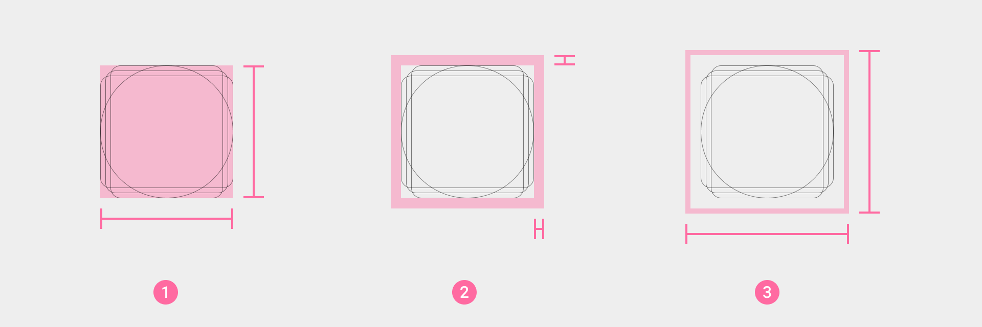
① Basic drawing area of the icon body
② Reserved area of the icon body
③ Final actual size of the icon body