Illustrations
As an important part of the product's visual experience, illustrations can express information graphically, improve legibility and aesthetic experience to a certain extent, and shape the brand image.
Design principles
Zepp OS illustrations follow the "lightweight", "friendly", and "effective" design principles. Use lightweight and concise graphics, reduce excessive modeling combinations, convey friendly and appropriate emotions, and express the meaning in a clear and easy-to-understand manner to ensure efficient operation for the user.
Illustration Type
According to different usage scenarios, illustrations can be divided into the following types: status illustration, guidance feedback illustration, and badge illustration.
According to the different types of illustration elements, the expression of page information is prioritized differently, and illustrations are divided into: large size, medium size, and small size.
Status Description
Illustration types that clarify page status, have certain explanatory, calming, and decorative qualities.
Important notice
Used to indicate important tips for the system or application, illustrations in color or illustrations in gray with color accents.
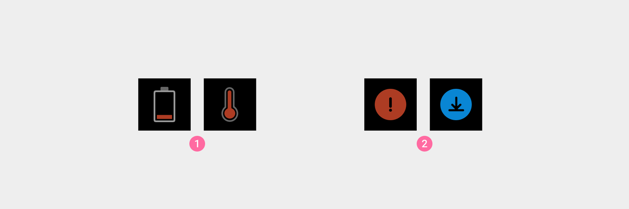
① Use illustrations that combine colors and gray tones to indicate important events or prompts.
② Use color illustrations to indicate important status information.
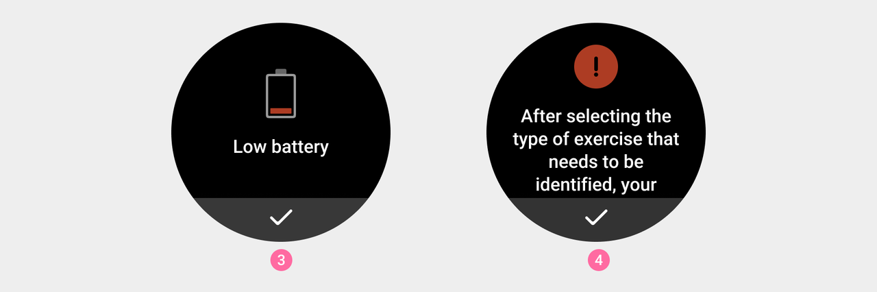
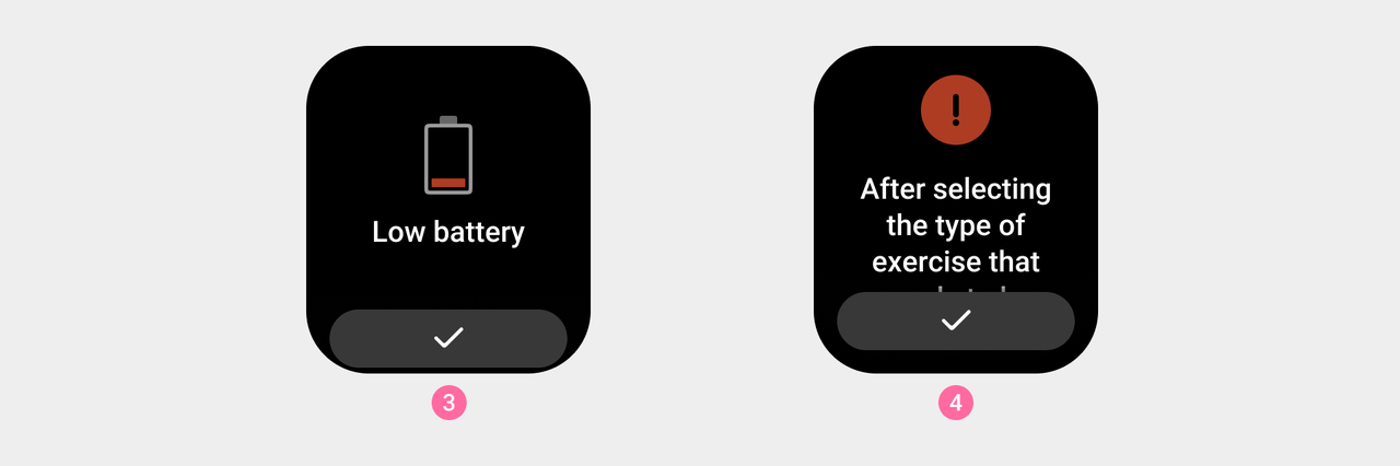
③ System, low battery warning (medium size).
④ Workout, notification that battery life will decrease when monitoring is on (medium size).
Function prompt
Colored illustrations are used to represent in-app feature hints.
Small icons can optionally be used to highlight page content or actions.

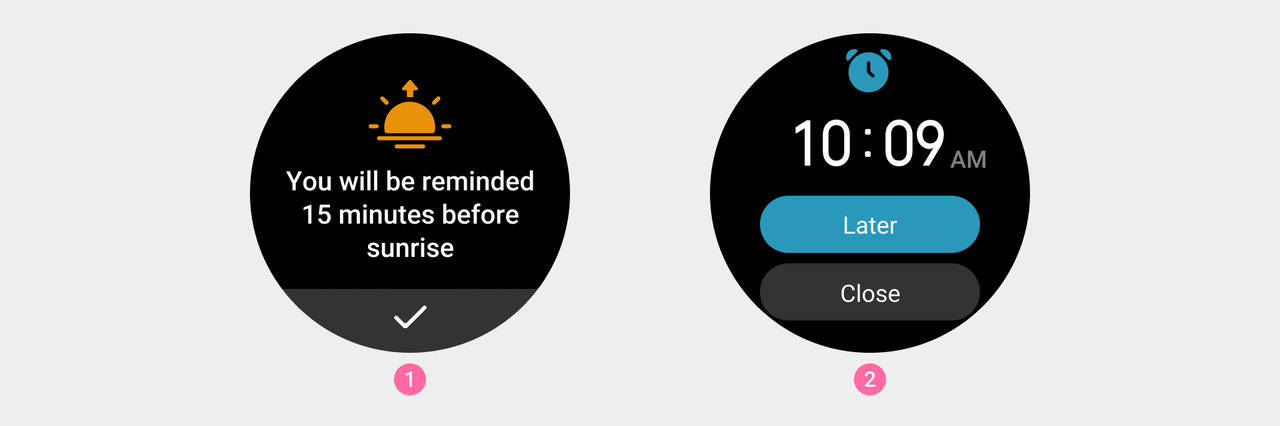
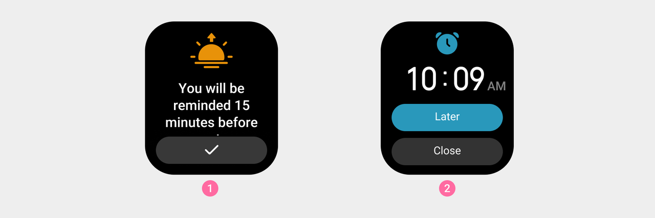
① Sun and moon —— The sunrise prompt (medium size).
② Alarm clock —— wake-up reminder (small size).
Instructions for use
Gray illustrations are used as reminders for abnormal states.

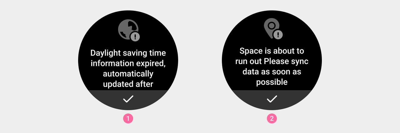
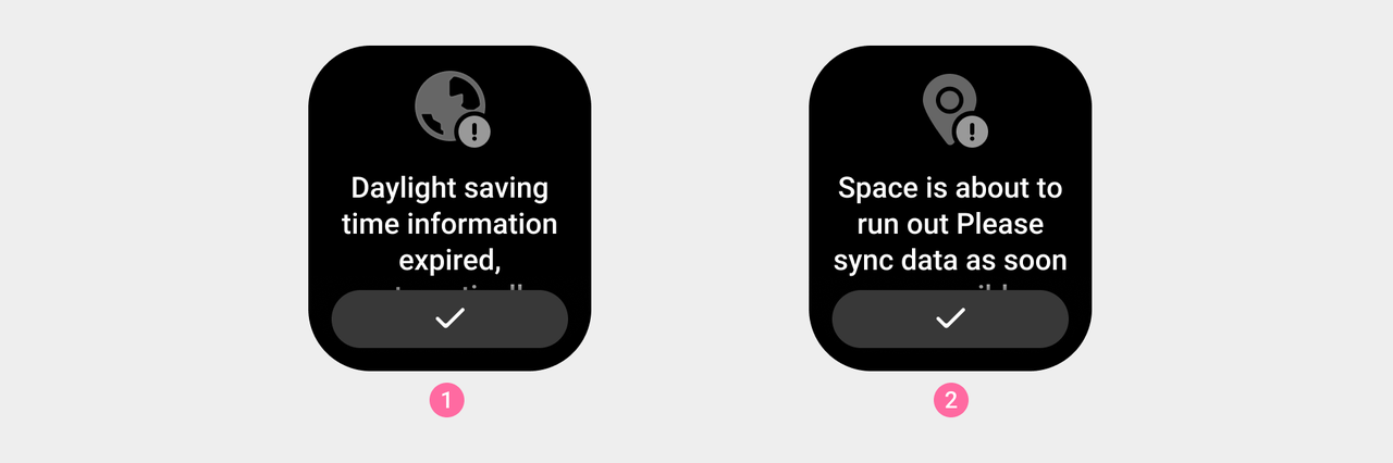
① World clock, daylight saving time expiration reminder (medium size).
② Workout, synchronized workout data prompt (medium size).
Guided Feedback
llustration types used to guide users in performing operations or provide corresponding feedback on user operations, with certain explanatory, guiding, and decorative propertie

When small illustrations are not clear enough to display the guided content, use large illustrations.
To ensure the clarity of the illustrations, feedback-related illustrations are often presented dynamically.

Medal
The medal conveys application notifications or physical condition reminders with time information to the user, which has certain incentives, decorative and explanatory properties.

Usage Rules
- The basic visual style of the system illustrations is white graphical style ①.
- Please use the gray graphic style ② for the empty page status illustrations of each application.
- Please use the color graphic style for the empty widget (indicating that the operation needs to be connected to the mobile phone application). Usually the application icon ③ will be used to ensure user understanding
- Illustrations with animated guidance feedback can have full-screen animations added to the background layer as decorative elements.
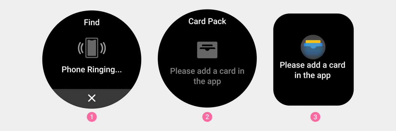
① Basic visual style of system illustrations
② Application empty page illustration
③ Illustration of empty widget page (indicating the need to connect to the mobile application for operation status).
- Rectangular screen devices should consider the existence of the status bar, and there is no need for titles in the illustrations in the in-app pages.

④ Basic visual style of square-screen device system illustrations.
⑤ Placeholder image for empty pages of square-screen devices.
Visual Guidelines
The main body of the illustration should be cut to size ③, with a transparent safety margin reserved inside.
The illustration graphic area is marked as ①, and the drawing area should generally be kept within the range of ②. If the graphic needs to add additional visual weight to ensure consistency with other icons, the drawing area can be extended into the reserve area (note: A 2px safety distance needs to be kept at the edge when cutting the image).
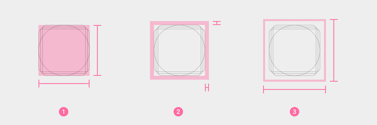
① The basic drawing area of the icon body.
② Reserved area of the icon body.
③ The final actual size of the icon body.