Font
When selecting and applying fonts, it is essential to ensure that the text is legible, the information hierarchy is clear, and key information is prominent. Zepp OS use the following fonts:
- Noto Sans
- Zepp OS Number
- Zepp OS Number Condensed
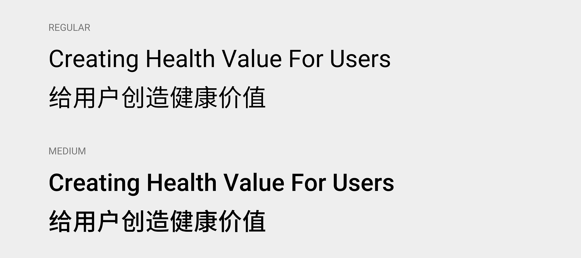
Noto Sans
Noto Sans is the default system font for Zepp OS and includes two weights: Regular and Medium. It is primarily used for system and feature interfaces, general content, and information.
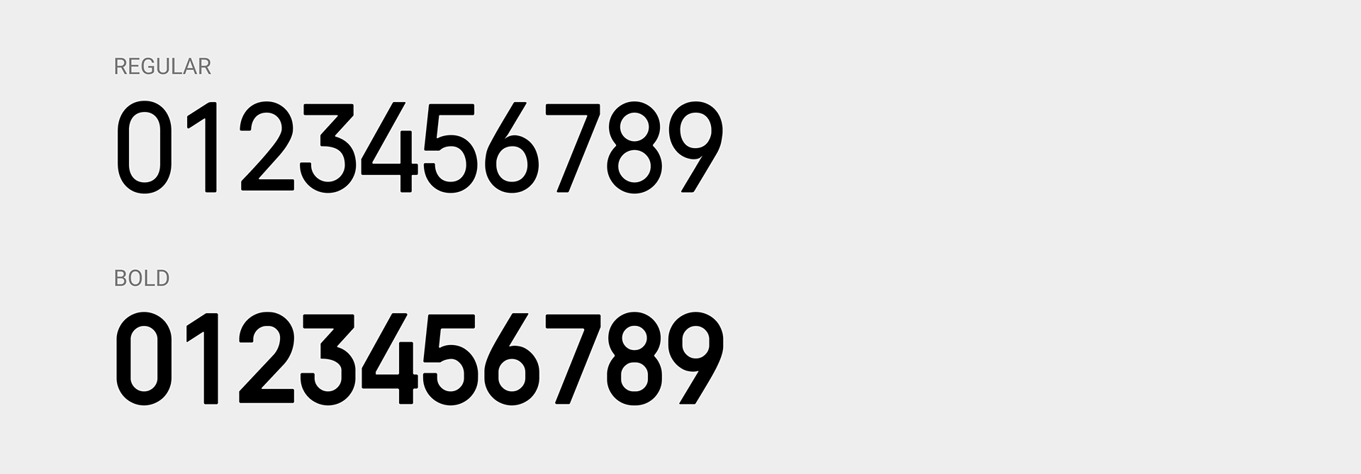
Zepp OS Number
In certain scenarios, the Zepp OS Number font is used to highlight key fitness or health data to draw the user's attention. This font includes Regular and Bold weights; please choose the appropriate weight based on the specific context.
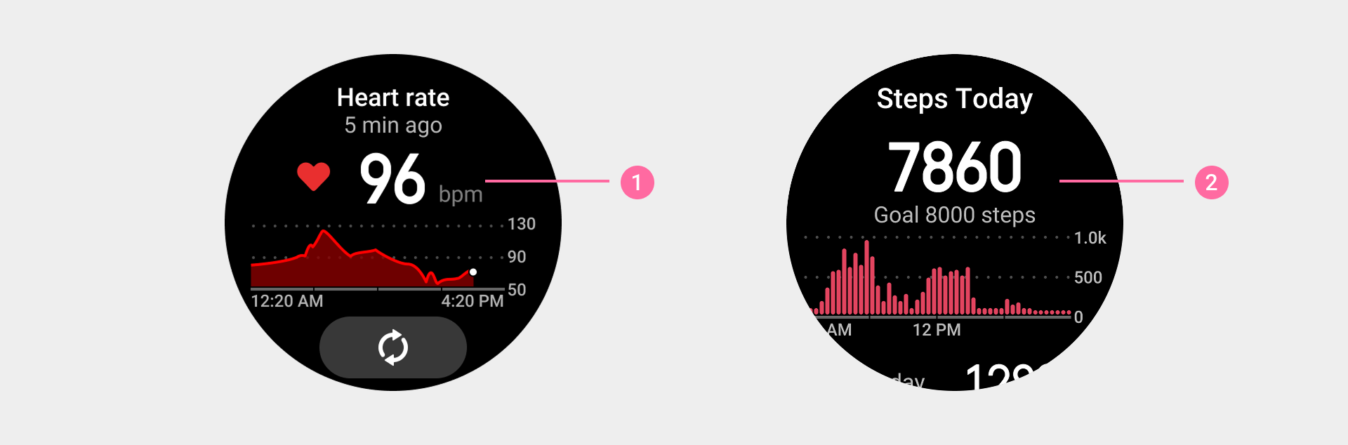
① Heart rate values in the Heart Rate app use the Zepp OS Number font
② Step count values in the Activity app use the Zepp OS Number font.
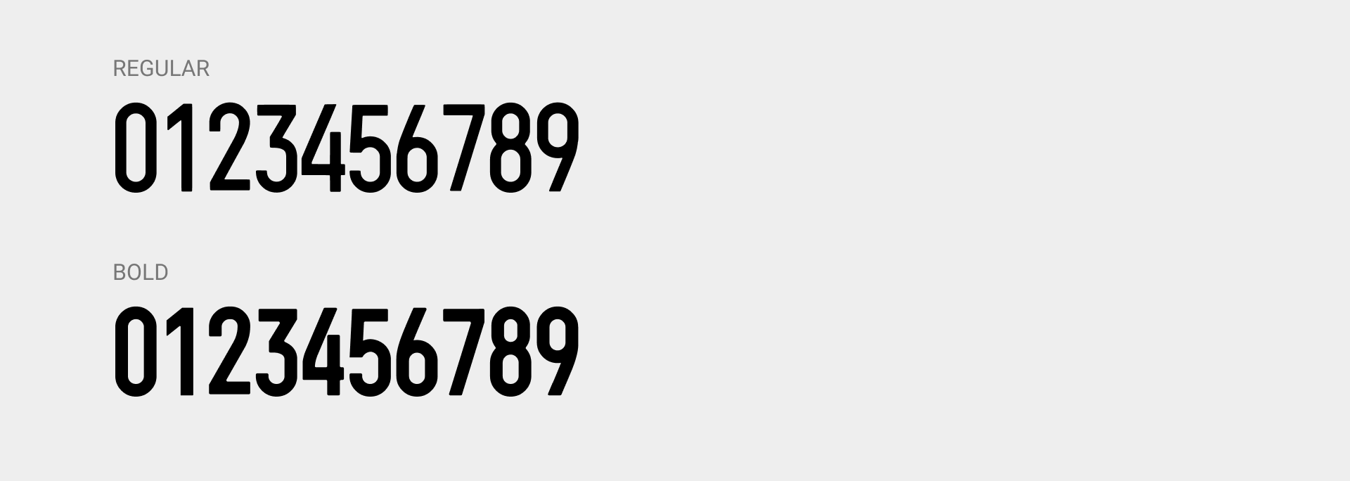
Zepp OS Number Condensed
In sports-related features, key metric values such as "Pace" and "Distance" are displayed using the Zepp OS Number Condensed font. This font includes Regular and Bold weights; please choose the appropriate weight based on the specific context.
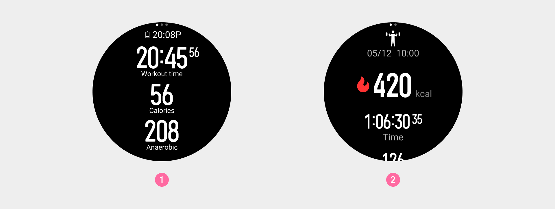
① During workouts, data-driven information uses the Zepp OS Number Condensed font to achieve clearer value recognition and info emphasis.
② Post-workout, the Zepp OS Number Condensed font is used to reinforce user focus on key results.
Line height settings
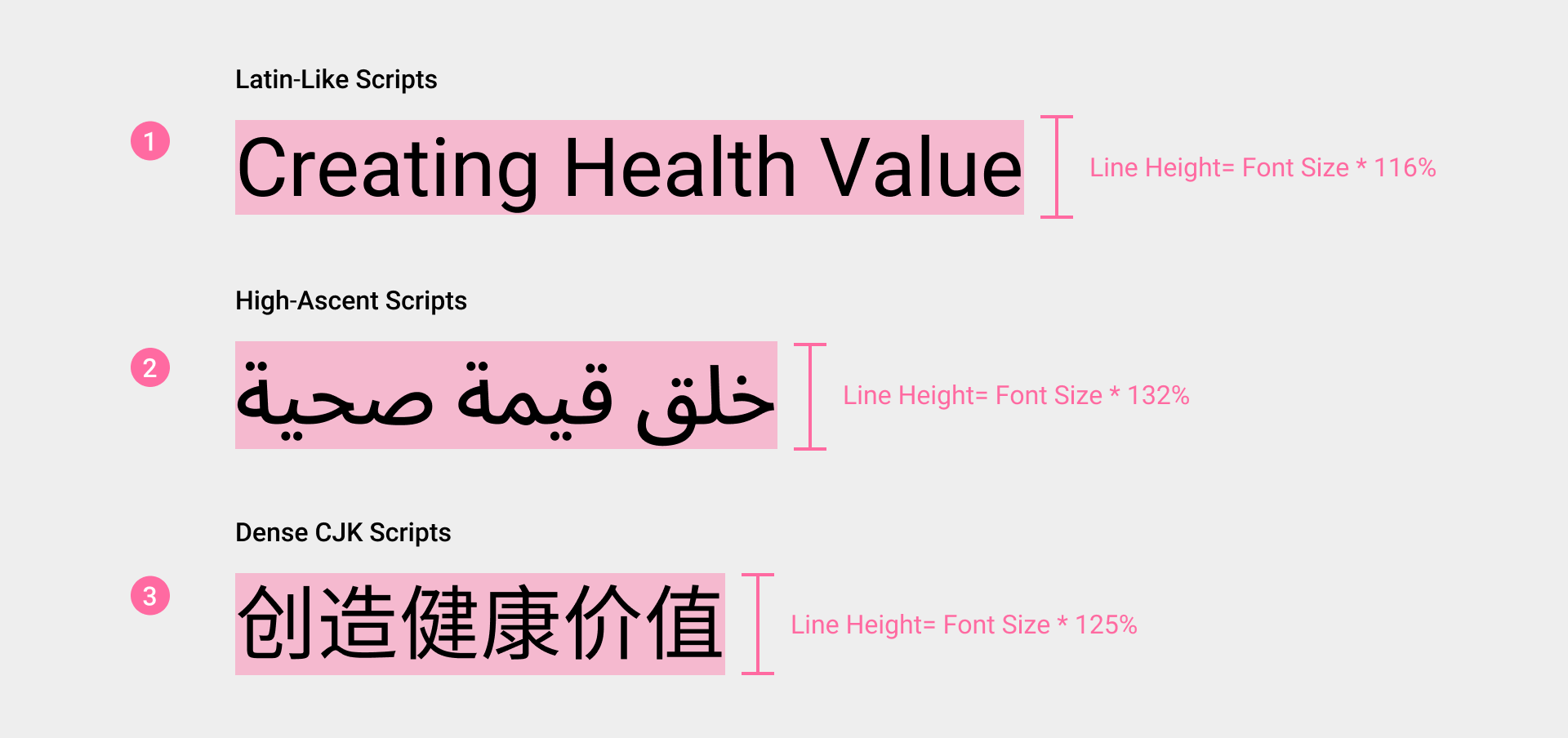
To ensure readability and visual consistency across multilingual interfaces, the default system font, Noto Sans, uses tiered line height settings across different language environments. Based on the typographical characteristics of each script, the line height strategy is divided into three categories:
- ① English-like Languages (Recommended Line Height: Font Size * 116%) These languages have glyph structures close to English, including scripts using Latin letters (excluding Vietnamese), Greek, Cyrillic, Hebrew, Armenian, and Georgian.
- ② Tall-character languages (Recommended Line Height: Font Size * 132%) These languages feature taller glyph structures that require extra vertical space, commonly found in South Asian, Southeast Asian, and certain Eastern language systems.
- ③ Compact Languages (Recommended Line Height: Font Size * 125%) Chinese, Japanese, and Korean consist of high-density block character structures. Although their overall visual presence is high, their vertical spacing requirements differ from Tall languages and must be configured separately to maintain rhythm and breathing room between text blocks.
| Category | Languages | Line Height |
|---|---|---|
| English-like | English, Spanish, German, French, Italian, Portuguese (Brazil/Portugal), Dutch, Hungarian, Czech, Polish, Slovak, Turkish, Russian, Ukrainian, Serbian, Hebrew, Romanian | 116% |
| Tall-character | Arabic, Hindi, Thai, Vietnamese | 132% |
| Compact | Simplified Chinese, Traditional Chinese (HK), Traditional Chinese (TW), Japanese, Korean | 125% |
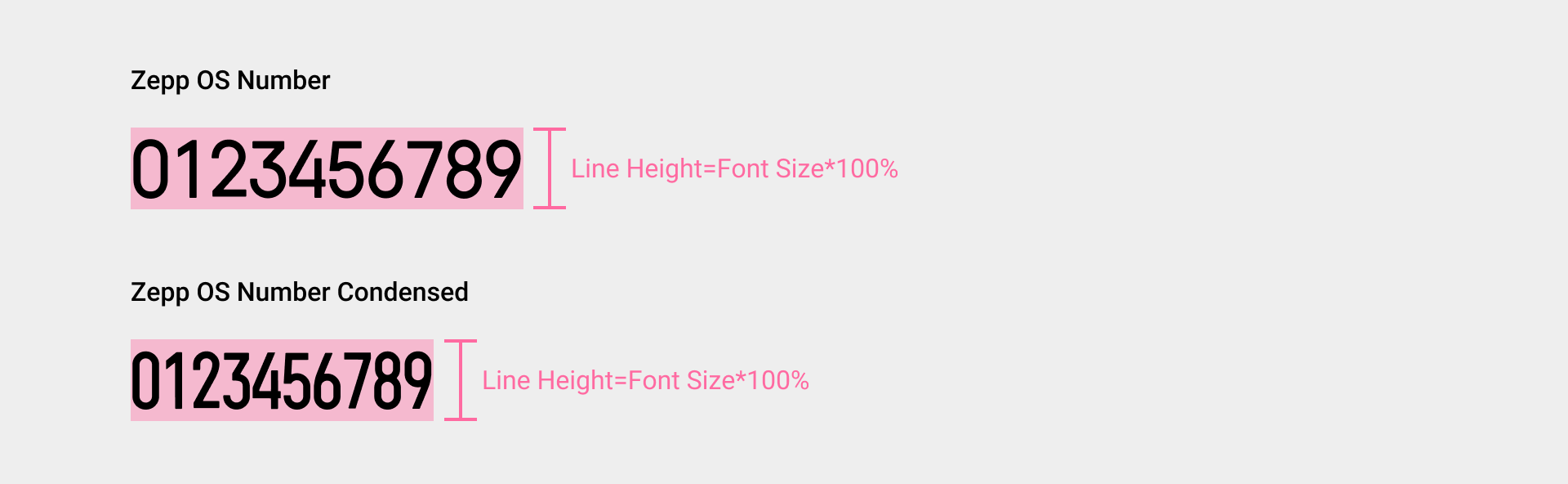
For the special fonts “Zepp OS Number” and “Zepp OS Number Condensed,” the recommended line height is: font size * 100%.
To get font resources, please vist: Font Resources Resource Downloads。