Selectors
Data selectors
A data selector component is an option collection control that provides a single or multiple parameters for the user.
Design principles
Reasonable
- Provide reasonable default options: Provide reasonable default options to convey the correct information, reduce the number of user operations, and improve efficiency.
- Reasonable sorting: Sort the options based on product features, logics, or user experience to help users make quick selections.
Simplicity
- Simple description: The text (titles and description text) in the selector should be simple and clear, so the user can understand it with ease. Use internationally accepted abbreviations for option units.
- Simple options: Due to the screen size limitation of smart wearables, if there are too many options or the options are complicated and difficult to understand, use another form of operation. We recommend that selector options do not exceed 3 lines. Try not to use selectors that require text description for options.
Types
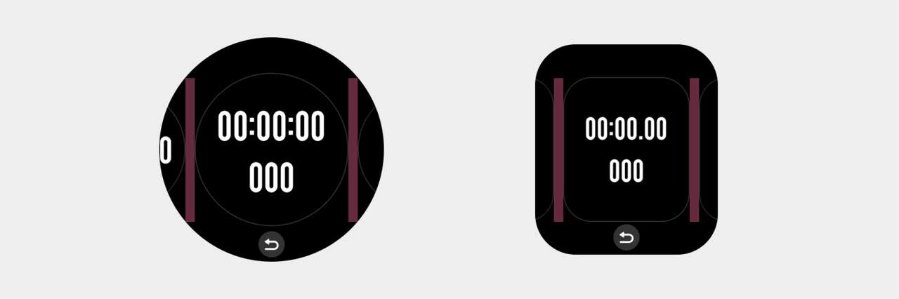
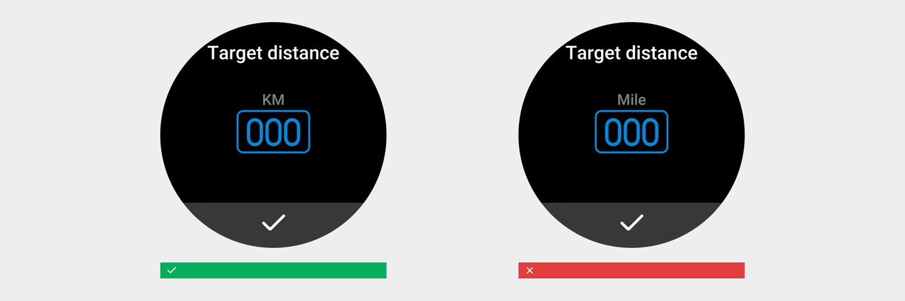
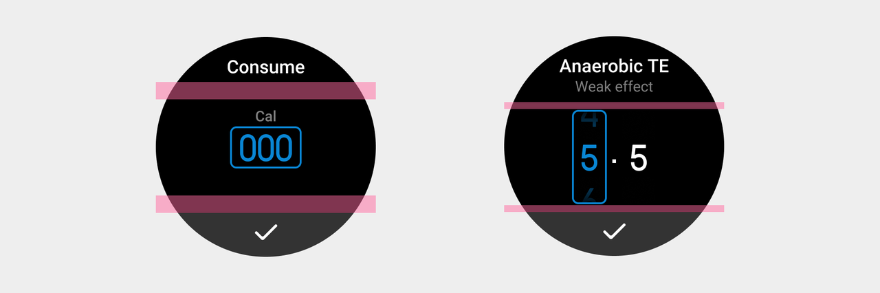
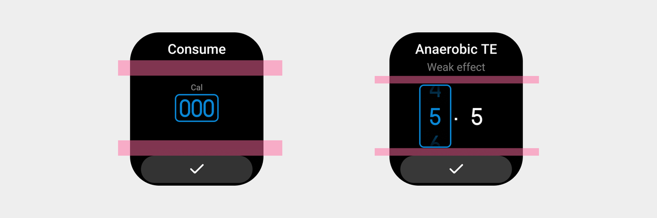
Digit selectors:A selector consisting of numerical options.
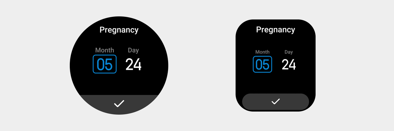
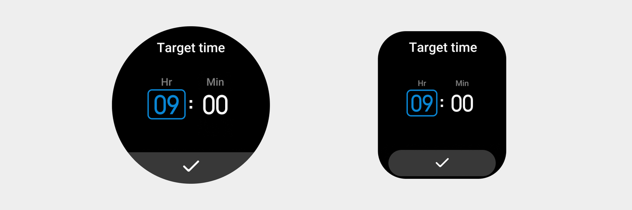
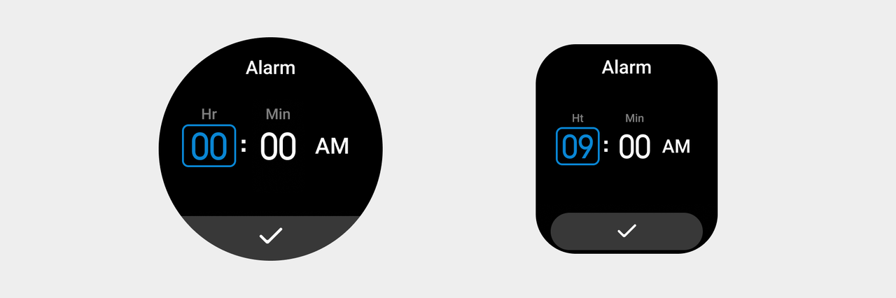
Combination selectors: A selector consisting of numerical and textual options.
Rules for use
- Click to activate the item to be set, and switch the parameter value setting vertically by sliding up and down or rotating the crown. Direct sliding can also activate the vertical parameter setting.
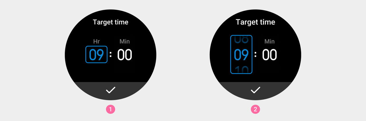
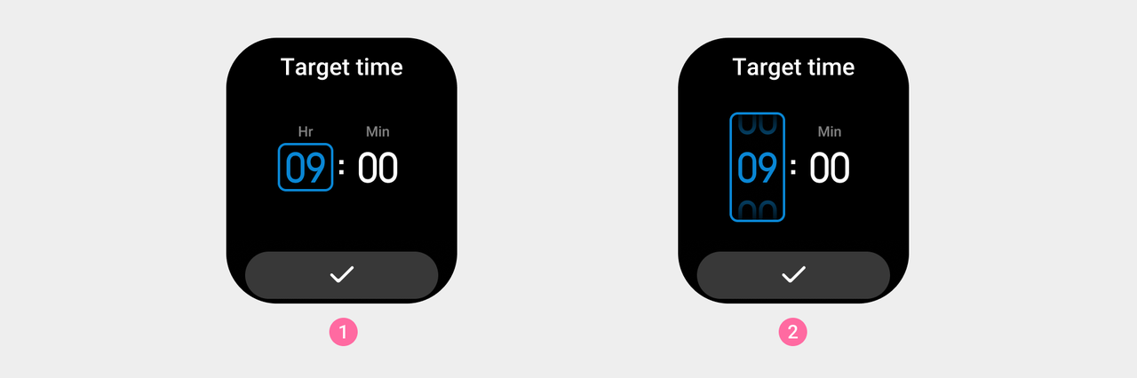
① Default state ② Selected state
- The method to switch between text type options is the same as switching between numerical type options. It is done by scrolling up and down or rotating the crown vertically to adjust the parameter values. Direct sliding can also activate the vertical parameter setting.
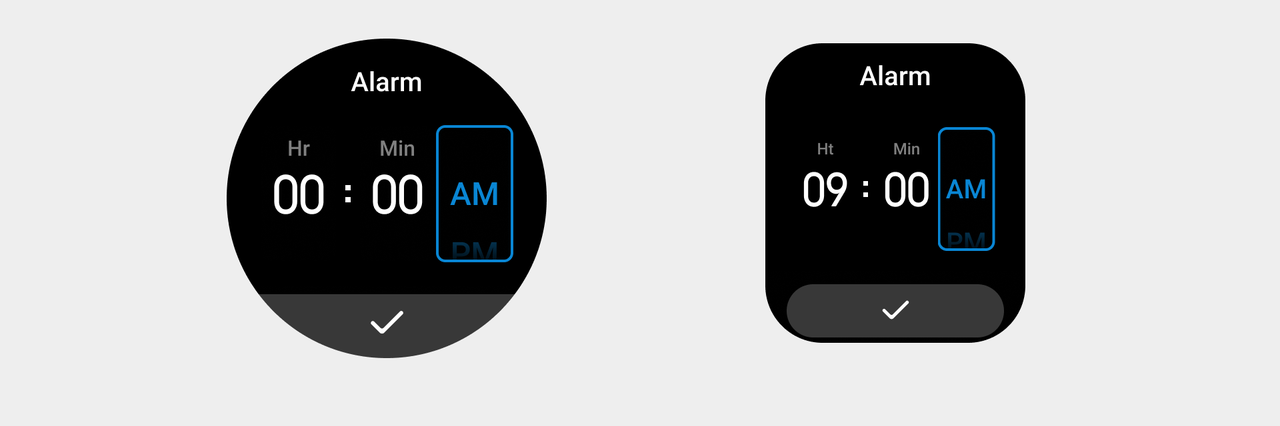
- Use internationally accepted abbreviations for option units.
Visual specifications
-
The position of the control is automatically adjusted to the center according to the upper and lower blocks.
-
Option digit font: DIN1451 Default color value: color_text_title, color value for selected digits: color_sys_key
Page selectors
A page selector is a control that provides the user with a choice of pages.
Rules for use
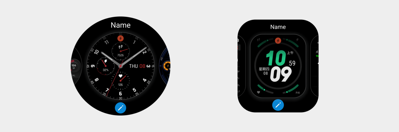
The user switches pages by swiping horizontally or rotating the crown, and taps to confirm the current page. For example, Watchface editing.
Visual specifications
- Scrollable pages ➀ The interval space between two pages is 2px, color value name: color_sys_item bg

- The same interval space applies to scrollable pages on both square screen devices and circular screen devices.