Sliders
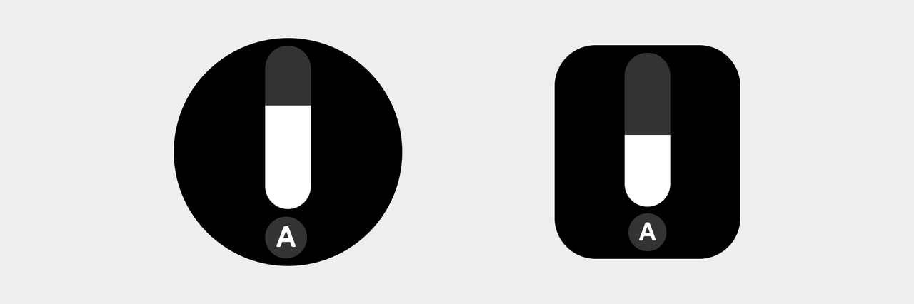
Slider controls (referred to as Sliders) allow the user to select an appropriate value from a continuous range while displaying the progress. At the minimum value, the top edge of the slider will be at the top end of the scroll bar. At the maximum value, the bottom edge of the slider will be at the bottom end of the scroll bar.
Design principles
Valid operations. Given the characteristics of wearable devices, it is necessary to ensure that the entire page can respond to the sliding operation. In certain devices, users can also rotate the crown or operate the buttons to make operations even more efficient.
Clear feedback. When the user operates the device, use progress, icons, and colors to distinguish different states and give clear feedback in a timely manner.
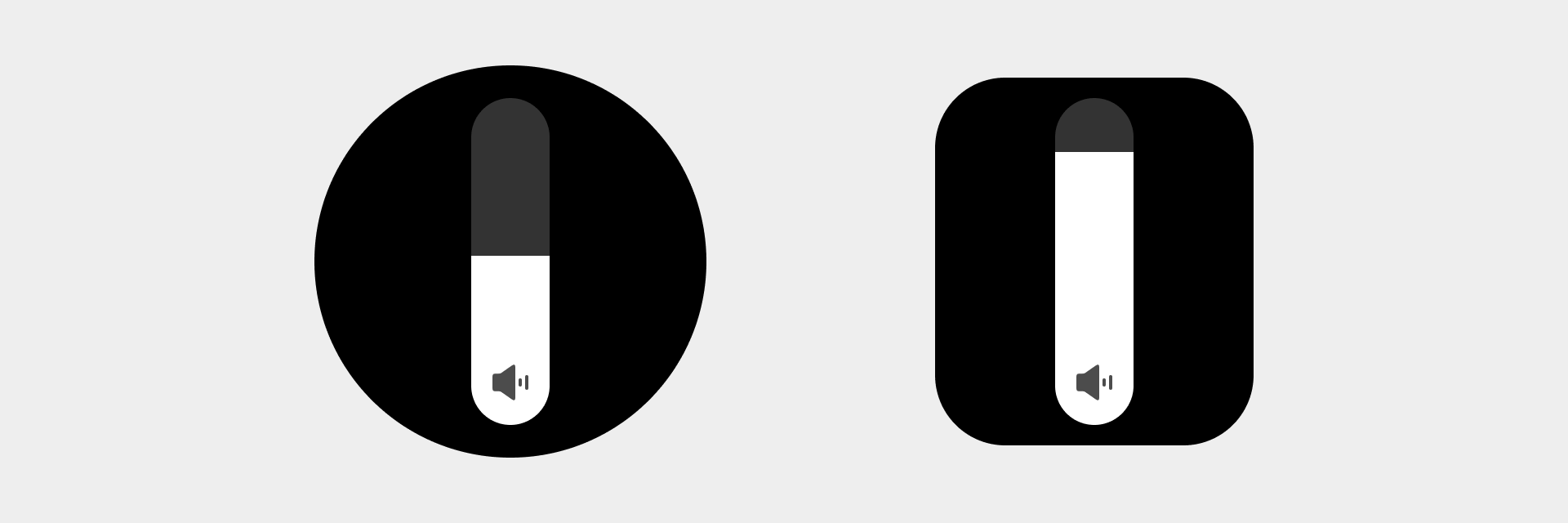
Continuous sliders
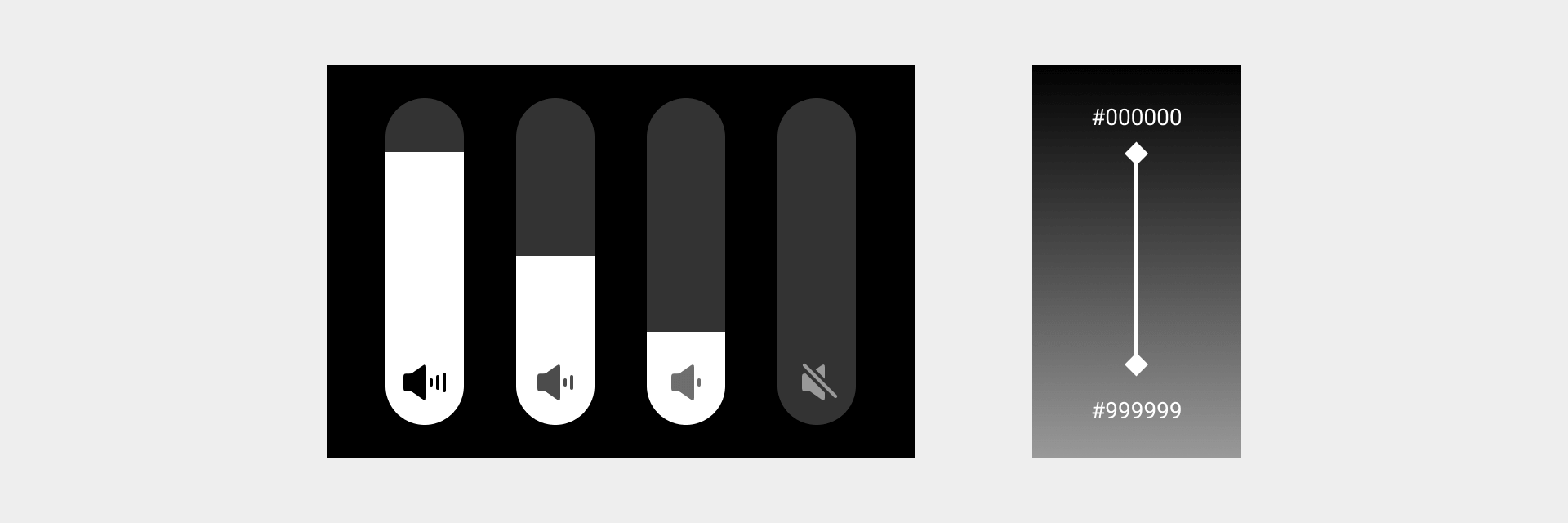
Continuous sliders allow users to select a value along a subjective range when the precise value won't matter. This allows users to make more meaningful adjustments, such as volume sliders.
Visual specifications
- The volume icon status and color value should change correspondingly with sliding. The icon status has four levels: strong, medium, weak, and mute. The color value of the icon changes at a constant speed with the sliding, from #000000 to #999999.
- Color value at the bottom of the slider: color_sys_item bg Bar color value: color_sys_normal graphic
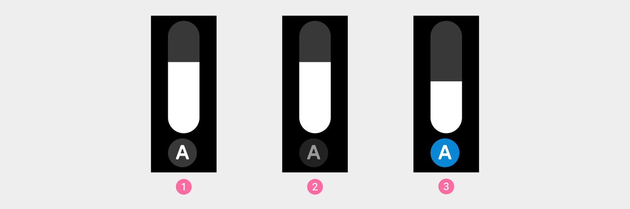
Operable sliders
Sliders that support other operations in addition to value adjustment. For example, when the user operates a brightness slider, the slider area can increase or decrease continuously, and the user can tap the button to enable/disable the automatic screen brightness adjustment.
Visual specifications
Automatic screen brightness adjustment button background color names: ① Default color_sys_item bg ② Click state button overall brightness decreased by 28.6% ③ Active state color_sys_key.