Switches
A switch is a control used to toggle the state of a single option/card.
Rules for use
When the user toggles the "switch" button, it directly triggers a state change.

Visual specifications
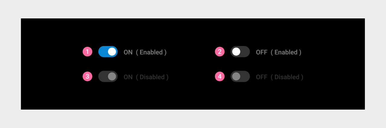
- The switch corresponds to four states:
① On. The switch is turned on, and the user can manually turn it on/off.
② Off. The switch is turned off, and the user can manually turn it off/on.
③ On (disabled) The switch is turned on, and the user cannot manually turn it off.
④ Off (disabled) The switch is turned off, and the user cannot manually turn it on.
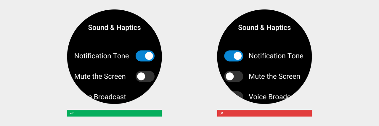
As for the page layout, a switch is always displayed on the right side of a list item or a card