Selection and status indicators
Selection and status indicators allow the user to choose from a set of predetermined options.
Radio buttons
Radio buttons (required) allow the user to select one out of several options.

Visual specifications
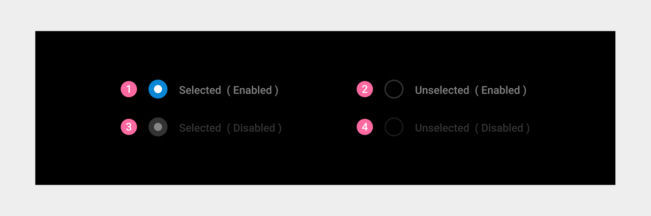
- Radio buttons have four states:
① Selected
② Unselected
③ Selected (disabled) The item is selected, but the user cannot manually switch between the selected and unselected states.
④ Unselected (disabled) The item is not selected, but the user cannot manually switch between the selected and unselected states.
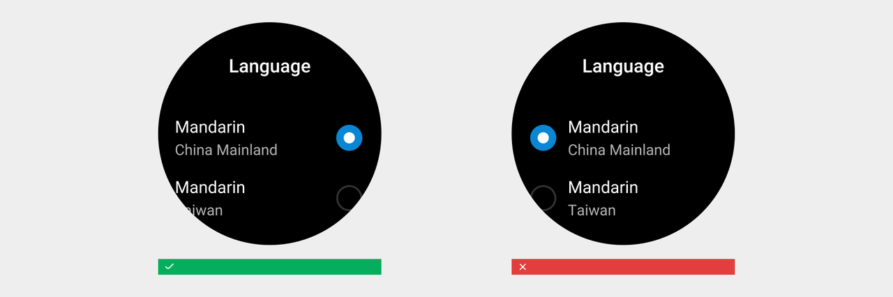
Radio boxes are placed uniformly on the right side of the list
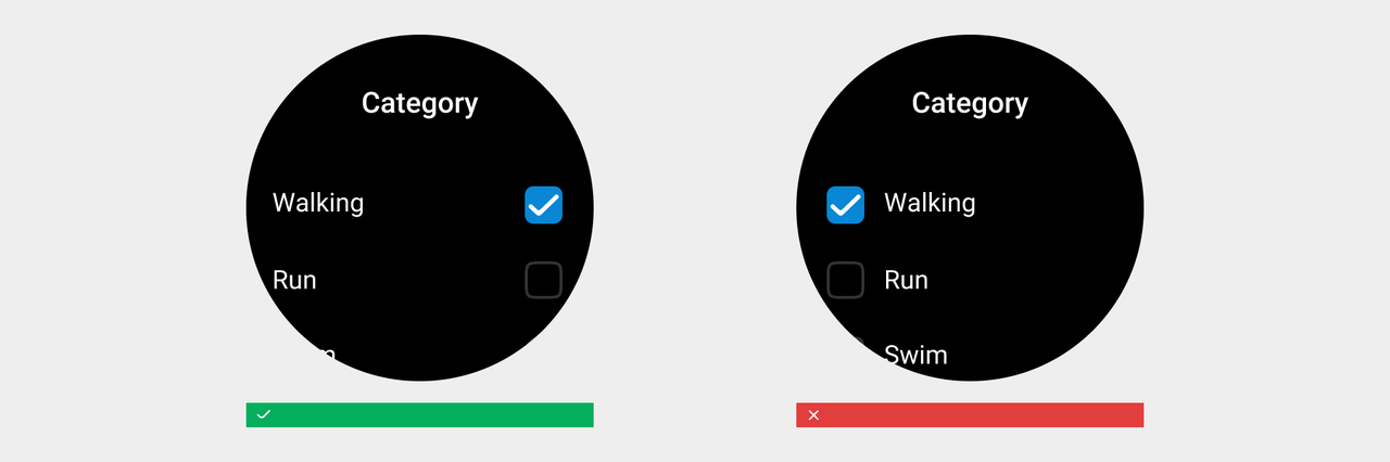
Checkboxes
Checkboxes (optional) allow the user to make multiple selections from provided options.
Visual specifications
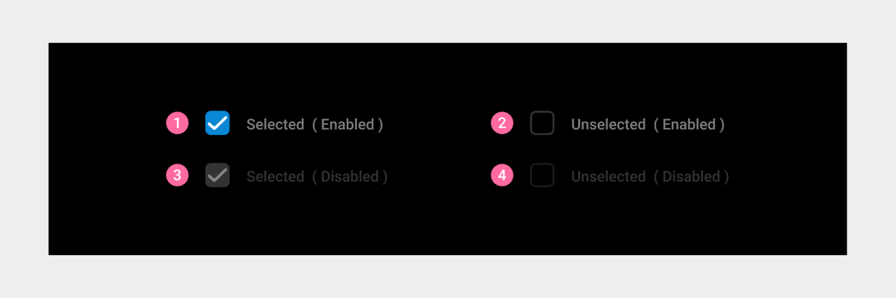
- Checkboxes have four states:
① Selected
② Unselected
③ Selected (disabled) The item is selected, but the user cannot manually switch between the selected and unselected states.
④ Unselected (disabled) The item is not selected, but the user cannot manually switch between the selected and unselected states.
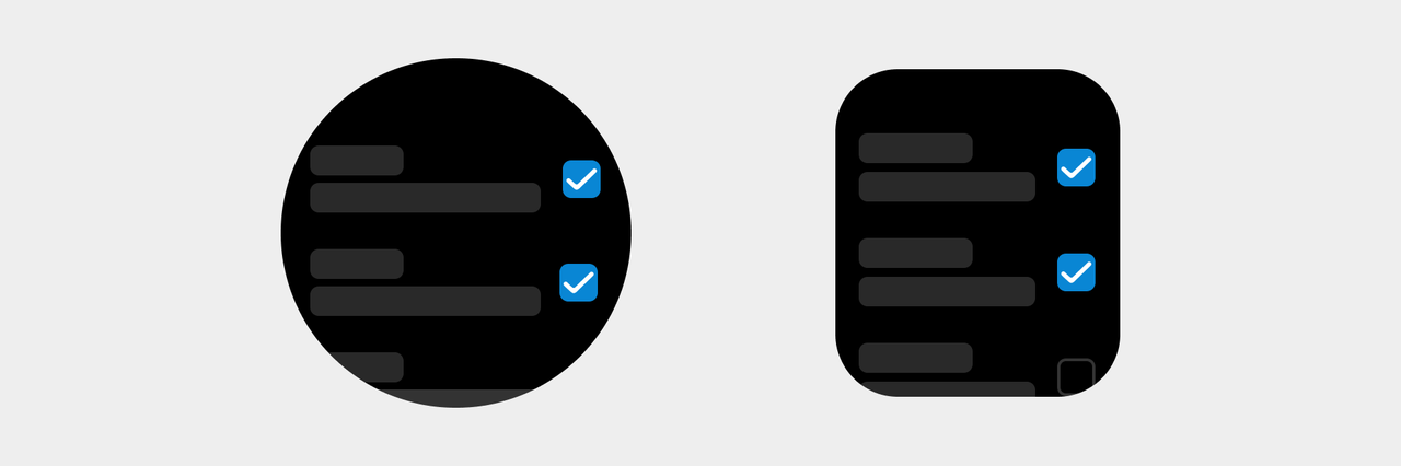
- Checkboxes are placed uniformly on the right side of the list
Status indicators
A status indicator is used to indicate the completion of an operation, such as indicating a completed to-do item.

Visual specifications
Status indicators have two states: ① Completed ② Uncompleted