BUTTON
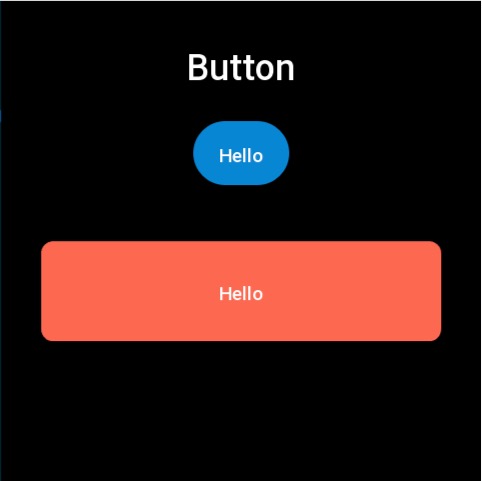
按钮控件支持设置正常态和按压态的颜色或者图片。
创建 UI 控件
const button = hmUI.createWidget(hmUI.widget.BUTTON, Param)
类型
Param: object
| 属性 | 说明 | 是否必须 | 类型 |
|---|---|---|---|
| x | 控件 x 坐标 | 是 | number |
| y | 控件 y 坐标 | 是 | number |
| w | 控件显示宽度 注: 设为-1 则优先根据 normal_src 的 size 适配,否则默认为 100 | 是 | number |
| h | 控件显示高度 注: 设为-1 则优先根据 normal_src 的 size 适配,否则默认为 40 | 是 | number |
| text | 按钮显示的文本 | 否 | string |
| color | 文本颜色 | 否 | number |
| text_size | 文本字体大小 | 否 | number |
| normal_color | 正常状态的背景色,需要与 press_color 同时设置才能生效 | 否 | number |
| press_color | 按压时显示的背景色,需要与 normal_color 同时设置才能生效 | 否 | number |
| radius | 使用颜色作为按钮背景时的圆角 | 否 | number |
| normal_src | 正常状态的背景图,需要与 press_src 同时设置才能生效 | 否 | string |
| press_src | 按压时显示的背景图,需要与 normal_src 同时设置才能生效 | 否 | string |
| click_func | 点击按钮的回调 | 否 | ClickFunc |
警告
- 当按钮的背景和颜色都没有设置的时候,会使用默认的点击态背景色(正常黑色 点击灰色)
- 当按钮的背景和颜色都设置时会优先使用背景色而不是背景图
- radius 字段只有在设置背景色之后才有用
- 背景色
normal_color与按压背景色press_color需要同时设置才能生效 - 背景色
normal_src与按压背景色press_color需要同时设置才能生效 - 在使用
widget.setPropertyAPI 修改 BUTTON 控件属性时,需要传入必填字段x、y、w、h(参考代码示例)
ClickFunc
(button: Button) => void
createWidget 方法创建的 button 实例
代码示例
提示
代码示例中的图片资源请参考 设计资源
Page({
  build() {
    const img_button = hmUI.createWidget(hmUI.widget.BUTTON, {
      x: (480 - 96) / 2,
      y: 120,
      text: 'Hello',
      w: -1,
      h: -1,
      normal_src: 'button_normal.png',
      press_src: 'button_press.png',
      click_func: () => {
        console.log('button click')
      }
    })

    hmUI.createWidget(hmUI.widget.BUTTON, {
      x: (480 - 400) / 2,
      y: 240,
      w: 400,
      h: 100,
      radius: 12,
      normal_color: 0xfc6950,
      press_color: 0xfeb4a8,
      text: 'Hello',
      click_func: (button_widget) => {
        button_widget.setProperty(hmUI.prop.MORE, {
          x: (480 - 400) / 2,
          y: 300,
          w: 400,
          h: 100,
        })
      }
    })
  }
})