List
Usually, a list is a finite sequence of data items of the same width, or in other words, a set of data items arranged in a certain linear order.
Composition
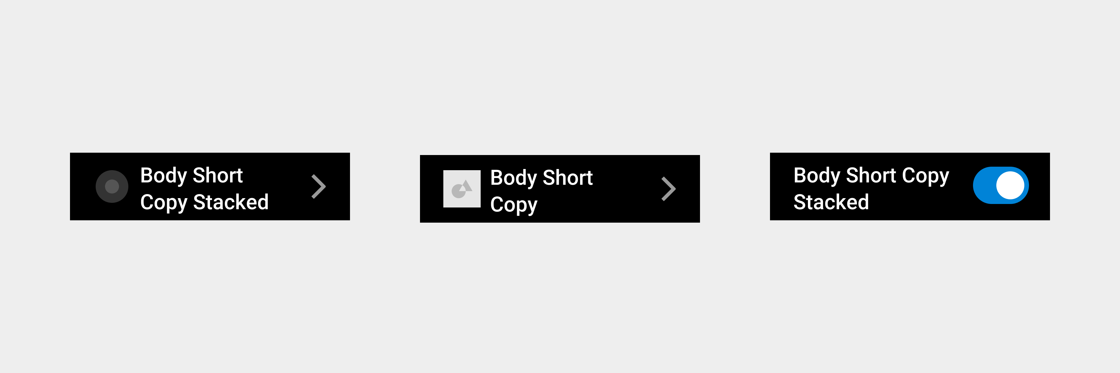
The list consists of icons, text, and operation buttons.
Inoperable list
List items that only contain text descriptions. The user cannot go to the next level or perform any operations.
Operable list
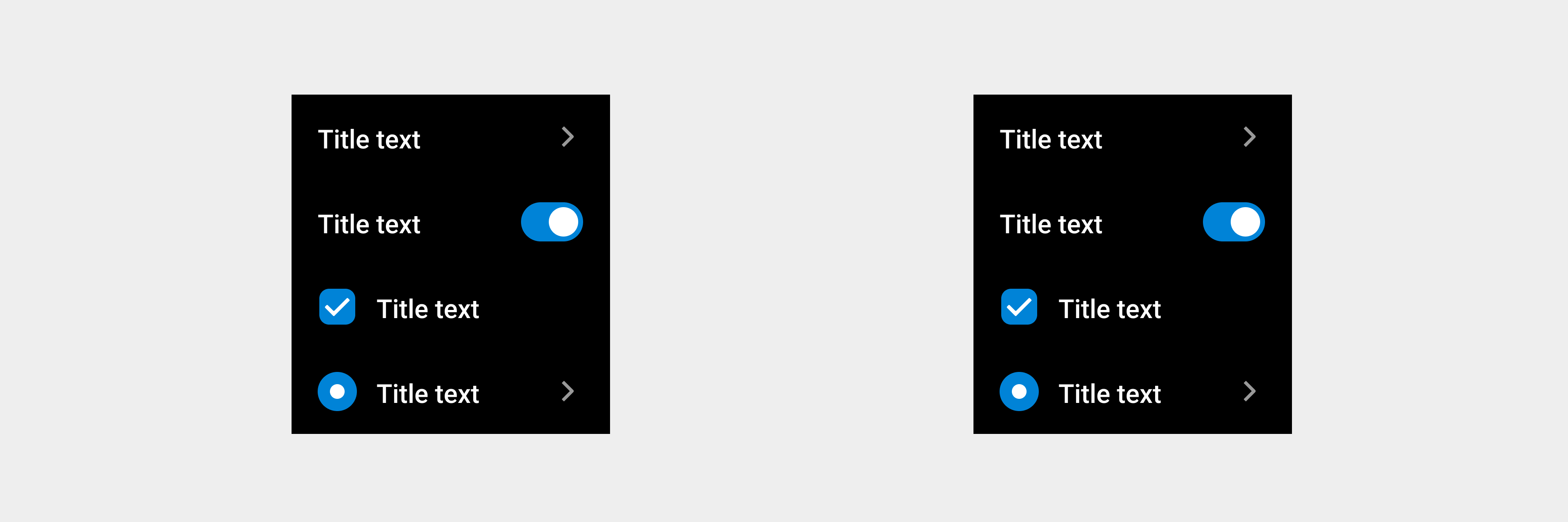
List items for which the user can perform further operations according to the description. The list item consists of a schematic icon, a description text, and an operation option. The operation option includes entry, switch, radio button, and checkbox.
Auxiliary text
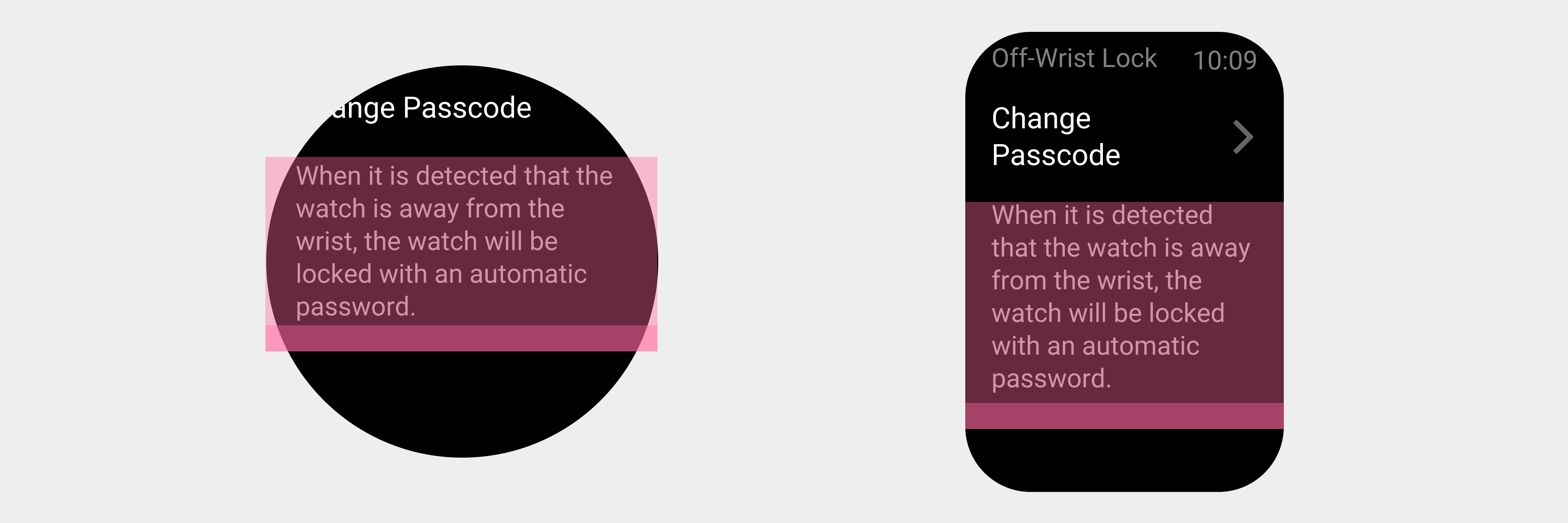
The description text in the text box must maintain a fixed distance from the bottom. If a super-long line of description text is wrapped, the text cannot be tapped.
Rules for use
- Users can select an item from the list to view details or perform more tasks.
- A list page can contain multiple list items of different types.
- If the list text occupies one line, it is the minimum height of the list. Even if the content of the list is empty, the minimum height should still be maintained.
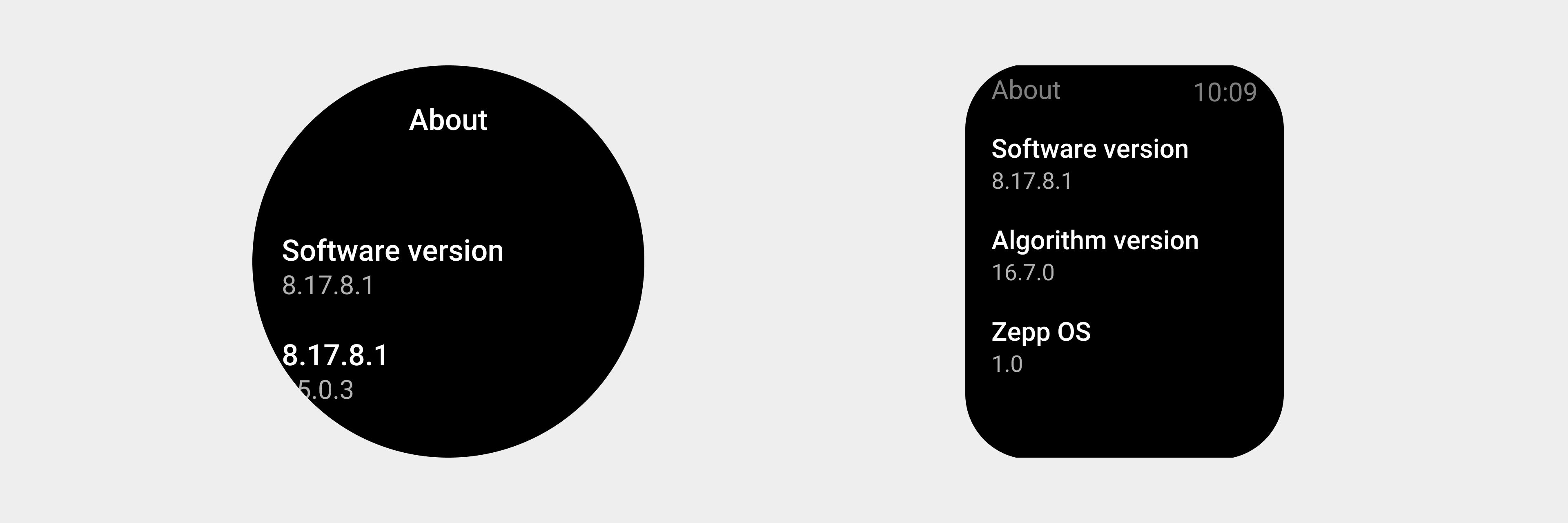
List headers have different layout schemes on different devices.
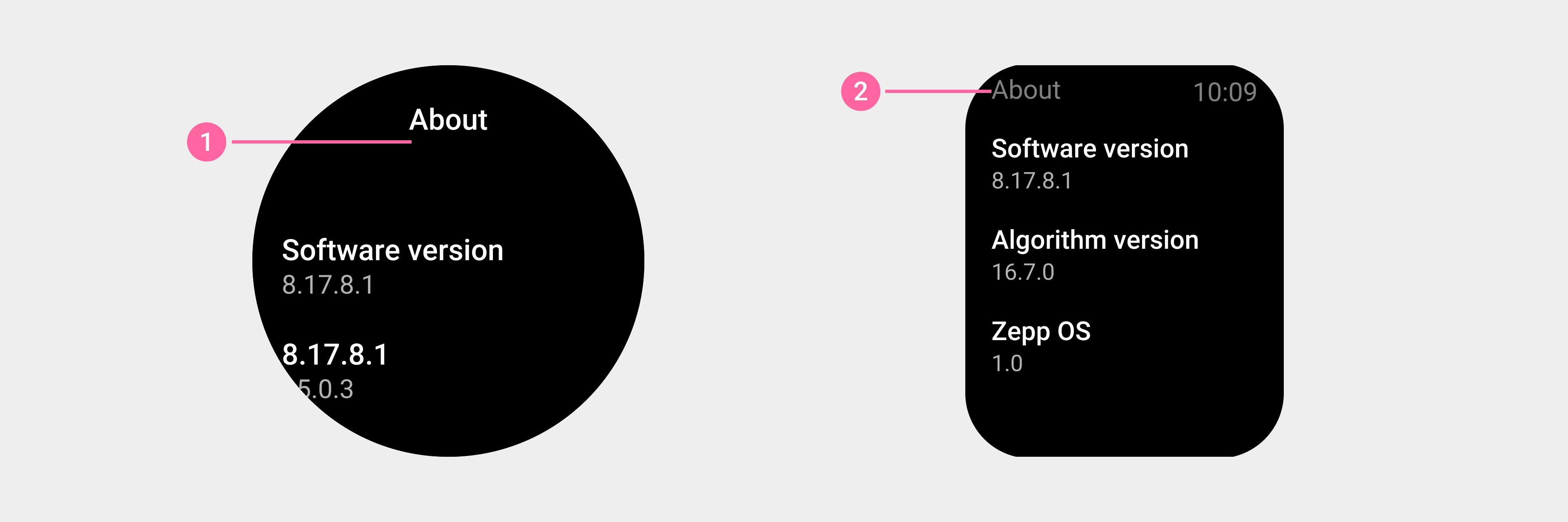
① On a circular screen, the title is at the top of the list.
② On a square screen, the title is on the status bar.
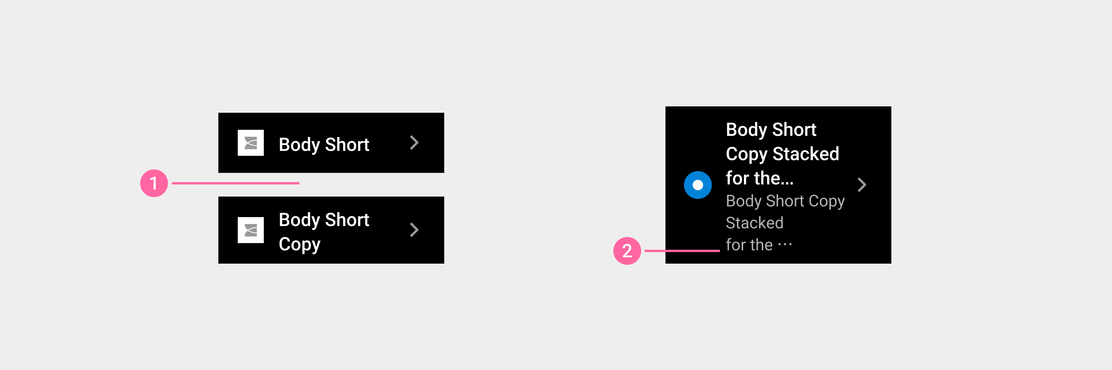
① The height of the list component is adaptive, and you can directly enter the text as needed.
② Use an ellipsis (...) at the end of the text when the text exceeds the display range.