Color
Color is an intuitive way for users to perceive interface information and product features. Zepp OS's color system originates from our "natural" design value and follows the law of color changes in nature. Extract the color, light, and shadow characteristics of Magic Hour to obtain different types of color palettes and guide and standardize color application scenarios.
Design principles
Fully understand the psychological effects of different colors and use colors following the basic principles of color psychology. In terms of color matching, use a global accent color to give each page consistency and familiarity. At the same time, we recommend testing colors in different usage scenarios to improve interface usability.
Color types
- System colors
- Text colors
- Secondary colors
System colors
Colors for key content and information, alerts, controls, base graphics, and so on.
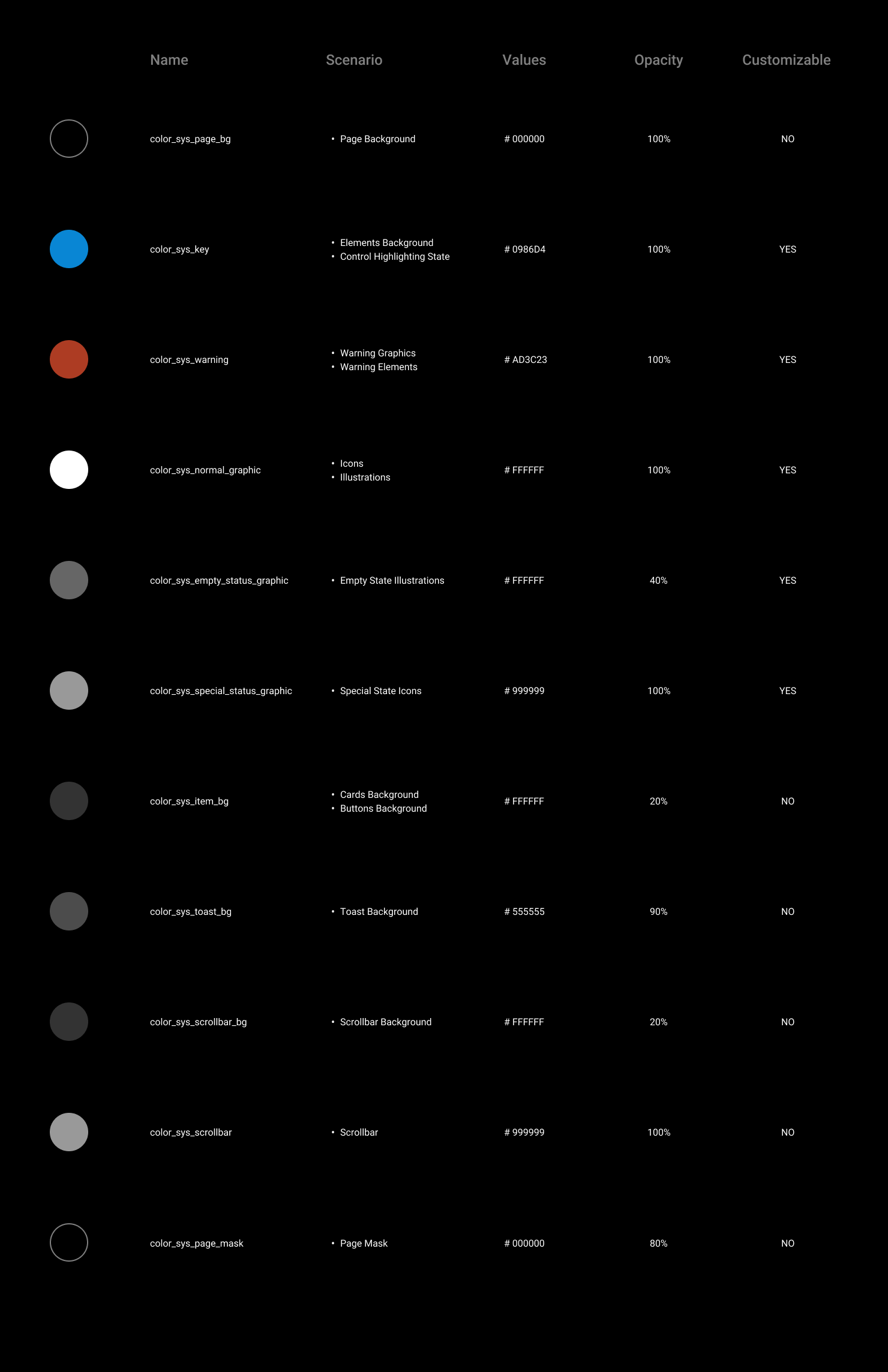
Usage examples:
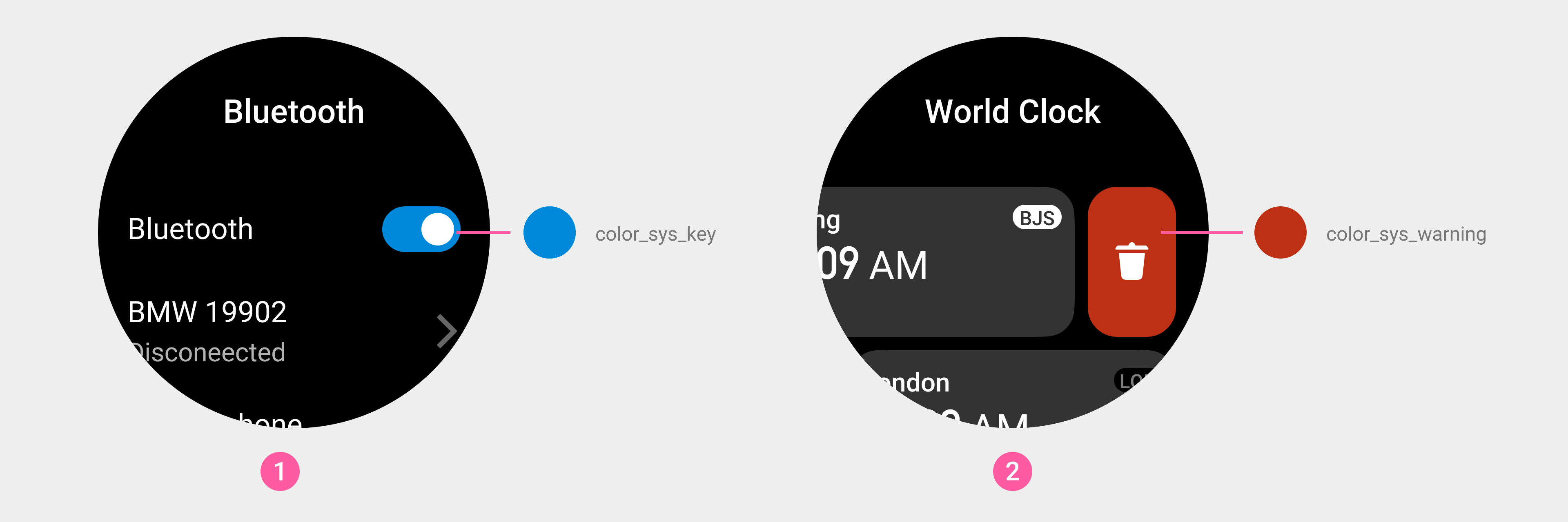
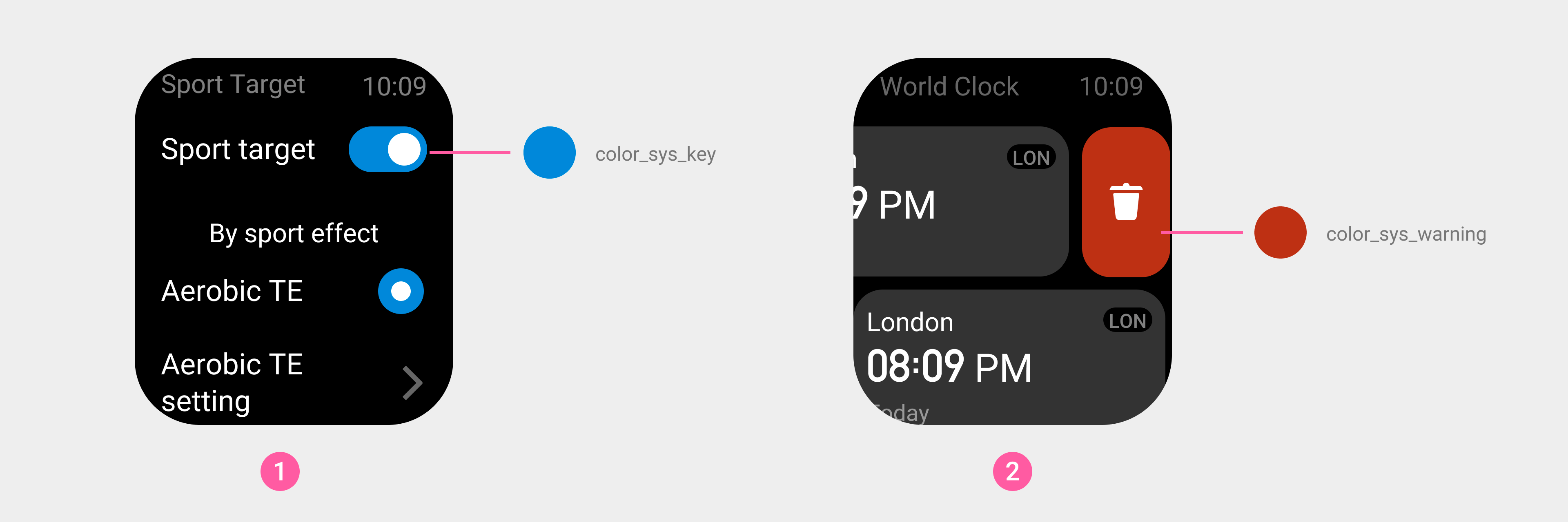
① Switch
② Delete button
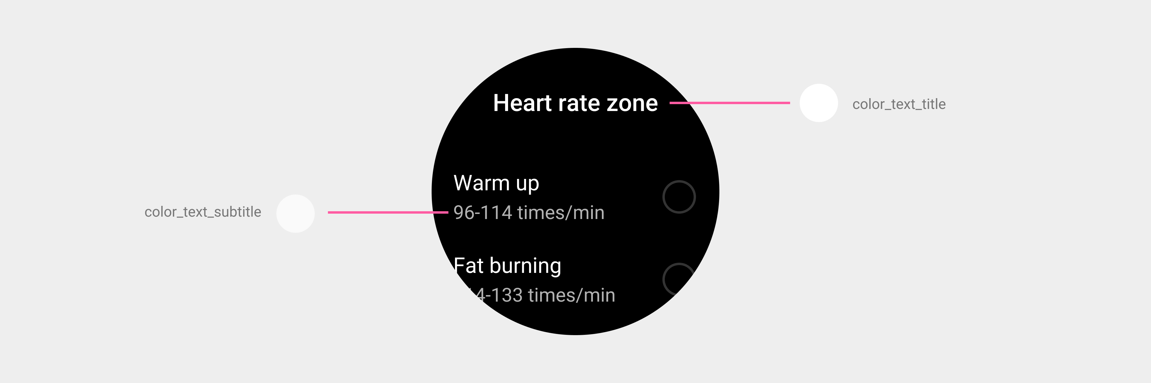
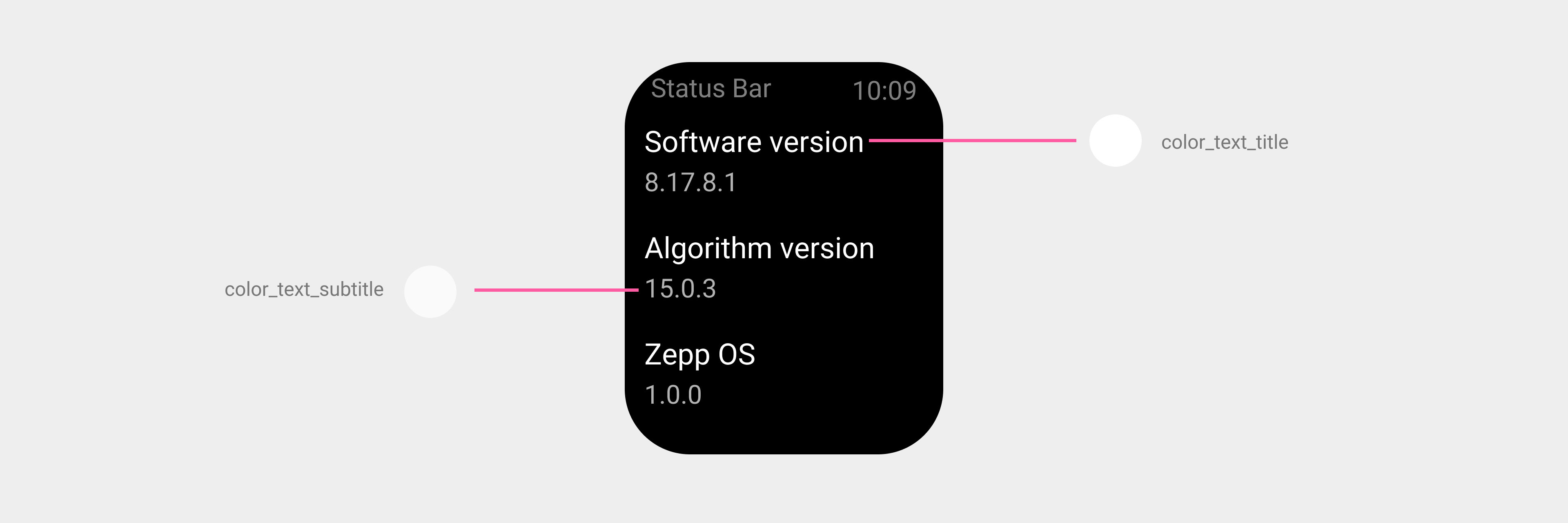
Text colors
The color of text content in titles, subtitles, descriptions, buttons, and other elements.
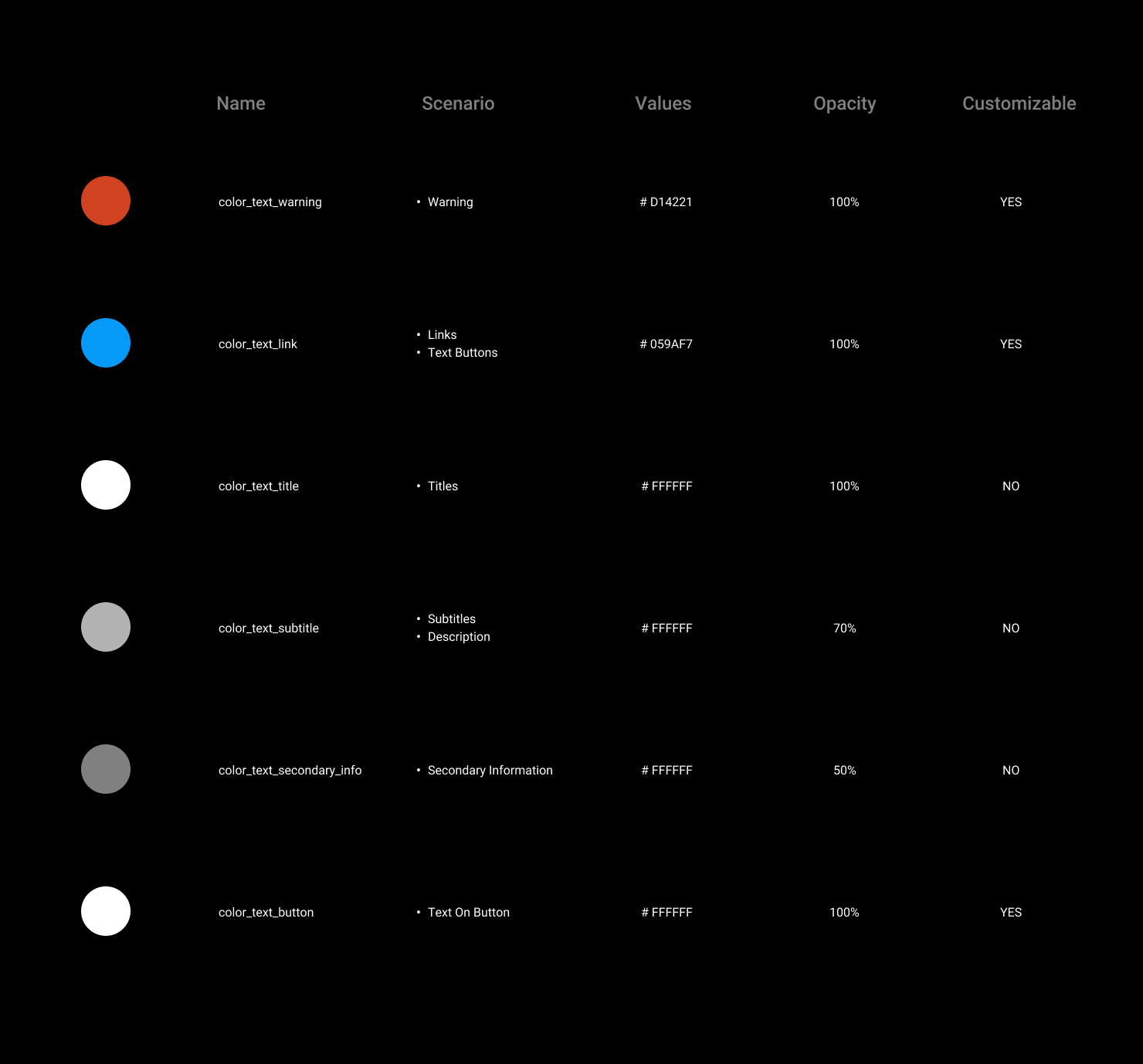
Usage examples:
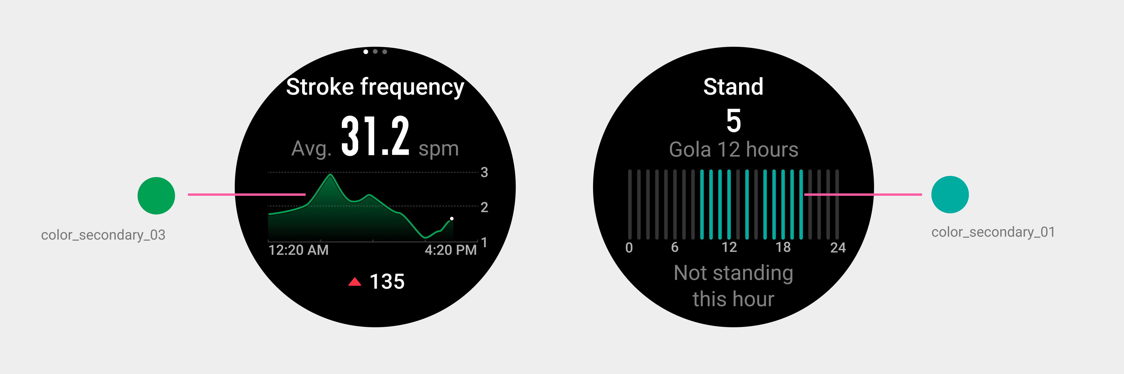
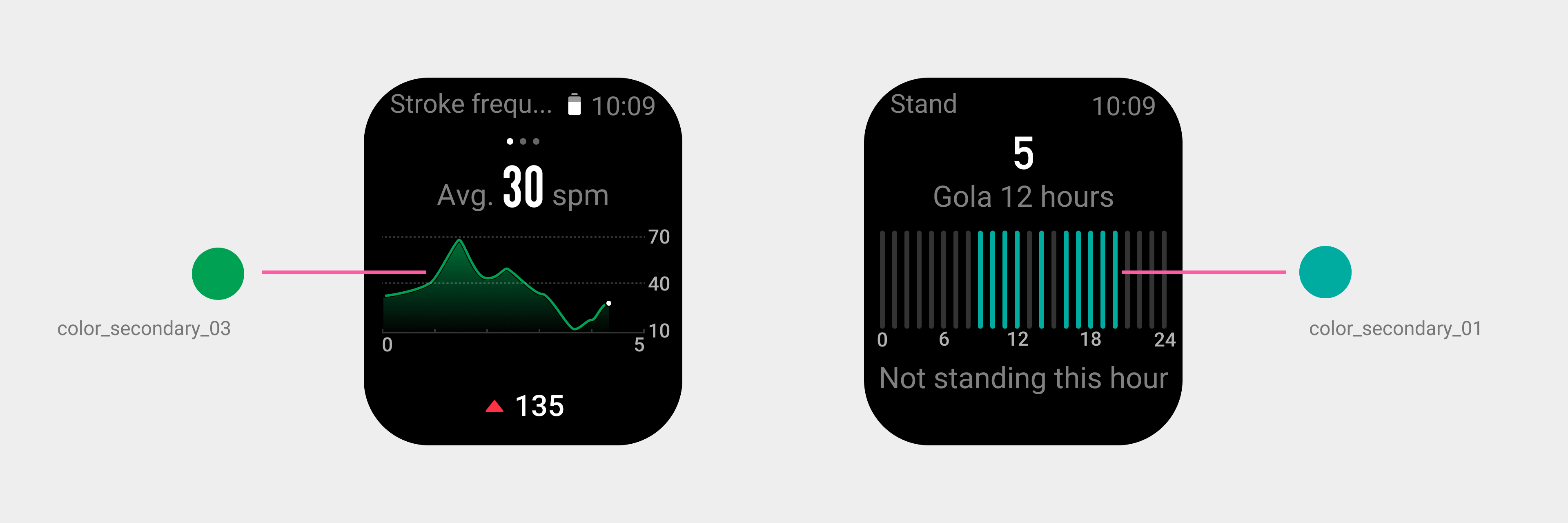
Secondary colors
Data chart colors, special colors within features, etc.
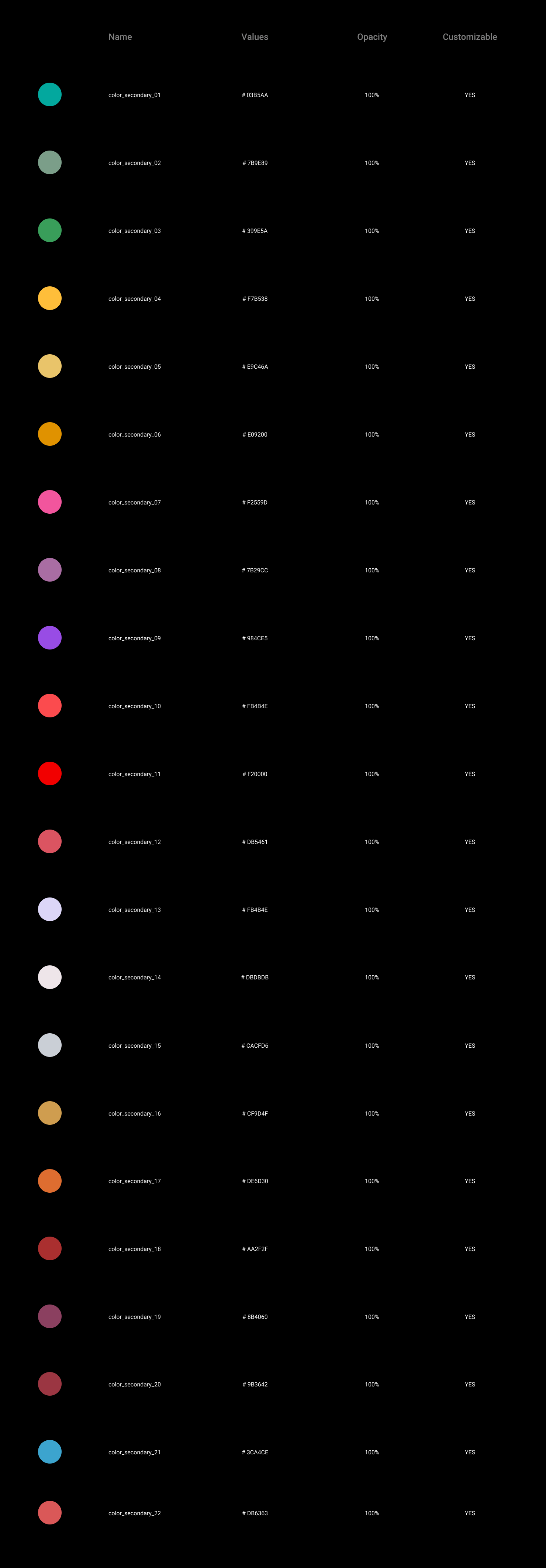
Usage examples:
Color status changes
Change the color of page elements based on the properties or states of page elements, such as tapped state and disabled state.
- For a control element in a "tapped state", when the tap action is triggered, the overall color brightness of the control element is reduced by 40%. After the tap action is completed, the color returns to the normal state.
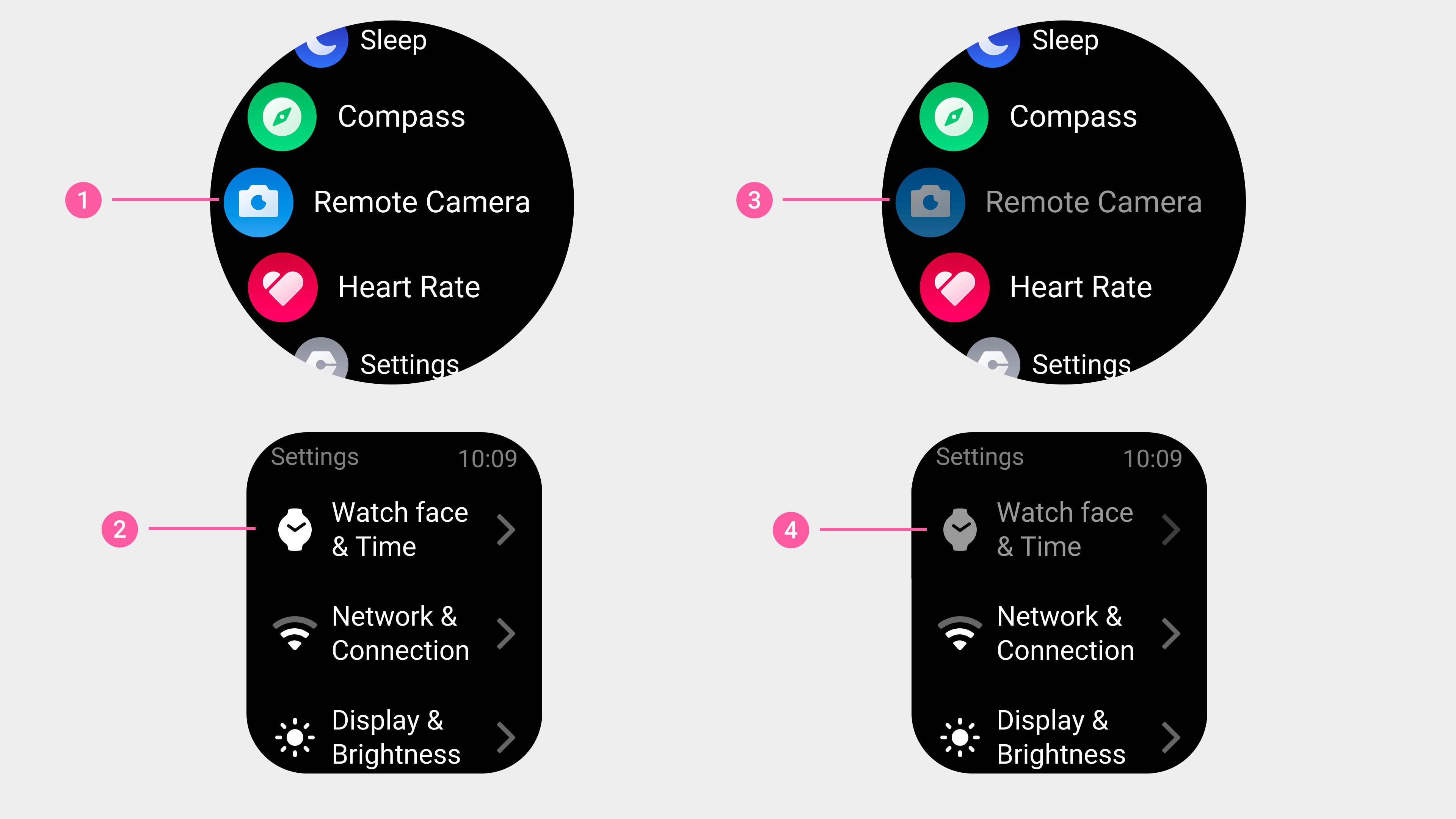
①②List: Normal state
③④List: Tapped state
①②③Button: Normal state
④⑤⑥Button: Tapped state
- For a control element in the "disabled state", the overall color brightness of the control element is reduced by 30%-50%. At the same time, for controls in the highlighted state, replace the highlight color replaced with a grayscale color.
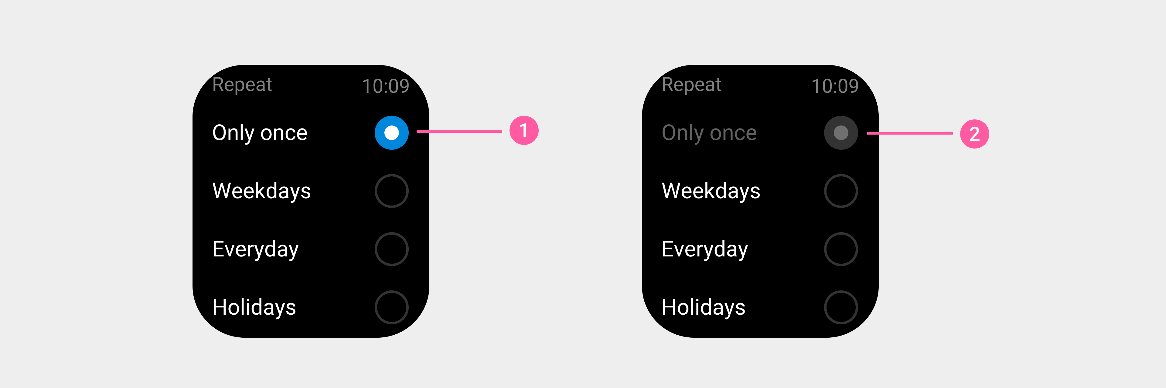
① Radio button list: Normal state
② Radio button list: Disabled state
Color availability
To ensure the readability of information and the integrity of the visual element display, follow these principles when using colors:
- Avoid excessive use of low grayscale colors (RGB values between 1 and 46).
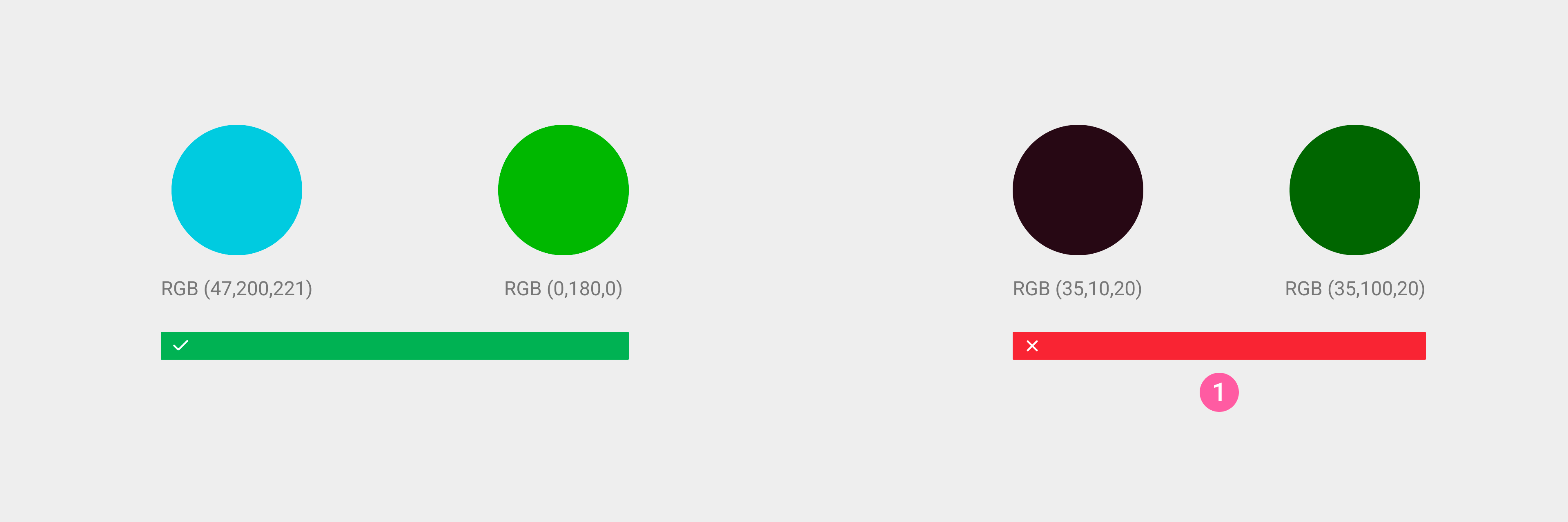
① Make sure that the RGB value is not between 1 and 46.
- Avoid gradients with too great a span. At the same time, we recommended testing the colors used on a real device to ensure correct color display.
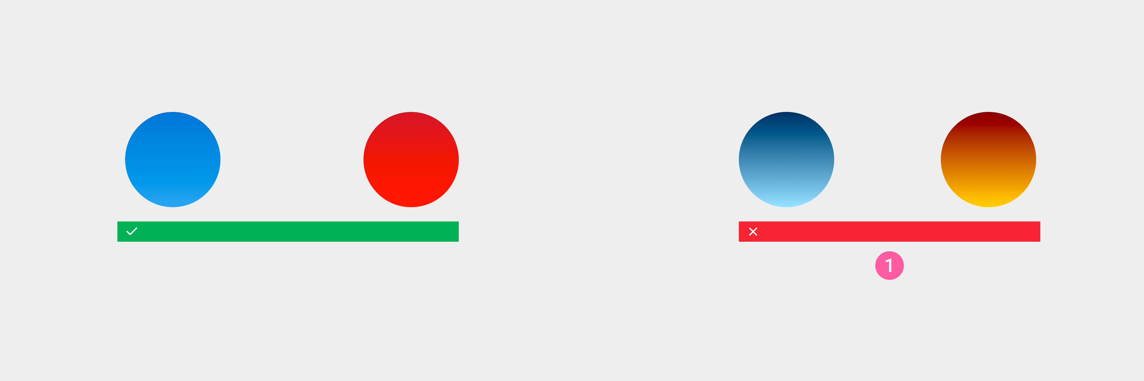
① Avoid gradients with too great a span.
- The recommended color contrast ratio between foreground and background content is ≥ 3:1. For more information, see Accessibility Design.
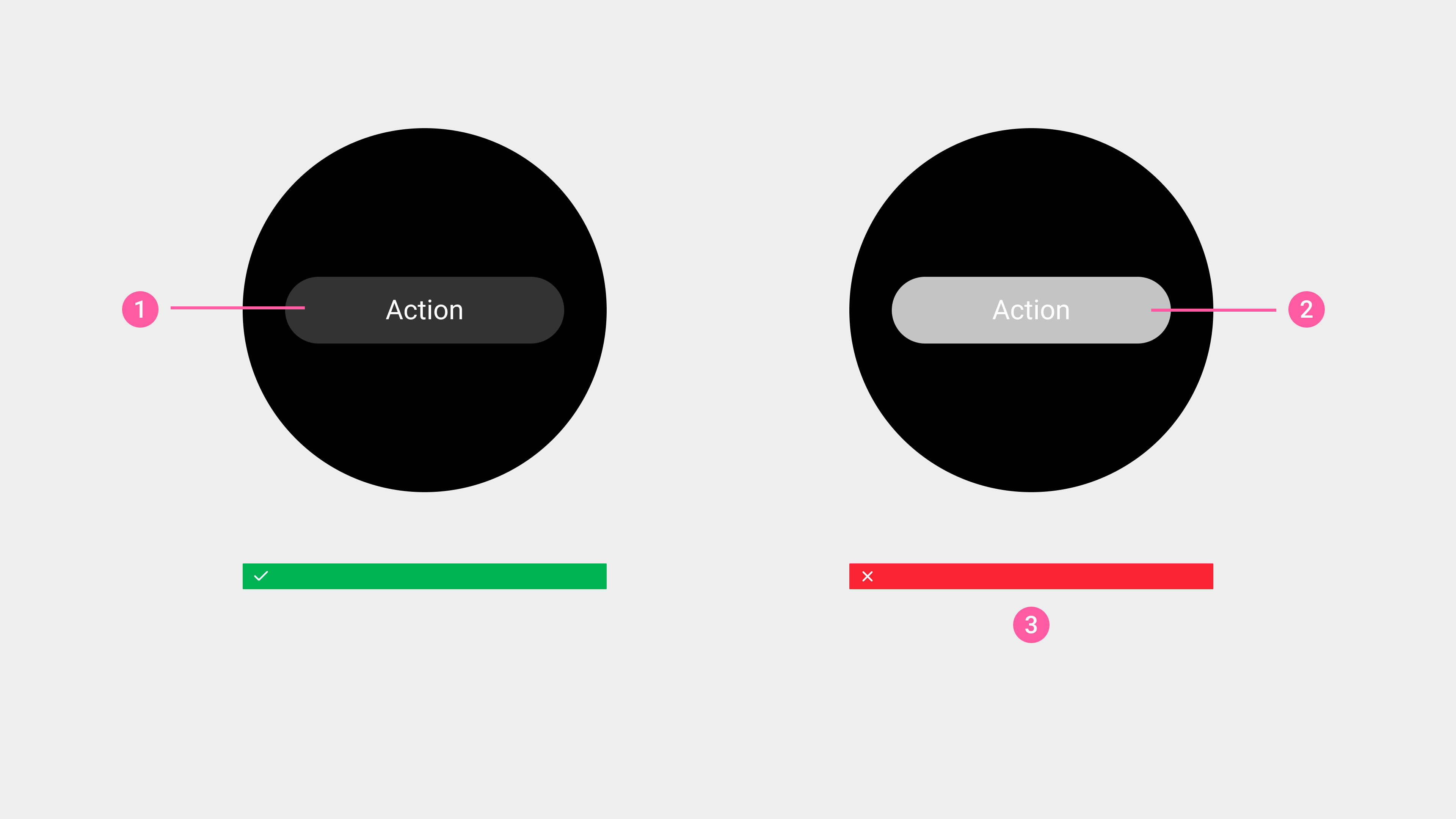
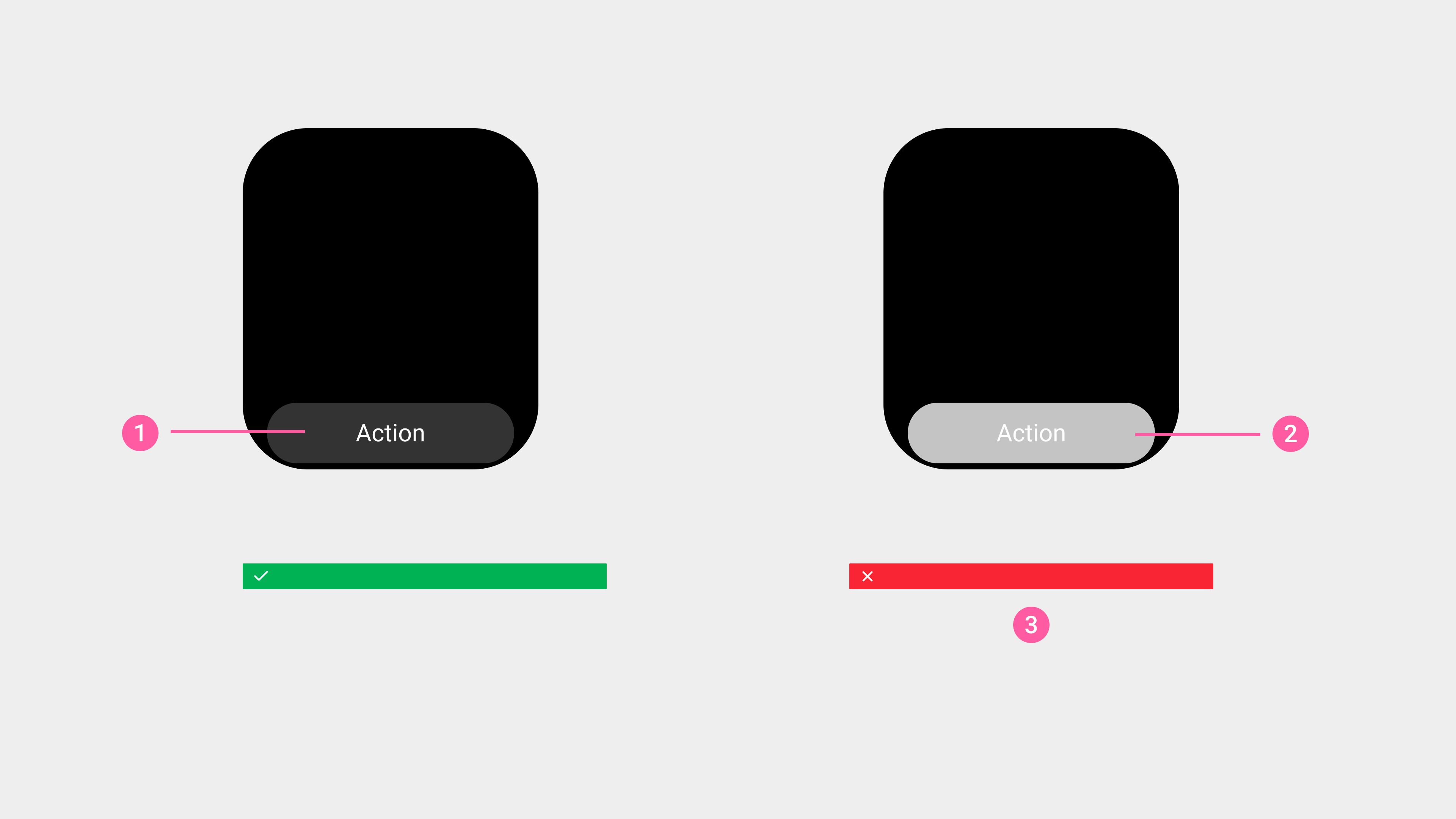
① Button text: button background = 12.63
② Button text: button background = 1.74
③ The contrast ratio between the foreground content and the background should be equal to or greater than 3:1