RADIO_GROUP
API_LEVEL
2.0开始支持,API 兼容性请参考 API_LEVEL。
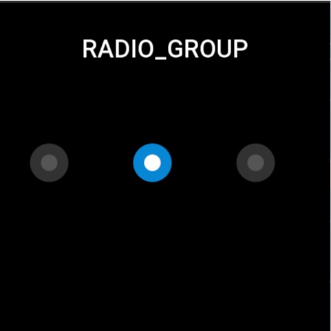
用于在多个选项中选择单个选项。每个单独的选项是 STATE_BUTTON 控件,需要单独创建。
创建 UI 控件
import { createWidget, widget } from '@zos/ui'

const radioGroup = createWidget(widget.RADIO_GROUP, radioGroupParam)
const stateButton = createWidget(widget.STATE_BUTTON, stateButtonParam)
类型
radioGroupParam: object
| 属性 | 说明 | 是否必须 | 类型 | API_LEVEL |
|---|---|---|---|---|
| x | 控件 x 坐标 | 是 | number | 2.0 |
| y | 控件 y 坐标 | 是 | number | 2.0 |
| w | 控件显示宽度 | 是 | number | 2.0 |
| h | 控件显示高度 | 是 | number | 2.0 |
| select_src | 控件选中状态所显示的图片 | 是 | string | 2.0 |
| unselect_src | 控件未选中状态所显示的图片 | 是 | string | 2.0 |
| check_func | 按钮状态改变时的回调 | 否 | CheckFunc | 2.0 |
| use_color | 是否通过颜色来显示控件 | 否 | boolean | 4.0 |
CheckFunc: function
(radioGroup: RadioGroup, index: number, checked: boolean) => void
| 参数 | 说明 | 类型 |
|---|---|---|
| radioGroup | radioGroup 实例 | RadioGroup |
| index | 单个选项的索引 | number |
| checked | 是否选中 | boolean |
StateButton: object
| 属性 | 说明 | 是否必须 | 类型 | API_LEVEL |
|---|---|---|---|---|
| x | 控件 x 坐标,相对于 radioGroup 的坐标 | 是 | number | 2.0 |
| y | 控件 y 坐标, 相对于 radioGroup 的坐标 | 是 | number | 2.0 |
| w | 控件显示宽度 | 是 | number | 2.0 |
| h | 控件显示高度 | 是 | number | 2.0 |
| select_color | 选中的颜色 | 否 | number | 4.0 |
| unselect_color | 非选中颜色 | 否 | number | 4.0 |
| fill_width | Button 颜色显示区域 | 否 | number | 4.0 |
| fill_height | Button 颜色显示区域 | 否 | number | 4.0 |
警告
必须要对控件进行一次初始化设置 prop.INIT,才能渲染视图
Prop 属性
| 属性 | 支持 get/set | 类型 | 备注 |
|---|---|---|---|
prop.INIT | set | object | 初始化组件,并且设置默认的选中项 |
prop.CHECKED | set/get | object | 设置选中子控件为选中状态,或者用于获取子控件的选中状态,值的类型为 boolean |
prop.UNCHECKED | get | object | 设置选中子控件为未选中状态,或者用于获取子控件的选中状态,值的类型为 boolean |
属性访问支持列表
RADIO_GROUP
| 属性名 | setProperty | getProperty | setter | getter |
|---|---|---|---|---|
| x | Y | Y | Y | Y |
| y | Y | Y | Y | Y |
| w | Y | Y | Y | Y |
| h | Y | Y | Y | Y |
| select_src | N | N | N | N |
| unselect_src | N | N | N | N |
| check_func | N | N | N | N |
| use_color | N | N | N | N |
STATE_BUTTON
| 属性名 | setProperty | getProperty | setter | getter |
|---|---|---|---|---|
| x | Y | Y | Y | Y |
| y | Y | Y | Y | Y |
| w | Y | Y | Y | Y |
| h | Y | Y | Y | Y |
| select_color | N | N | N | N |
| unselect_color | N | N | N | N |
| fill_width | N | N | N | N |
| fill_height | N | N | N | N |
代码示例
提示
代码示例中的图片资源请参考 设计资源
import { createWidget, widget } from '@zos/ui'

Page({
  build() {
    const radioGroup = createWidget(widget.RADIO_GROUP, {
      x: 0,
      y: 0,
      w: 480,
      h: 64,
      select_src: 'selected.png',
      unselect_src: 'unselected.png',
      check_func: (group, index, checked) => {
        console.log('index', index)
        console.log('checked', checked)
      }
    })

    const button1 = radioGroup.createWidget(widget.STATE_BUTTON, {
      x: 40,
      y: 200,
      w: 64,
      h: 64
    })
    const button2 = radioGroup.createWidget(widget.STATE_BUTTON, {
      x: 190,
      y: 200,
      w: 64,
      h: 64
    })
    const button3 = radioGroup.createWidget(widget.STATE_BUTTON, {
      x: 340,
      y: 200,
      w: 64,
      h: 64
    })

    radioGroup.setProperty(prop.INIT, button3)
  }
})