RADIO_GROUP
Start from API_LEVEL
2.0. Please refer to API_LEVEL.
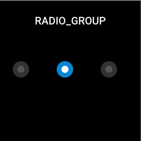
Used to select a single option among multiple options. Each individual option is a STATE_BUTTON widget that needs to be created separately.
Create UI Widget
import { createWidget, widget } from '@zos/ui'

const radioGroup = createWidget(widget.RADIO_GROUP, radioGroupParam)
const stateButton = createWidget(widget.STATE_BUTTON, stateButtonParam)
Types
radioGroupParam: object
| Properties | Description | Required | Type | API_LEVEL |
|---|---|---|---|---|
| x | The x-coordinate of the widget | YES | number | 2.0 |
| y | The y-coordinate of the widget | YES | number | 2.0 |
| w | Width of the widget | YES | number | 2.0 |
| h | Height of the widget | YES | number | 2.0 |
| select_src | Image displayed when widget is selected | YES | string | 2.0 |
| unselect_src | Image displayed when widget is unselected | YES | string | 2.0 |
| check_func | Callback when button state changes | NO | CheckFunc | 2.0 |
| use_color | Whether to display widget using colors | NO | boolean | 4.0 |
CheckFunc: function
(radioGroup: RadioGroup, index: number, checked: boolean) => void
| Parameters | Description | Type |
|---|---|---|
| radioGroup | The radioGroup instance | RadioGroup |
| index | Index of the option | number |
| checked | Whether selected | boolean |
StateButton: object
| Properties | Description | Required | Type | API_LEVEL |
|---|---|---|---|---|
| x | The x-coordinate relative to radioGroup | YES | number | 2.0 |
| y | The y-coordinate relative to radioGroup | YES | number | 2.0 |
| w | Width of the widget | YES | number | 2.0 |
| h | Height of the widget | YES | number | 2.0 |
| select_color | Color when selected | NO | number | 4.0 |
| unselect_color | Color when unselected | NO | number | 4.0 |
| fill_width | Button color display area width | NO | number | 4.0 |
| fill_height | Button color display area height | NO | number | 4.0 |
caution
The widget must be initialized once with prop.INIT to render the view
Prop Properties
| Properties | Support get/set | Type | Notes |
|---|---|---|---|
prop.INIT | set | object | Initialize the component and set the default selected item |
prop.CHECKED | set/get | object | Set the selected child widget to selected state, or get the selected state of the child widget, the value type is boolean |
prop.UNCHECKED | get | object | Set the selected child widget to unselected state, or get the selected state of the child widget, the value type is boolean |
Property Access Support List
RADIO_GROUP
| Property Name | setProperty | getProperty | setter | getter |
|---|---|---|---|---|
| x | Y | Y | Y | Y |
| y | Y | Y | Y | Y |
| w | Y | Y | Y | Y |
| h | Y | Y | Y | Y |
| select_src | N | N | N | N |
| unselect_src | N | N | N | N |
| check_func | N | N | N | N |
| use_color | N | N | N | N |
STATE_BUTTON
| Property Name | setProperty | getProperty | setter | getter |
|---|---|---|---|---|
| x | Y | Y | Y | Y |
| y | Y | Y | Y | Y |
| w | Y | Y | Y | Y |
| h | Y | Y | Y | Y |
| select_color | N | N | N | N |
| unselect_color | N | N | N | N |
| fill_width | N | N | N | N |
| fill_height | N | N | N | N |
Code Example
tip
Please refer to Design Resources for the image resources in the code example
import { createWidget, widget } from '@zos/ui'

Page({
  build() {
    const radioGroup = createWidget(widget.RADIO_GROUP, {
      x: 0,
      y: 0,
      w: 480,
      h: 64,
      select_src: 'selected.png',
      unselect_src: 'unselected.png',
      check_func: (group, index, checked) => {
        console.log('index', index)
        console.log('checked', checked)
      }
    })

    const button1 = radioGroup.createWidget(widget.STATE_BUTTON, {
      x: 40,
      y: 200,
      w: 64,
      h: 64
    })
    const button2 = radioGroup.createWidget(widget.STATE_BUTTON, {
      x: 190,
      y: 200,
      w: 64,
      h: 64
    })
    const button3 = radioGroup.createWidget(widget.STATE_BUTTON, {
      x: 340,
      y: 200,
      w: 64,
      h: 64
    })

    radioGroup.setProperty(prop.INIT, button3)
  }
})