CHECKBOX_GROUP
Supported from API_LEVEL
2.0. Please refer to API_LEVEL for API compatibility.
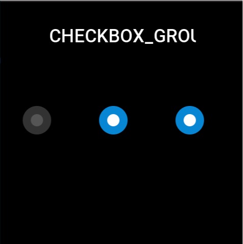
Used to select multiple options from a set of choices. Each option needs to be created using STATE_BUTTON.
Create UI Widget
import { createWidget, widget } from '@zos/ui'

const checkGroup = createWidget(widget.CHECKBOX_GROUP, checkboxGroupParam)
const stateButton = createWidget(widget.STATE_BUTTON, stateButtonParam)
Types
checkboxGroupParam: object
| Properties | Description | Required | Type | API_LEVEL |
|---|---|---|---|---|
| x | The x-coordinate of the widget | YES | number | 2.0 |
| y | The y-coordinate of the widget | YES | number | 2.0 |
| w | The width of the widget | YES | number | 2.0 |
| h | The height of the widget | YES | number | 2.0 |
| select_src | Image displayed when selected | YES | string | 2.0 |
| unselect_src | Image displayed when unselected | YES | string | 2.0 |
| check_func | Callback when button state changes | NO | CheckFunc | 2.0 |
| use_color | Whether to display widget using colors | NO | boolean | 4.0 |
CheckFunc: function
(checkboxGroup: CheckboxGroup, index: number, checked: boolean) => void
| Parameters | Description | Type |
|---|---|---|
| checkboxGroup | The checkboxGroup instance | CheckboxGroup |
| index | Index of the option | number |
| checked | Whether selected | boolean |
StateButton: object
| Properties | Description | Required | Type | API_LEVEL |
|---|---|---|---|---|
| x | The x-coordinate relative to radioGroup | YES | number | 2.0 |
| y | The y-coordinate relative to radioGroup | YES | number | 2.0 |
| w | The width of the widget | YES | number | 2.0 |
| h | The height of the widget | YES | number | 2.0 |
| select_color | Color when selected | NO | number | 4.0 |
| unselect_color | Color when unselected | NO | number | 4.0 |
| fill_width | Button color display area width | NO | number | 4.0 |
| fill_height | Button color display area height | NO | number | 4.0 |
Prop Properties
| Properties | Supports get/set | Type | Notes |
|---|---|---|---|
prop.INIT | set | object | Initialize the widget and set default selected item |
prop.CHECKED | set/get | object | Set/get selected sub-widget state, returns boolean type when getting |
prop.UNCHECKED | set | object | Set sub-widget to unselected state |
caution
The widget must be initialized once with prop.INIT to render the view. Currently, initialization only supports single option parameter passing. To initialize multiple options, use prop.CHECKED to set them.
Property Access Support List
CHECKBOX_GROUP
| Property | setProperty | getProperty | setter | getter |
|---|---|---|---|---|
| x | Y | Y | Y | Y |
| y | Y | Y | Y | Y |
| w | Y | Y | Y | Y |
| h | Y | Y | Y | Y |
| select_src | N | N | N | N |
| unselect_src | N | N | N | N |
| check_func | N | N | N | N |
| use_color | N | N | N | N |
STATE_BUTTON
| Property | setProperty | getProperty | setter | getter |
|---|---|---|---|---|
| x | Y | Y | Y | Y |
| y | Y | Y | Y | Y |
| w | Y | Y | Y | Y |
| h | Y | Y | Y | Y |
| select_color | N | N | N | N |
| unselect_color | N | N | N | N |
| fill_width | N | N | N | N |
| fill_height | N | N | N | N |
Code Example
tip
Please refer to Design Resources for the image resources in the code example
import { createWidget, widget, prop } from '@zos/ui'

Page({
  build() {
    const checkbox_group = createWidget(widget.CHECKBOX_GROUP, {
      x: 0,
      y: 0,
      w: 480,
      h: 64,
      select_src: 'selected.png',
      unselect_src: 'unselected.png',
      check_func: (group, index, checked) => {
        console.log('index', index)
        console.log('checked', checked)
      }
    })

    const button1 = checkbox_group.createWidget(widget.STATE_BUTTON, {
      x: 40,
      y: 200,
      w: 64,
      h: 64
    })
    const button2 = checkbox_group.createWidget(widget.STATE_BUTTON, {
      x: 190,
      y: 200,
      w: 64,
      h: 64
    })
    const button3 = checkbox_group.createWidget(widget.STATE_BUTTON, {
      x: 340,
      y: 200,
      w: 64,
      h: 64
    })

    checkbox_group.setProperty(prop.INIT, button2)
    checkbox_group.setProperty(prop.CHECKED, button3)
  }
})