SLIDE_SWITCH
Start from API_LEVEL
2.0. Please refer to API_LEVEL.
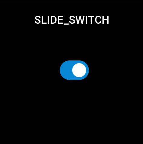
Used to switch between open and closed states.
Create UI widget
import { createWidget, widget } from '@zos/ui'

const slideSwitch = createWidget(widget.SLIDE_SWITCH, Param)
Type
Param: object
| Properties | Description | Required | Type |
|---|---|---|---|
| x | The x-axis coordinate of the widget. | YES | number |
| y | The y-axis coordinate of the widget. | YES | number |
| w | The width of the widget. | YES | number |
| h | The height of the widget. | YES | number |
| select_bg | The selected background. | YES | string |
| un_select_bg | Unselected background. | YES | string |
| slide_src | Switch button. | YES | string |
| slide_select_x | Relative coordinates.The selected state of the switch button. | YES | number |
| slide_un_select_x | Relative coordinates.The unselected state of the switch button. | YES | number |
| slide_y | Relative coordinates.The y-axis offset of the switch button. | NO | number |
| checked_change_func | Callback on state change. | NO | CheckedChangeFunc |
| checked | Default switch state. | NO | boolean |
CheckedChangeFunc: function
(slideSwitch: SlideSwitch, checked: boolean) => void
| Parameters | Description | Type |
|---|---|---|
| slideSwitch | The instance of slideSwitch | SlideSwitch |
| checked | checked or unchecked | boolean |
Prop Properties
| properties | description | support get/set | types |
|---|---|---|---|
prop.CHECKED | Set switch state.Get switch state | set/get | boolean returns bool type when you get |
Code example
tip
Please refer to Design Resources for the image resources in the code example
import { createWidget, widget, prop } from '@zos/ui'

Page({
  build() {
    const slide_switch = createWidget(widget.SLIDE_SWITCH, {
      x: 200,
      y: 200,
      w: 96,
      h: 64,
      select_bg: 'switch_on.png',
      un_select_bg: 'switch_off.png',
      slide_src: 'radio_select.png',
      slide_select_x: 40,
      slide_un_select_x: 8,
      checked: true,
      checked_change_func: (slideSwitch, checked) => {
        console.log('checked', checked)
      }
    })

    console.log('slide checked', slide_switch.getProperty(prop.CHECKED))
  }
})