Input
Selectors
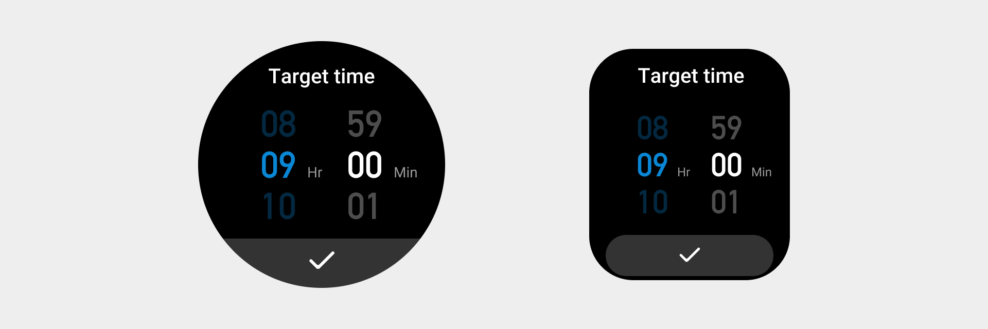
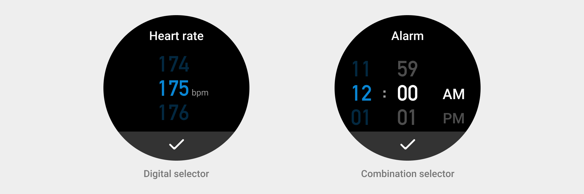
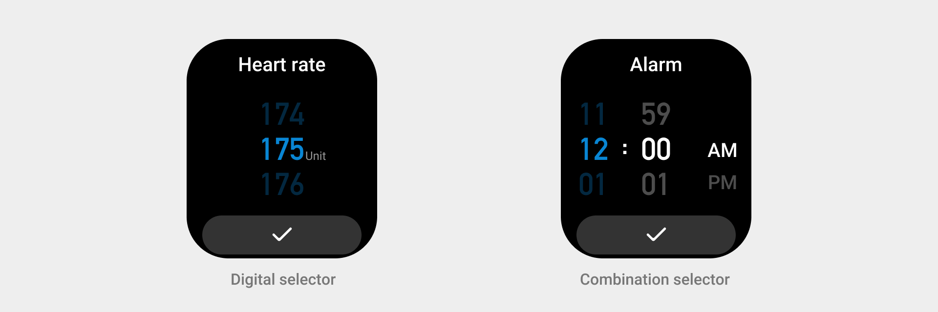
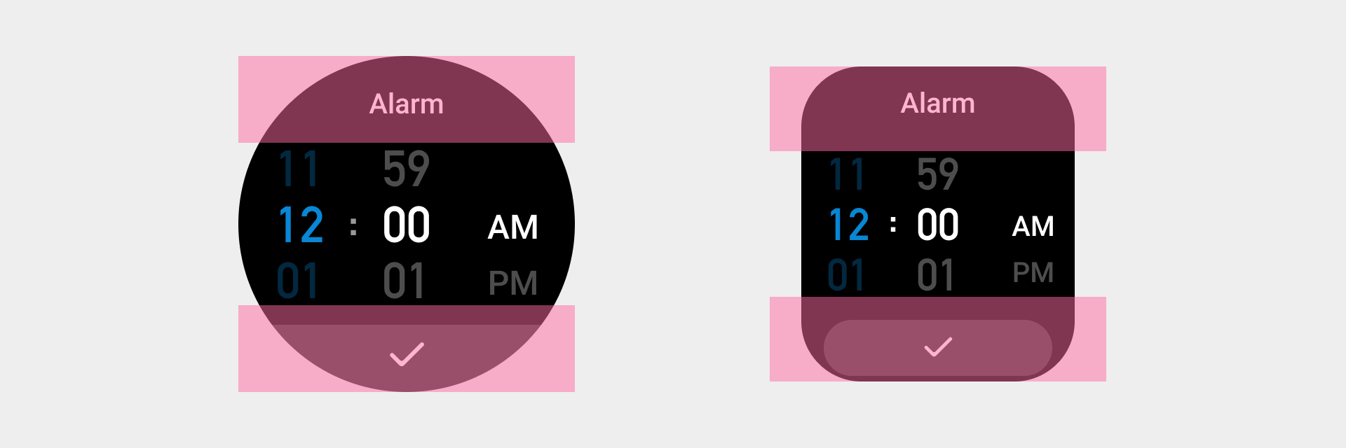
Data selectors
A data selector component is an option collection control that provides a single or multiple parameters for the user.
Design principles
Reasonable
- Provide reasonable default options: Provide reasonable default options to convey the correct information, reduce the number of user operations, and improve efficiency.
- Reasonable sorting: Sort the options based on product features, logics, or user experience to help users make quick selections.
Simplicity
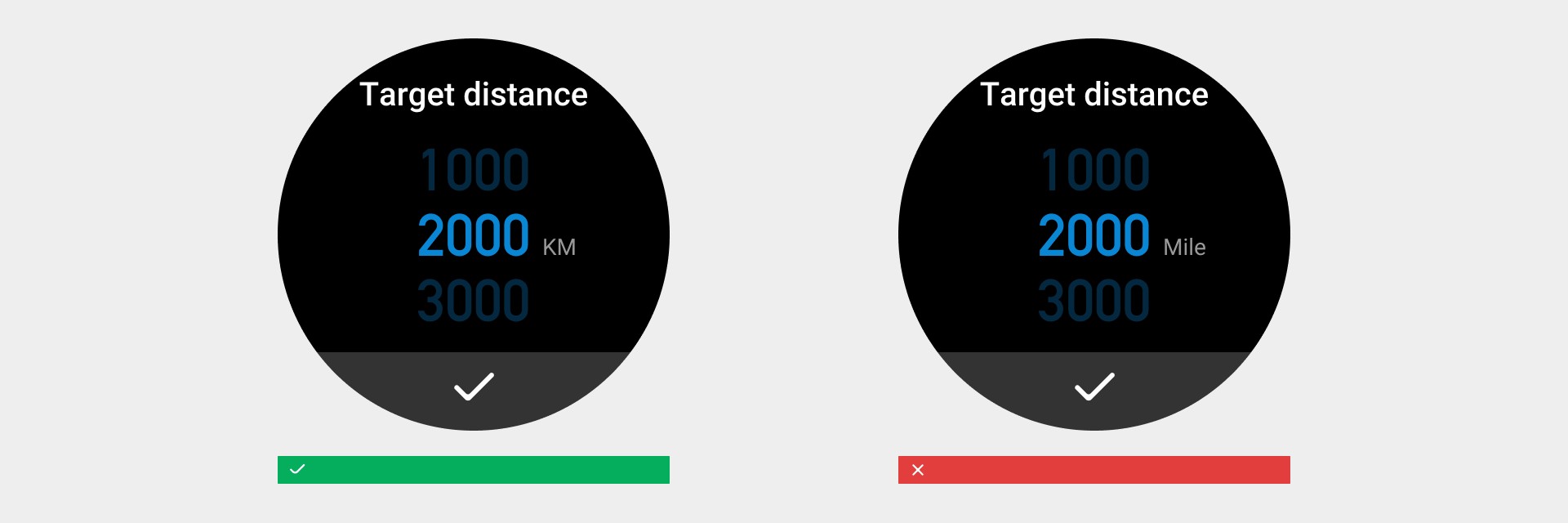
- Simple description: The text (titles and description text) in the selector should be simple and clear, so the user can understand it with ease. Use internationally accepted abbreviations for option units.
- Simple options: Due to the screen size limitation of smart wearables, if there are too many options or the options are complicated and difficult to understand, use another form of operation. We recommend that selector options do not exceed 3 lines. Try not to use selectors that require text description for options.
Types
- Digit selectors
- Combination selectors
Rules for use
- Use internationally accepted abbreviations for option units.
Visual specifications
- The control should be positioned at the center of the entire page.
- Option digit font: DIN1451 Default color value: color_text_title, color value for selected digits: color_sys_key
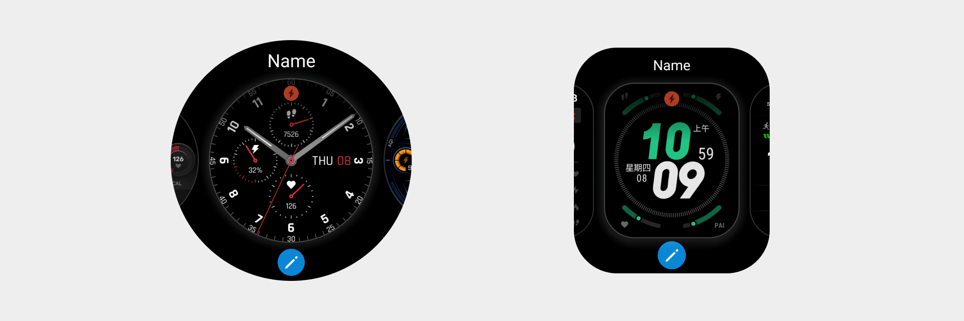
Page selectors
A page selector is a control that provides the user with a choice of pages.

Rules for use
The user switches pages by swiping horizontally or rotating the crown, and taps to confirm the current page. For example, Watchface editing.
Visual specifications
- Scrollable pages ➀ The interval space between two pages is 2px, color value name: color_sys_item bg

- The same interval space applies to scrollable pages on both square screen devices and circular screen devices.
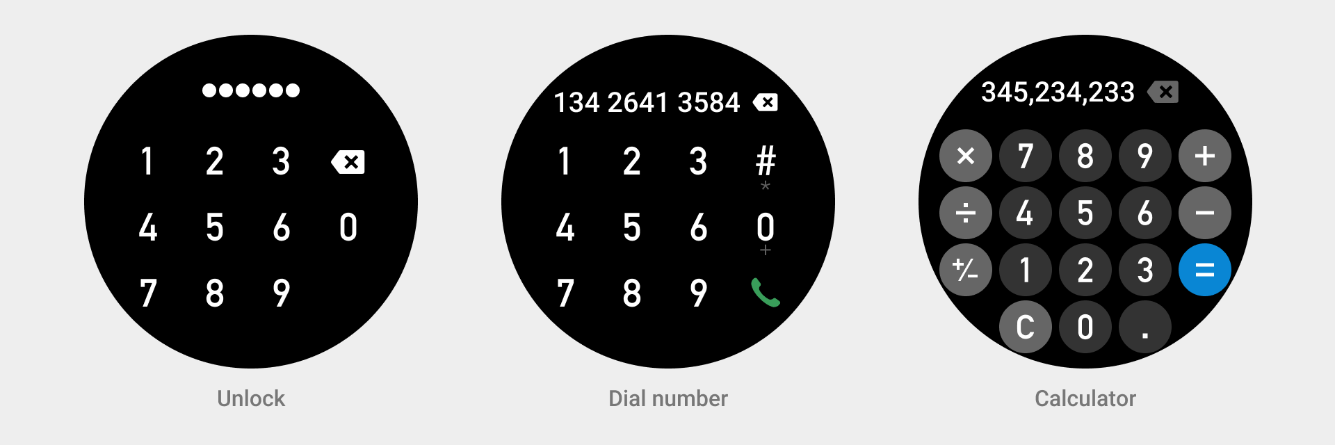
Digit input
Digit input provides users with a visual way to enter digit-related information.
Design goals
Provide users with a simple and effective form to enter digital information so that they can complete tasks with efficient input.
Provide clear visual feedback to guide user input during operations.
Types
- Unlock control
- Dial control
- Calculator tool
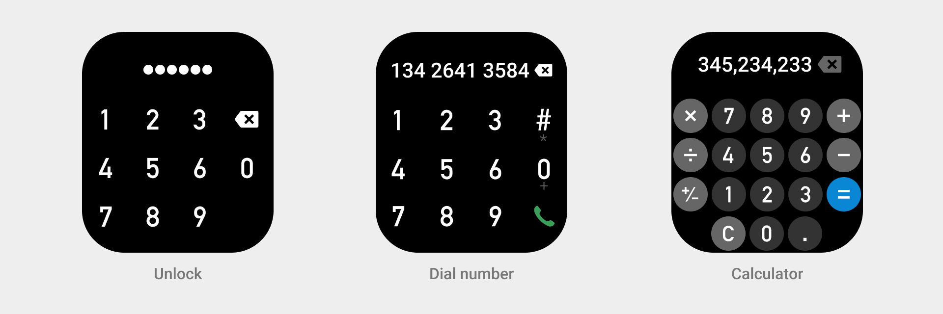
Rules for use
The unlock control is enabled when it detects that the wearable device is off the wrist. The user taps to enter the digits, and the screen displays the digits for 500ms before it hides the digits.

Visual specifications
-
For the dial/unlock control, when the user taps a digit in the digit input area, the digit and its background color are enlarged by a ratio of 1.26, and they will return to the normal size when the tap ends.
Background color value for a tapped digit: #FFFFFF 20%

-
In the circular button area of the calculator tool, when the user taps a digit/character, the digit/character and its background color are enlarged by a ratio of 1.26, and they will return to the normal size when the tap ends.
The changes of the background color values for tapped digits/symbols/signs:
① digits: #333333 — #666666
② math symbols: #666666 — #999999
③ equals sign: #0986D4 — #3A9EDD
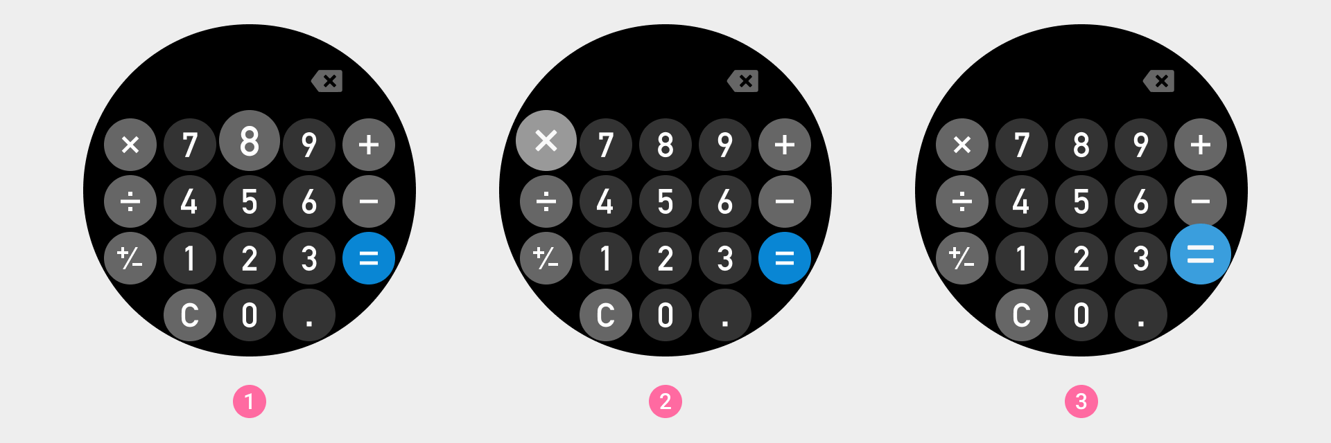
- The calculator tool symbol button will light up after the user taps OK to inform the user of the current calculation method.