Operations
Buttons
A button is an interactive element that indicates a specific action. It triggers functionality, guides user actions, and supports user cognitive actions.
Design principles
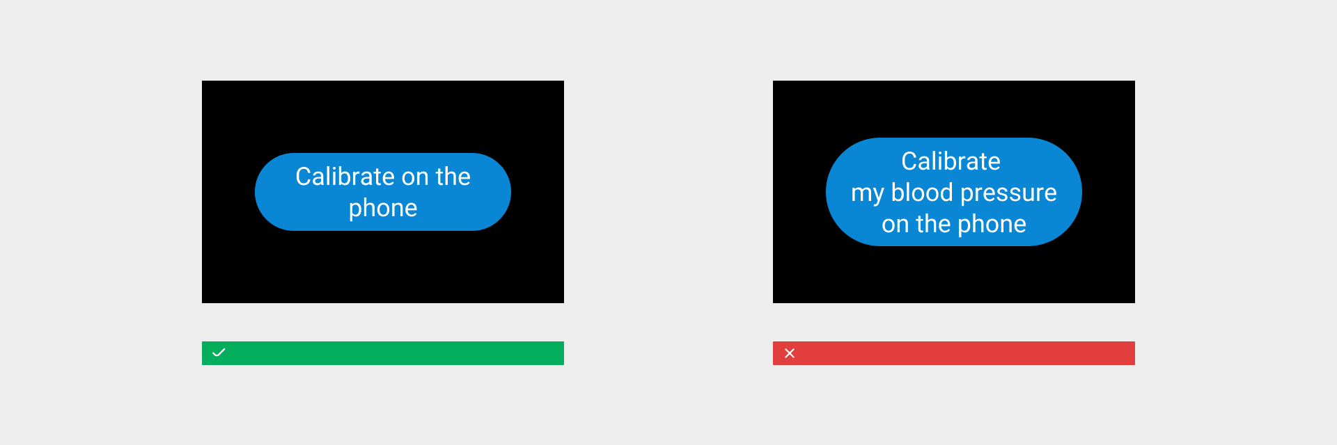
- Write button labels that clearly explain what each button does, so that users can quickly understand its action.
- Provide feedback for button interactions, reduce unnecessary user operations, and enhance usage efficiency.
- Ensure the tappable area of the button. Due to the screen size limitation of wearable devices, for smaller buttons, expand the tappable area of the button to ensure the accuracy of user operations.
- Avoid using too many buttons. Be sure to control the number of buttons on the page, consider the most important actions, and control the priority and complexity of buttons.
- Pay attention to the order of buttons. The order of buttons on the page should follow the directional principle, which is in line with the user's interaction habits. Ensure that the buttons are in the same order to help the user improve operation efficiency and reduce the likelihood of user operation errors.
Floating buttons
Fixed buttons contain highly informative features. They float on the top layer of a page and do not slide with the page.
Capsule buttons
As a common button style displayed on pages, capsule buttons slide with the interface. Based on the usage scenario, they are divided into ➀ default buttons, ② emphasis buttons, and ③ warning buttons.

Circular buttons
Circular buttons use graphics to visualize the button content and display more content in a relatively small screen space. Limit the number of circular buttons of different sizes on the page.

Icon buttons
Compared with circular buttons, icon buttons offer a more lightweight visual hierarchy as they can save more interface space. Avoid using icon buttons to express complex meanings.

Text buttons
Because text buttons don't have a visible container, they don't distract from nearby content and are less visually appealing. Text buttons have a low level of emphasis to less important actions.
Rules for use
- Choose an appropriate button style based on the current level of button interaction behavior, and take into account both the screen space size and the overall layout.
- Keep the button text concise. The length limit of the capsule button text is two lines.
- Avoid all caps to increase the level of visual perception.

- Add key colors to the button to inform the user of progress and status. For example: to use offline voice commands to set an alarm, we recommend using a floating button and clearly informing the user of countdown progress.
Visual specifications
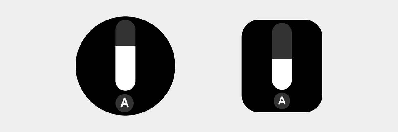
Buttons on square screens and round screens have different specifications. Call the button components in the corresponding component library as required. For more details about specification differences, see the examples below:
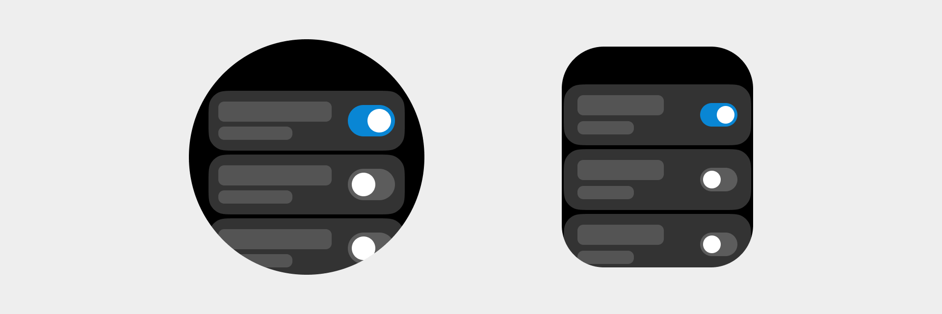
- Floating button styles on square screen and round screen devices
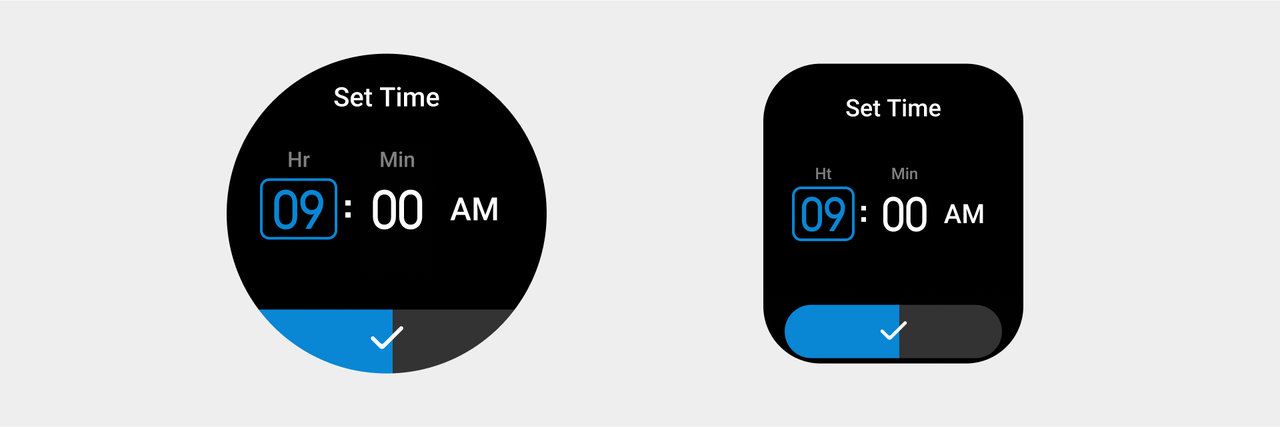
- The size of a capsule button on a square device is different from that on a round screen device

① Round screen device
② Square screen device
- Circular buttons are available in six sizes. When a specific circular button is used, its size remains unchanged in round screen devices and square screen devices.

-
Icon buttons are available in two specifications. When a specific icon button is used, its specification remains unchanged in round screen devices and square screen devices.
Make sure that you follow the corresponding icon size specifications when drawing a slice (we recommend expanding the tappable area for smaller icon buttons, and the size of the drawing area should not be less than 52px).
-
Set the button state and color value definition based on the corresponding specifications.

➀ Default button background color: color_sys_item bg Text/icon: color_text_button
② Emphasis button background color: color_sys_key Text/icon: color_text_button
③ Define the color value of a button with a special attribute based on the color specifications, such as the incoming call button and the delete button
④ Text button color value: color_text_link
- When a tap action is triggered, the overall color brightness of the button is reduced by 40%.
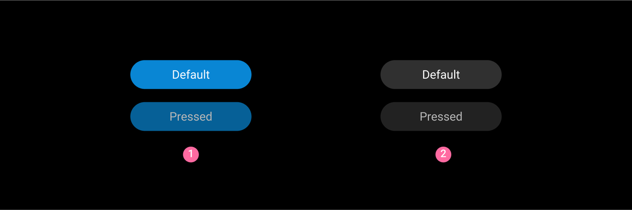
➀ Default state and tapped state of a colored button ② Default state and tapped state of a colorless button
Switches
A switch is a control used to toggle the state of a single option/card.
Rules for use
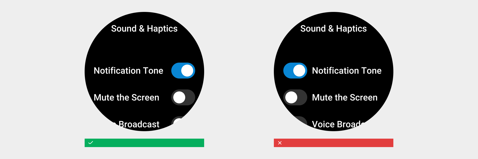
When the user toggles the "switch" button, it directly triggers a state change.

Visual specifications
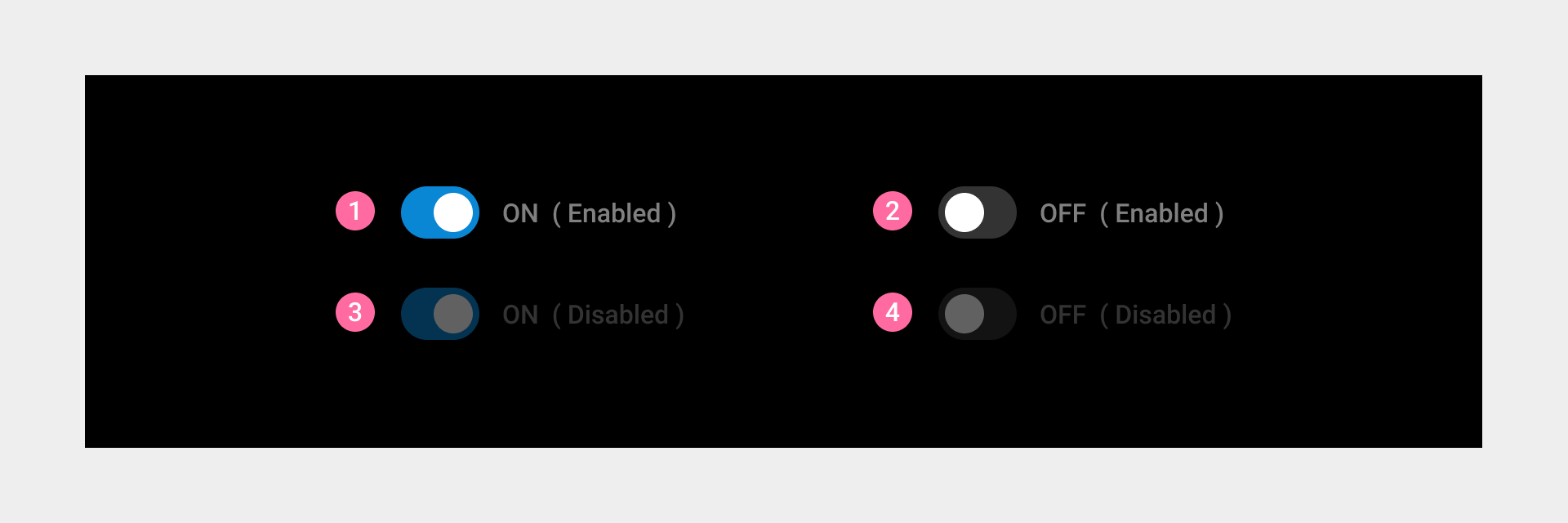
- The switch corresponds to four states:
① On. The switch is turned on, and the user can manually turn it on/off.
② Off. The switch is turned off, and the user can manually turn it off/on.
③ On (disabled) The switch is turned on, and the user cannot manually turn it off.
④ Off (disabled) The switch is turned off, and the user cannot manually turn it on.
- As for the page layout, a switch is always displayed on the right side of a list item or a card
Selection and status indicators
Selection and status indicators allow the user to choose from a set of predetermined options.
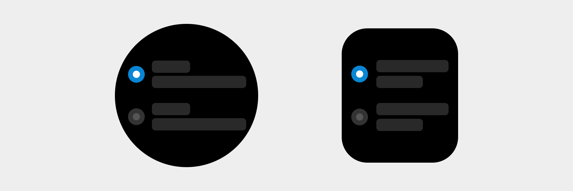
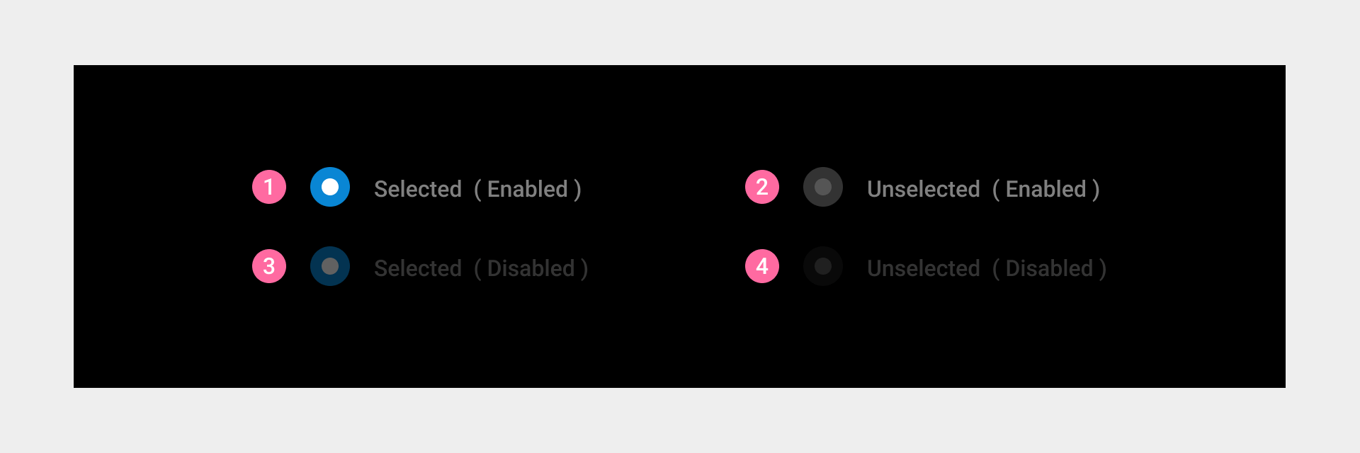
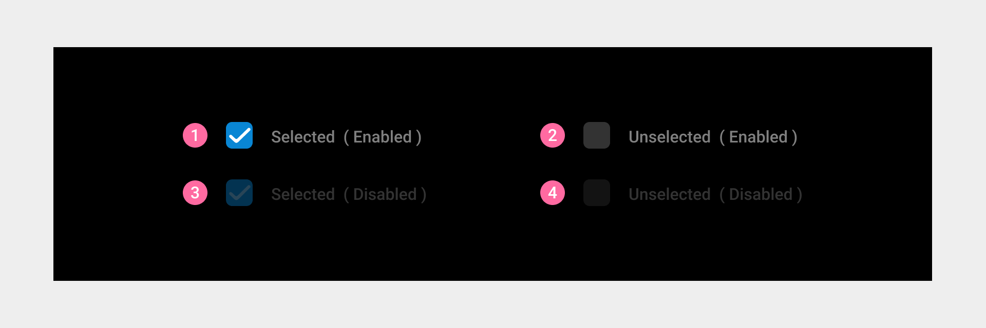
Radio buttons
Radio buttons (required) allow the user to select one out of several options.
Visual specifications
- Radio buttons have four states:
① Selected
② Unselected
③ Selected (disabled) The item is selected, but the user cannot manually switch between the selected and unselected states.
④ Unselected (disabled) The item is not selected, but the user cannot manually switch between the selected and unselected states.
Checkboxes
Checkboxes (optional) allow the user to make multiple selections from provided options.
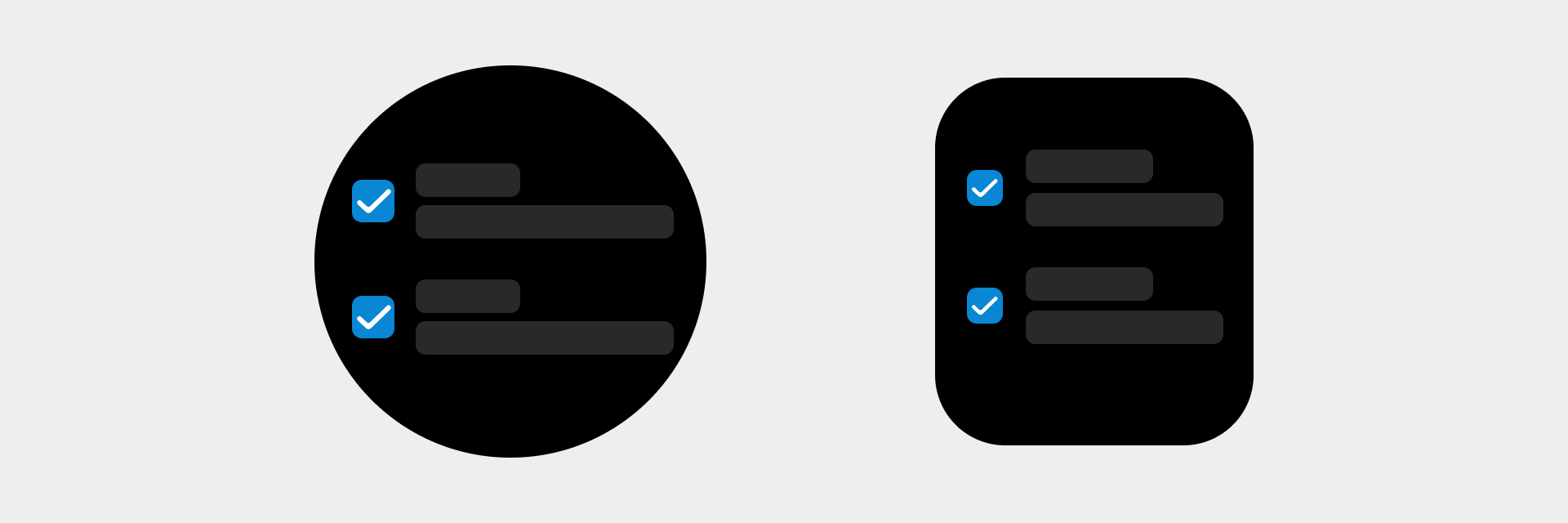
Visual specifications
- Checkboxes have four states:
① Selected
② Unselected
③ Selected (disabled) The item is selected, but the user cannot manually switch between the selected and unselected states.
④ Unselected (disabled) The item is not selected, but the user cannot manually switch between the selected and unselected states.
Status indicators
A status indicator is used to indicate the completion of an operation, such as indicating a completed to-do item.

Visual specifications
Status indicators have two states:
① Completed
② Uncompleted

Sliders
Slider controls (referred to as Sliders) allow the user to select an appropriate value from a continuous range while displaying the progress. At the minimum value, the top edge of the slider will be at the top end of the scroll bar. At the maximum value, the bottom edge of the slider will be at the bottom end of the scroll bar.
Design principles
Valid operations. Given the characteristics of wearable devices, it is necessary to ensure that the entire page can respond to the sliding operation. In certain devices, users can also rotate the crown or operate the buttons to make operations even more efficient.
Clear feedback. When the user operates the device, use progress, icons, and colors to distinguish different states and give clear feedback in a timely manner.
Continuous sliders
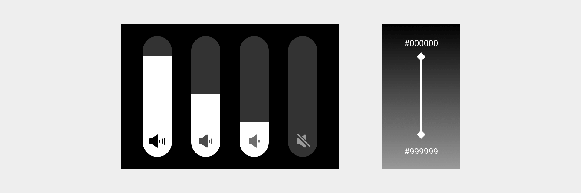
Continuous sliders allow users to select a value along a subjective range when the precise value won't matter. This allows users to make more meaningful adjustments, such as volume sliders.
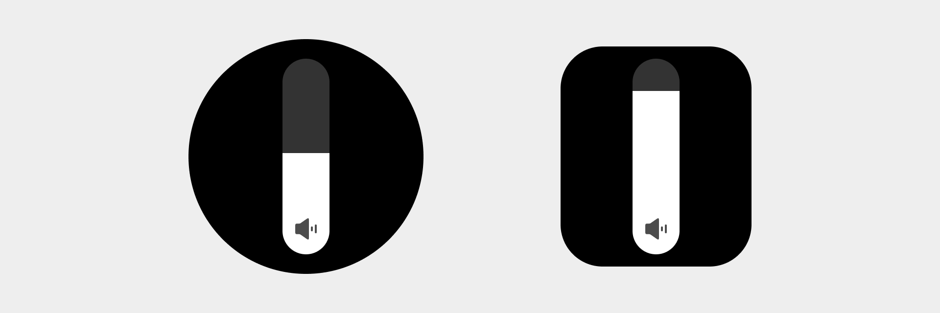
Visual specifications
- The volume icon status and color value should change correspondingly with sliding. The icon status has four levels: strong, medium, weak, and mute. The color value of the icon changes at a constant speed with the sliding, from #000000 to #999999.
- Color value at the bottom of the slider: color_sys_item bg Bar color value: color_sys_normal graphic
Operable sliders
Sliders that support other operations in addition to value adjustment. For example, when the user operates a brightness slider, the slider area can increase or decrease continuously, and the user can tap the button to enable/disable the automatic screen brightness adjustment.
Visual specifications
Background color of the automatic screen brightness adjustment button: color_sys_item bg by default, and color_sys_key in activated state
