Screen off mode
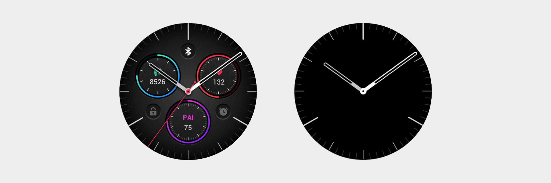
The screen-off mode means that the Watchface displays only important information such as time in a limited manner, which helps users obtain information without raising their wrists. It is an essential mode for a Watchface.
There are two types of screen-off mode display, one which follows the current Watchface and the other that users can configure independently. The screen-off mode display that follows the current Watchface requires special design from the Watchface designer.
Design rules
- Minimize Watchface elements. When an element on the Watchface lights up, its pixels cannot exceed 10% of the pixels of the screen.
- Watch face hands may not include a second hand.
- The background color of the Watchface must be black (#000000), and the main color of the hands must be white (#FFFFFF).
- Keep the hands/digital slices the same size.
- Since switching between screen off and screen on states must occur, try to minimize the movement of elements to avoid jumping during switching.
- To ensure legibility, try to retain the basic timescale (not mandatory).
- Except for time, the priority of other elements is: steps > date > weather > battery level > heart rate > others (not mandatory but should be followed in most cases)
Hand processing methods
Hand silhouette/digit silhouette + black border on the outer edge
- Remove texture parameters such as gradients, highlights, and shadows, but retain the silhouette graphics of hands/digits.
- The hand should have an additional black border of 1-2px on the outer edge. The purpose is to distinguish the hand at the upper layer from the hand at the lower layer, and to distinguish the relationship between the upper and lower layers of the hands and the data.
- The colors of the hands can be increased based on the characteristics of the Watchface, but add as few colors as possible.
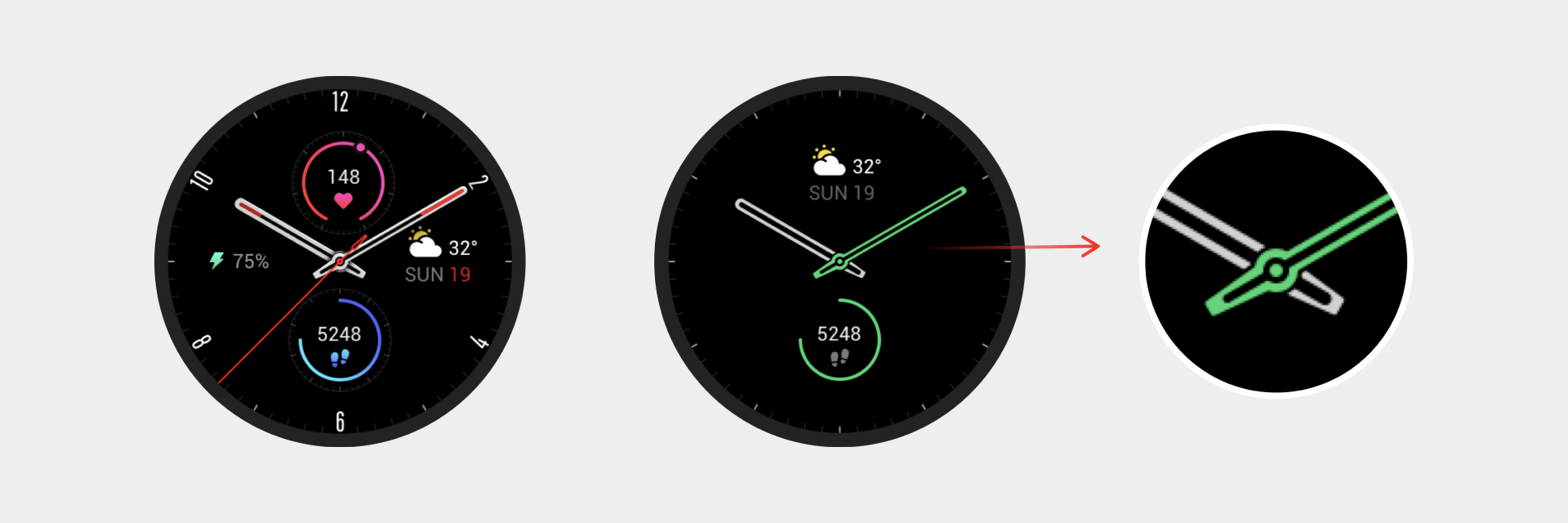
White film + black border on the outer edge
- The hands should retain part of the structural light and shadow to achieve the overall "white film" effect.
- The hand should have an additional black border of 1-2px on the outer edge. The purpose is to distinguish the hand at the upper layer from the hand at the lower layer, and to distinguish the relationship between the upper and lower layers of the hands and the data.
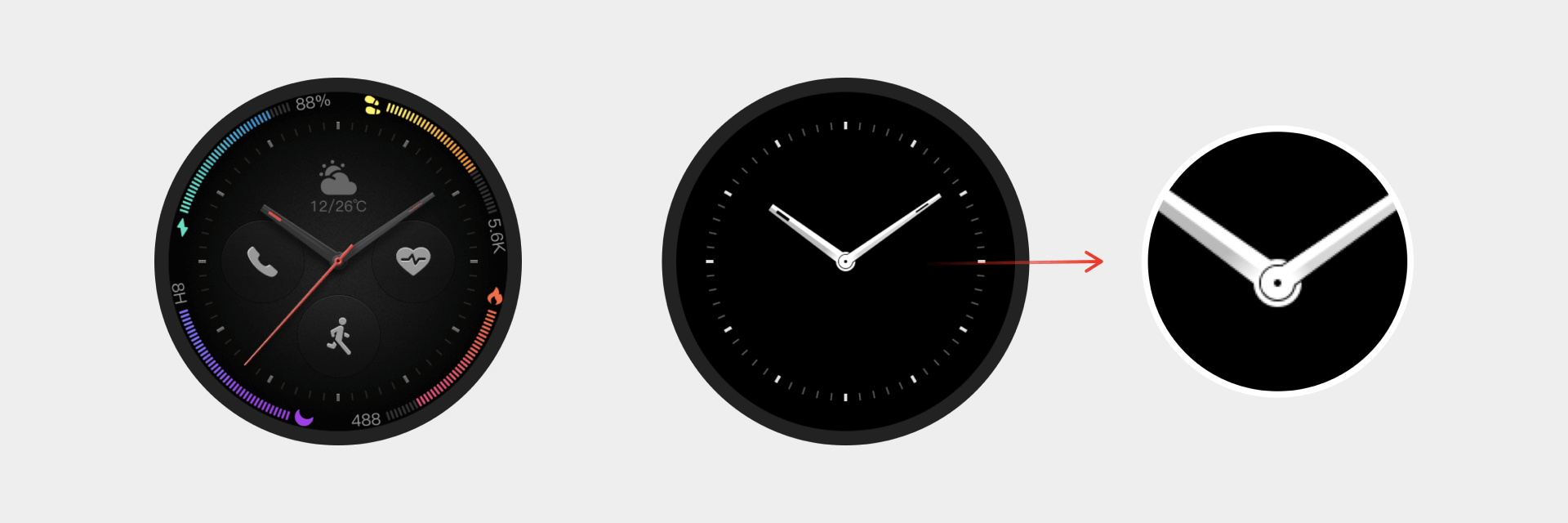
Digital time processing methods
- Digital time displays typically occupy a large graphical area, so the outer border is used. The border width should not be less than 2px.
- The border color must be white or another color with high brightness. When the illuminated area is less than 10%, the border area can be omitted.