IMG
The image widget is used to display images and supports image rotation.
tip
- Recommend using 24-bit or 32-bit png format images with RGB or RGBA color scheme.
- The parameters of the image widget are recommended to be understood in conjunction with the image example below.
Create UI widget
const img = hmUI.createWidget(hmUI.widget.IMG, Param)
Type
Param: object
| Properties | Description | Required | Type |
|---|---|---|---|
| src | The path of the image. Reference folder-structure structure | YES | string |
| w | The width of the component.If not passed then set the width of the image itself | NO | number |
| h | The height of the component.If not passed then set the height of the image itself | NO | number |
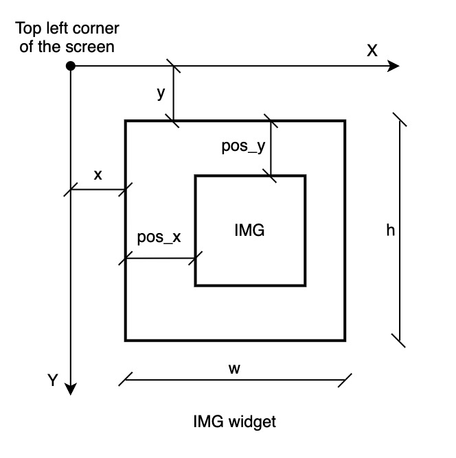
| x | The x-axis coordinate of the component. | YES | number |
| y | The y-axis coordinate of the component. | YES | number |
| pos_x | Horizontal offset of the image relative to the widget coordinates. | NO | number |
| pos_y | Vertical offset of the image relative to the widget coordinates. | NO | number |
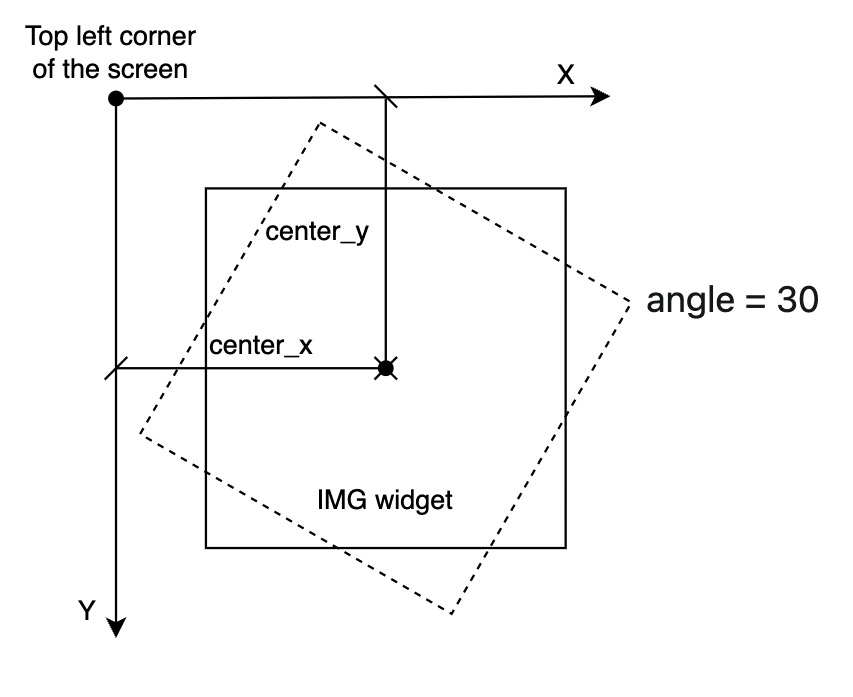
| angle | The rotation angle of the picture (the 12-point direction is 0 degrees). | NO | number |
| center_x | The rotation center of the picture. | NO | number |
| center_y | The rotation center of the picture. | NO | number |
Image example
caution
The w and h are the width and height of the image widget, while the IMG area is the display boundary of the image resource, whose width and height cannot be set individually for the time being, the value depends on the size of the image resource file itself, i.e. it cannot be scaled.
Code example
Page({
  build() {
    const img = hmUI.createWidget(hmUI.widget.IMG, {
      x: 125,
      y: 125,
      src: 'zeppos.png'
    })
    img.addEventListener(hmUI.event.CLICK_DOWN, (info) => {
      img.setProperty(hmUI.prop.MORE, {
        y: 200
      })
    })
  }
})
Page({
  build() {
    const img_hour = hmUI.createWidget(hmUI.widget.IMG)
    img_hour.setProperty(hmUI.prop.MORE, {
      x: 0,
      y: 0,
      w: 454,
      h: 454,
      pos_x: 454 / 2 - 27,
      pos_y: 50 + 50,
      center_x: 454 / 2,
      center_y: 454 / 2,
      src: 'hour.png',
      angle: 30
    })
  }
})