TEXT
Text component for displaying text. Support setting text size, color and alignment.
Create UI widget
const text = hmUI.createWidget(hmUI.widget.TEXT, Param)
Type
Param: object
| Properties | Description | Required | Type |
|---|---|---|---|
| x | The x-axis coordinate of the component. | YES | number |
| y | The y-axis coordinate of the component. | YES | number |
| w | The width of the component. | YES | number |
| h | The height of the component. | YES | number |
| color | The color of the text. | NO | number |
| align_h | The alignment of the horizontal axis (see ALIGN for values). | NO | ALIGN |
| align_v | Alignment of the vertical axis (see ALIGN for values). | NO | ALIGN |
| text | Text | NO | string |
| text_size | The size of the font. | NO | number |
| text_style | Text overlength handling, default is hmUI.text_style.NONE (see TEXT_STYLE for value). | NO | TEXT_STYLE |
| line_space | Row spacing. | NO | number |
| char_space | Character Spacing. | NO | number |
ALIGN alignment
| Value | Description |
|---|---|
| hmUI.align.LEFT | Horizontal axis-left aligned. |
| hmUI.align.RIGHT | Horizontal axis-align right. |
| hmUI.align.CENTER_H | Horizontal axis-centered. |
| hmUI.align.TOP | Vertical axis-top. |
| hmUI.align.BOTTOM | Vertical axis-bottommost. |
| hmUI.align.CENTER_V | Vertical axis-centered. |
TEXT_STYLE Text layout
| Value | Description |
|---|---|
| hmUI.text_style.ELLIPSIS | Single line overflow character display... |
| hmUI.text_style.NONE | Keep scrolling. |
Code example
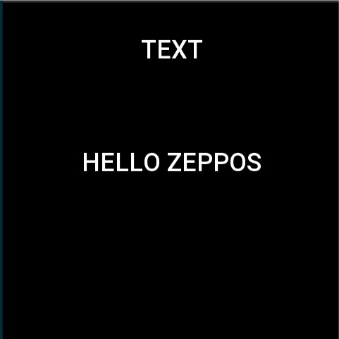
Page({
  build() {
    const text = hmUI.createWidget(hmUI.widget.TEXT, {
      x: 96,
      y: 120,
      w: 288,
      h: 46,
      color: 0xffffff,
      text_size: 36,
      align_h: hmUI.align.CENTER_H,
      align_v: hmUI.align.CENTER_V,
      text_style: hmUI.text_style.NONE,
      text: 'HELLO ZEPPOS'
    })

    text.addEventListener(hmUI.event.CLICK_DOWN, (info) => {
      text.setProperty(hmUI.prop.MORE, {
        y: 200
      })
    })
  }
})