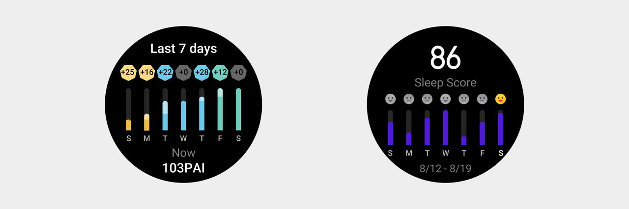
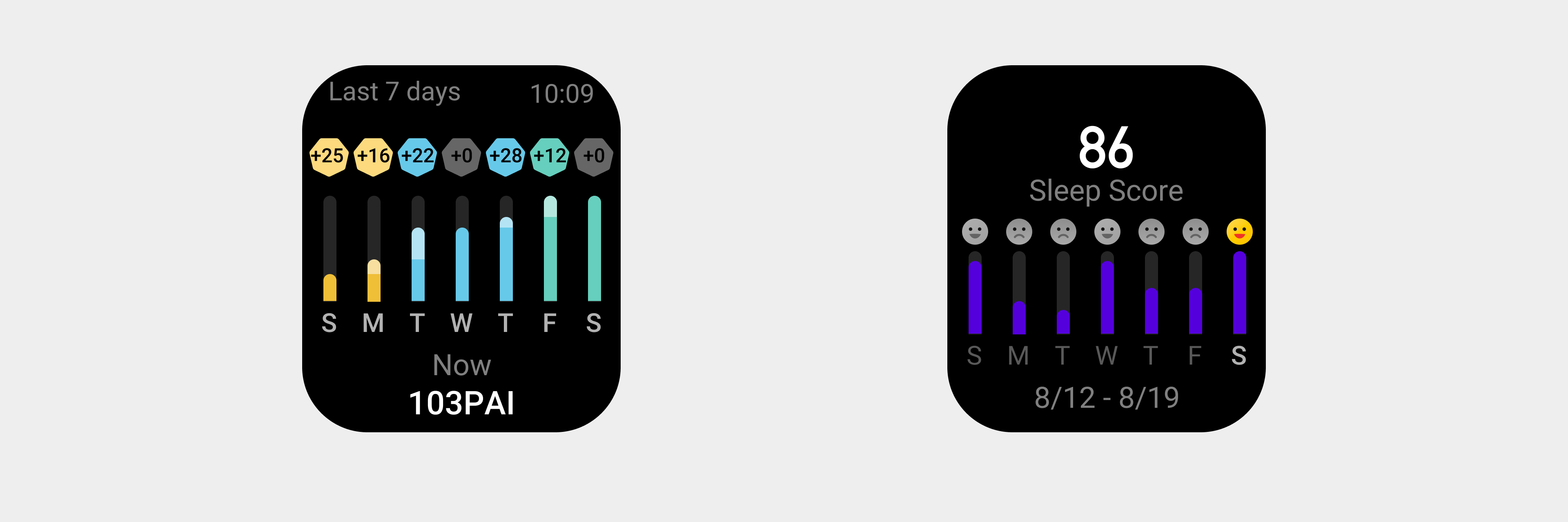
Charts
Charts are composed of graphics, images, digits, and other elements that explain and present the relationships between and properties of target data.
Composition
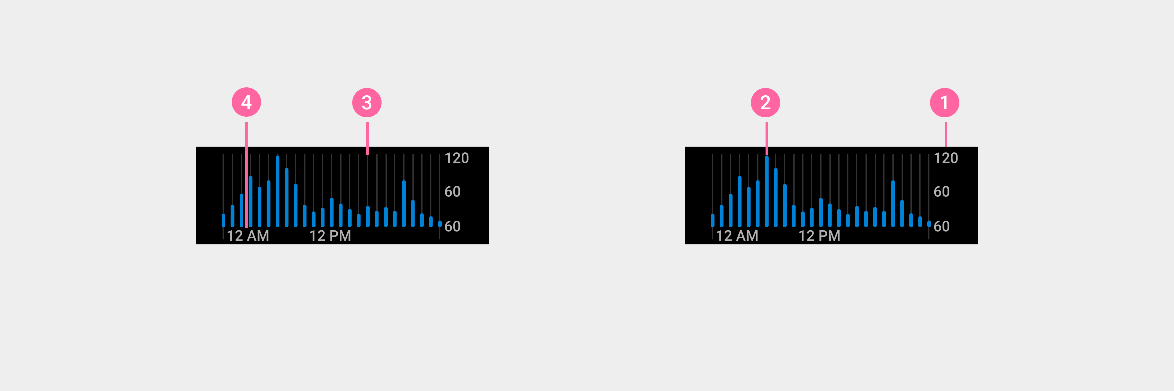
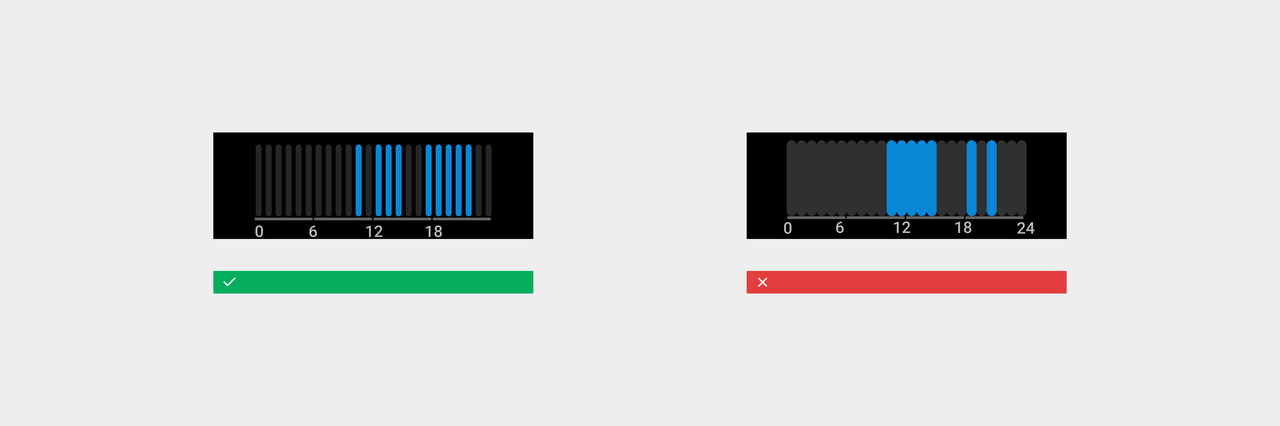
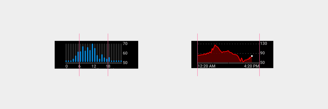
Charts are composed of: ① scale axis, ② data display, ③vertical grid line, ④ timeline. Elements can be displayed based on the actual situation.
Histograms
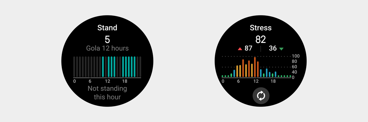
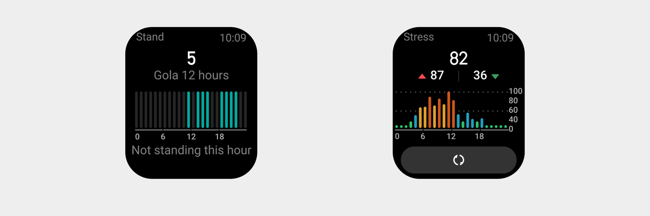
Histograms are used to compare two or more values (at different time points or under different conditions). They contain only one variable and are typically used to analyze smaller datasets.
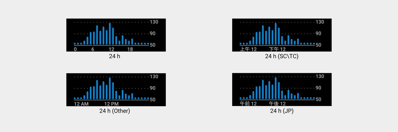
Choose the most suitable timeline according to different time granularities.
- 24-column histograms
- 7-column histograms
The width and height of columns can be adjusted as needed, but there should be clear separation between the columns.
Rules for use
Basic specifications for the use of charts
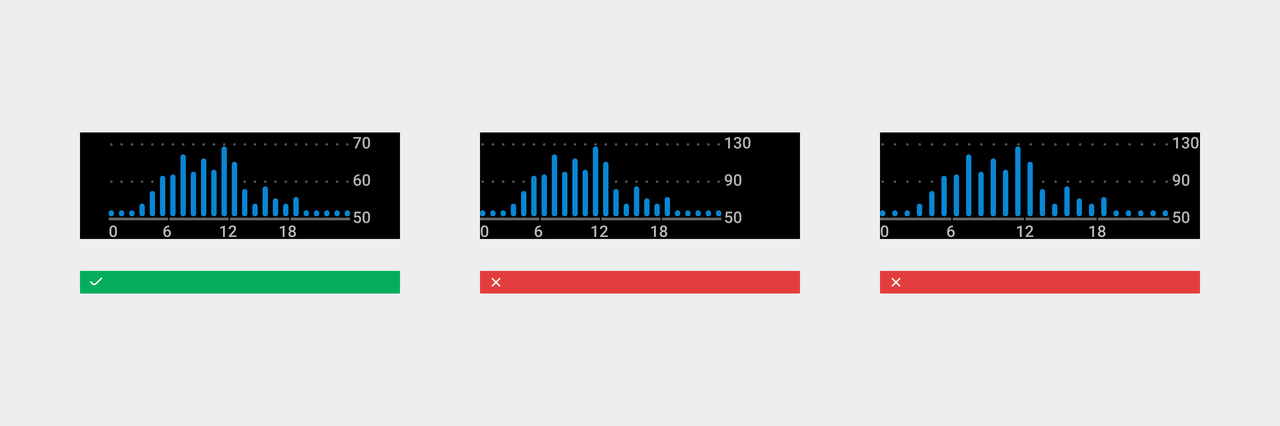
- With grid lines provided, start the first data item of the timeline from the beginning of the grid line, and align the last data item of the timeline with the end of the grid line.
- The timeline should display the corresponding time format under different time format settings (SC: Simplified Chinese, TC: Traditional Chinese, JP: Japanese).
- The width and height of a chart should be changed based on the usage scenario to keep the visual focal point in the center while maintaining a certain amount of white space.
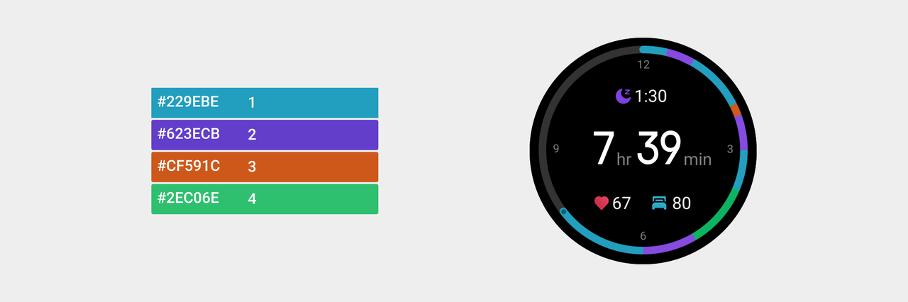
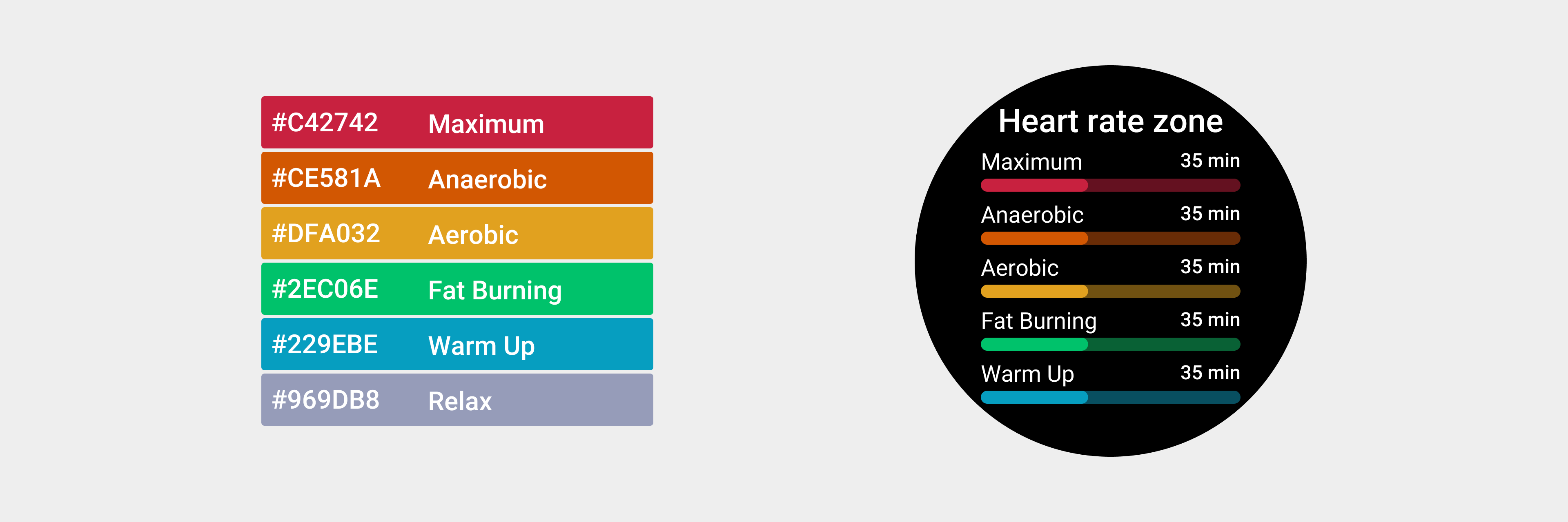
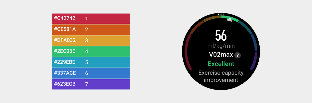
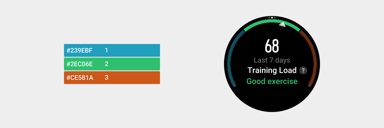
Colors with assigned meanings
In data display, typically, some colors can be used to indicate fixed meanings. The color value does not need to be kept uniform. While hue consistency is maintained, fine-tuning can be done to improve poor display of screen colors on different devices.
- Heart rate zone
- VO₂ Max
- Training load
- Sleep