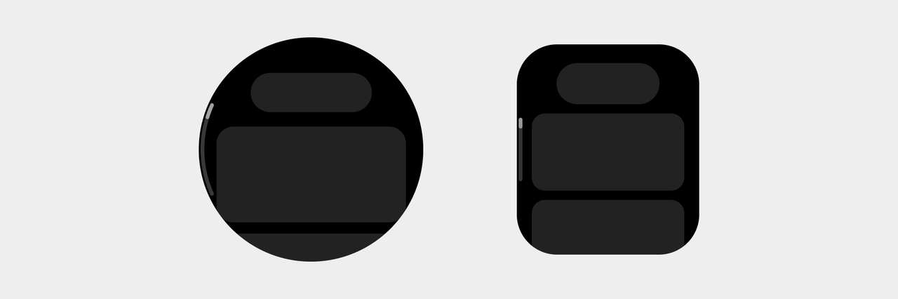
Interface layouts
Separation of graphics and text
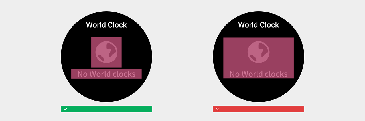
Do not embed text directly into images. When creating text in an image, we recommend layering the image and text.
Compatible with multilingual text
The length of translated texts in different languages is quite different. Therefore, in copywriting and translation, please try to use concise and accurate descriptions to reduce the number of characters. At the same time, when designing interfaces and controls, it is necessary to be compatible with text content of different lengths, reserve enough space for text display, and set the processing methods for text content overflow in different scenarios.
Reserve enough display space
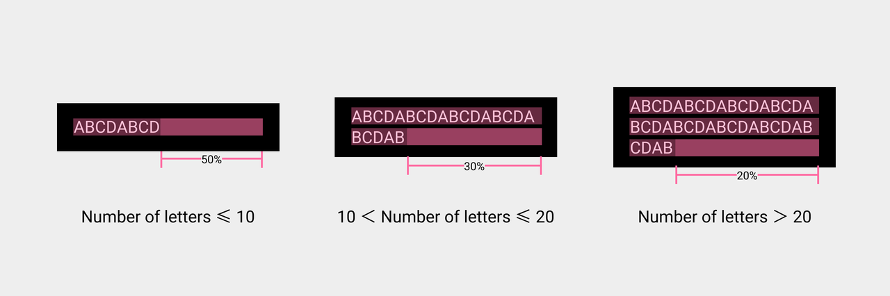
Reserve enough space for the display of localized control text based on the text length. Use a letter string as an example. If the number of letters is less than 10, reserve 50% of the space. If the number of letters is greater than 10 and less than 20, reserve 30% of the space. If the number of letters is greater than 20, reserve 20% of the space.
When the text content exceeds the width of the container, the following processing methods are used:
- Use the ellipsis... to indicate the excess content
- Scroll display
- Restricted line breaks
- Unlimited line breaks
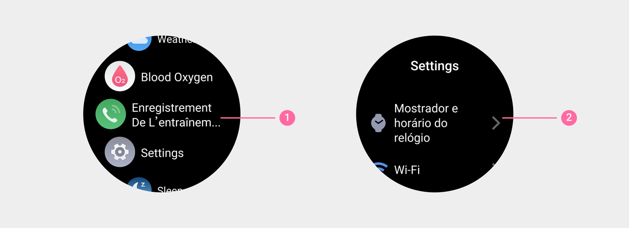
Exceeding content is indicated by an ellipsis:
When the text content exceeds the width of the container and the scene is not suitable for wrapping or scrolling, you can use the ellipsis...to indicate that the content is not fully displayed.
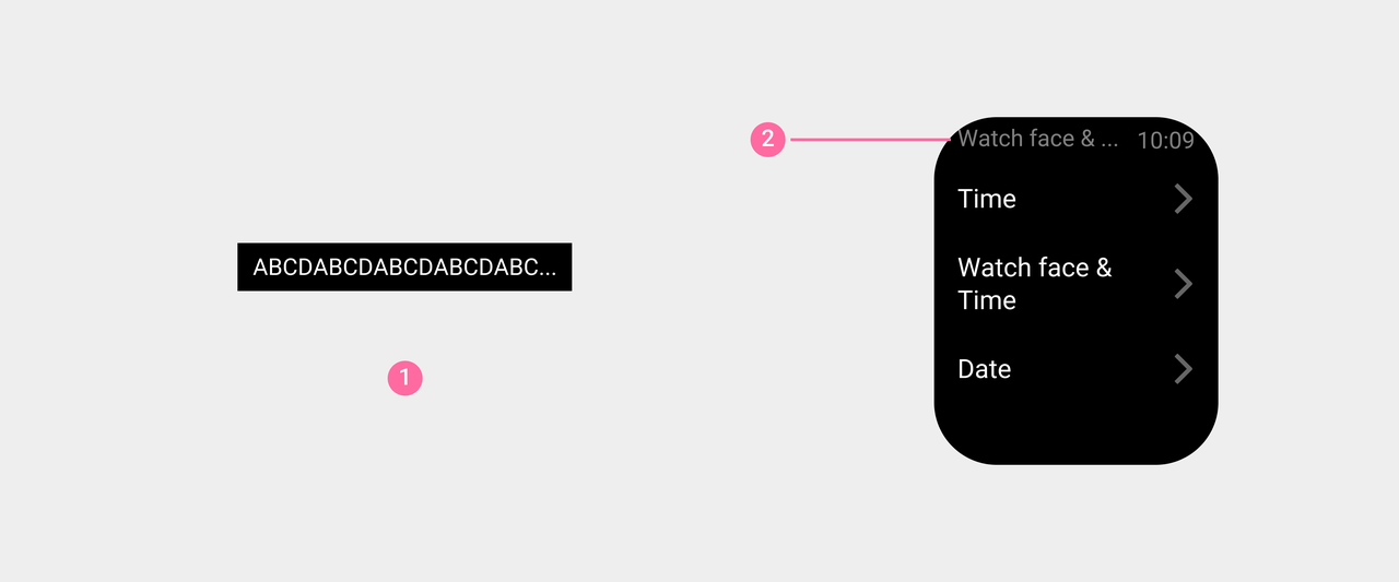
① Use ellipses...to denote incomplete content.
② Example: The title of the system status bar is Watch face & Time, and the display is Watch face & ...
Scroll display:
When the text content exceeds the width of the container, and the height of the container does not support line wrapping, but the text content must be fully displayed, the "scroll" effect can be used.
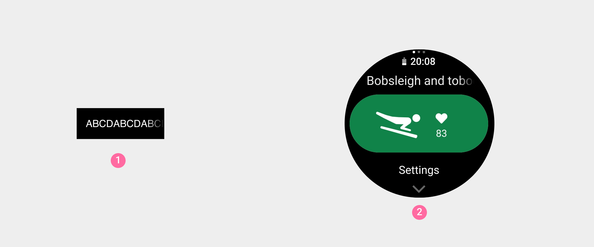
① Text scrolling display effect
② Example: On the interface before the exercise starts, the name of the exercise is scrolled.
For detailed scrolling effect parameters, please refer to: Visual--Animations--text scrolling display.
With limited newlines:
Text containers in different scenarios have different restrictions on the maximum number of lines that can be accommodated.
① Example: On the app view page, the application name is displayed in up to 2 lines.
② Example: On the setting page, the name of the setting item is displayed in up to 3 lines.
Unlimited line breaks:
When the container has no special limit on the length of the text, all text content should be completely displayed by wrapping. It should be noted that although there is no limit to the number of lines of text content in this scenario, please try to use concise and accurate copywriting to reduce the number of characters to ensure the readability of the content.
① Example: the tips text of the error tips page
② Example: Detailed content text of the notification page
Line break rules for ultra-long words:
In general, the line break of the text content should be performed between words, and avoid splitting a single word for line break.
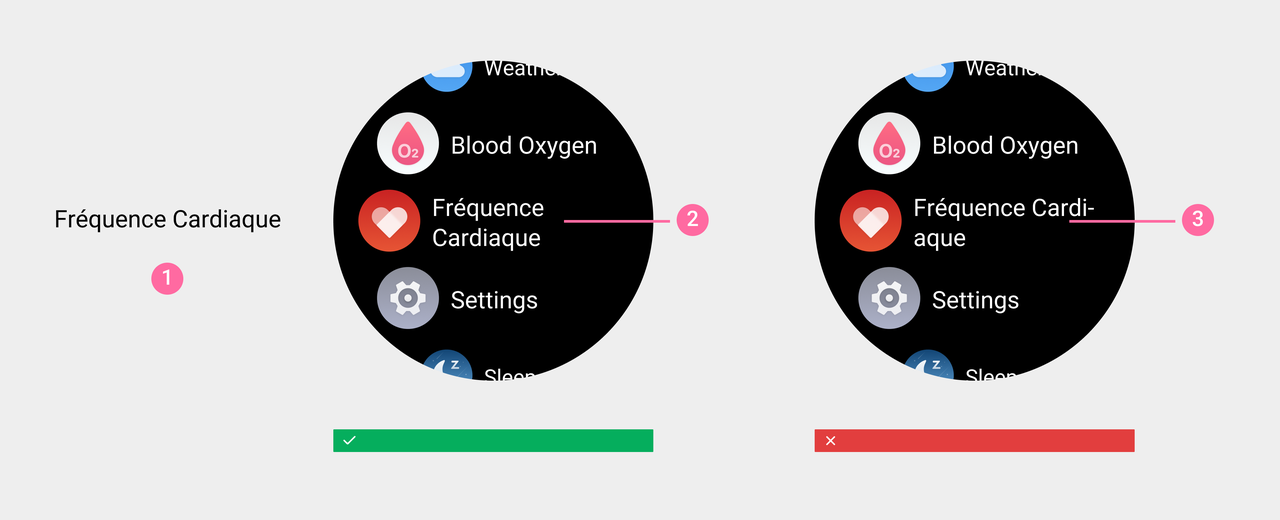
① Example: App's Name Fréquence Cardiaque
② Line break between words
③ Avoid splitting a single word
When the length of a single word exceeds the width of the container, words can be forced to wrap and add a hyphen to the wrap-.
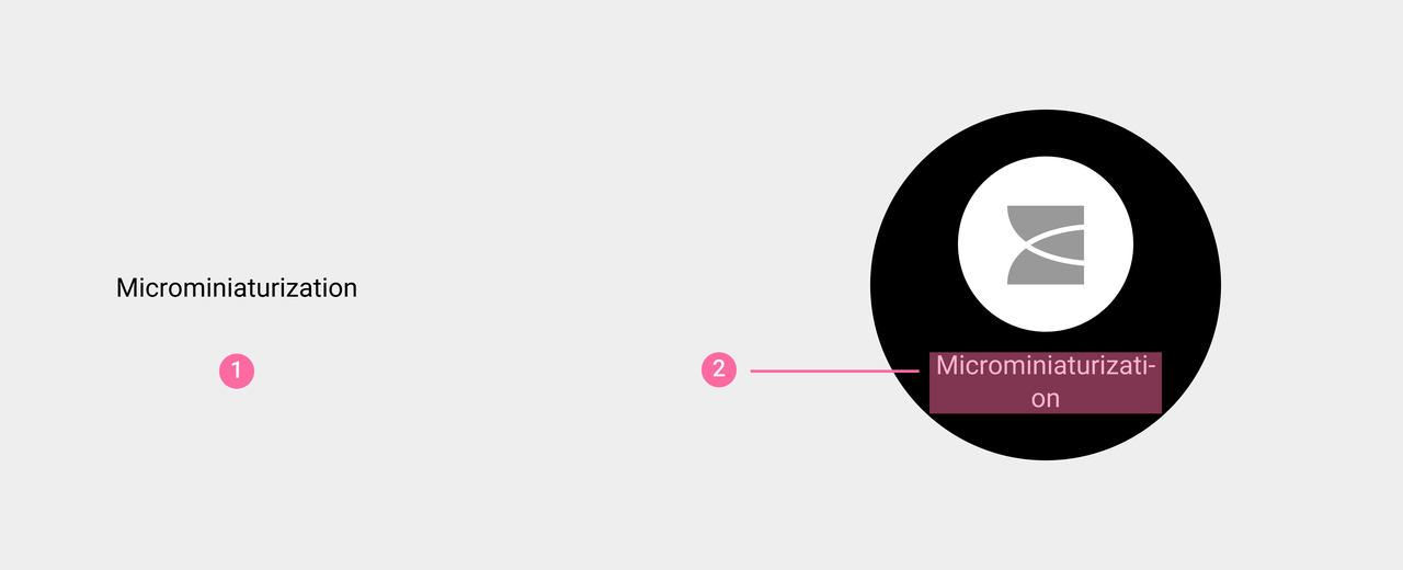
① Example: the word Microminiaturization
② A single word exceeds the width of the container, the word is forced to wrap, and a hyphen is added at the line break position -
Correct handling of RTL languages
RTL (Right to Left) languages refer to languages written from right to left. Common features of this language are: sentences are read from right to left; sequence of events progresses from right to left; an arrow pointing right to left (←) indicates forward motion, and an arrow pointing left to right (→) indicates backward motion.
① When the direction in which UI elements is displayed is changed, untranslated text (even if it is part of a phrase) and digits are not mirrored, and they should be maintained in the correct direction that fits the target language.
② Mirror the operations that indicate specific directions.
③ Maintain consistency in icons that do not indicate directions and only change their positions.
④ Mirror the icons that indicate specific directions.
⑤ After a word is translated, it is written from right to left.
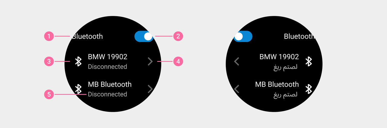
RTL Design Use Cases
Slider - Volume bar
Draw volume icon based on reading direction differences.
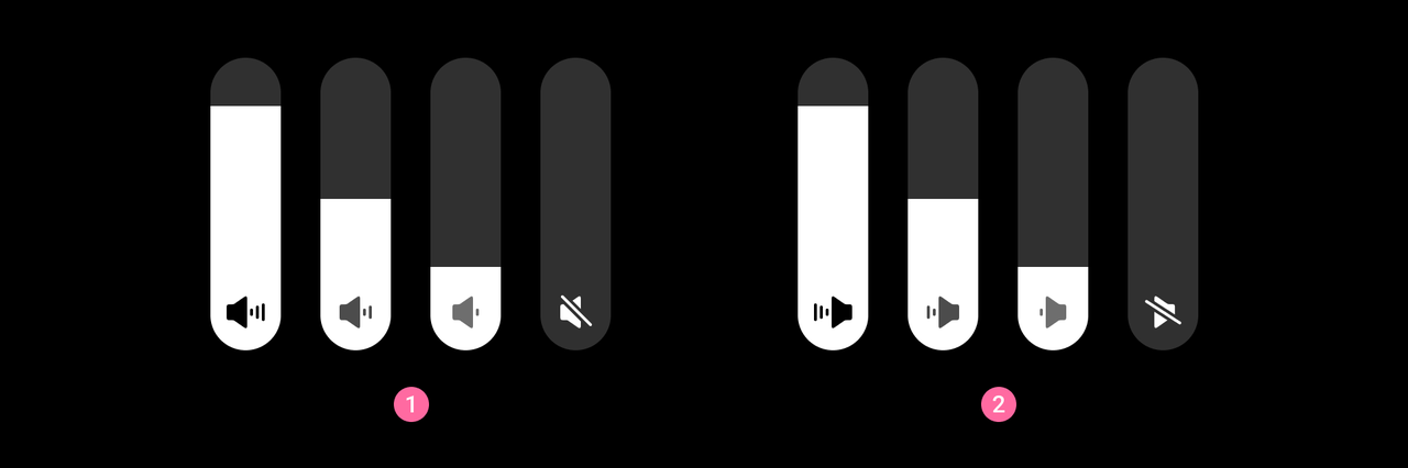
① General language icon style ② RTL language environment icon style
Switch
Direction of turning on and off the mirror switch.
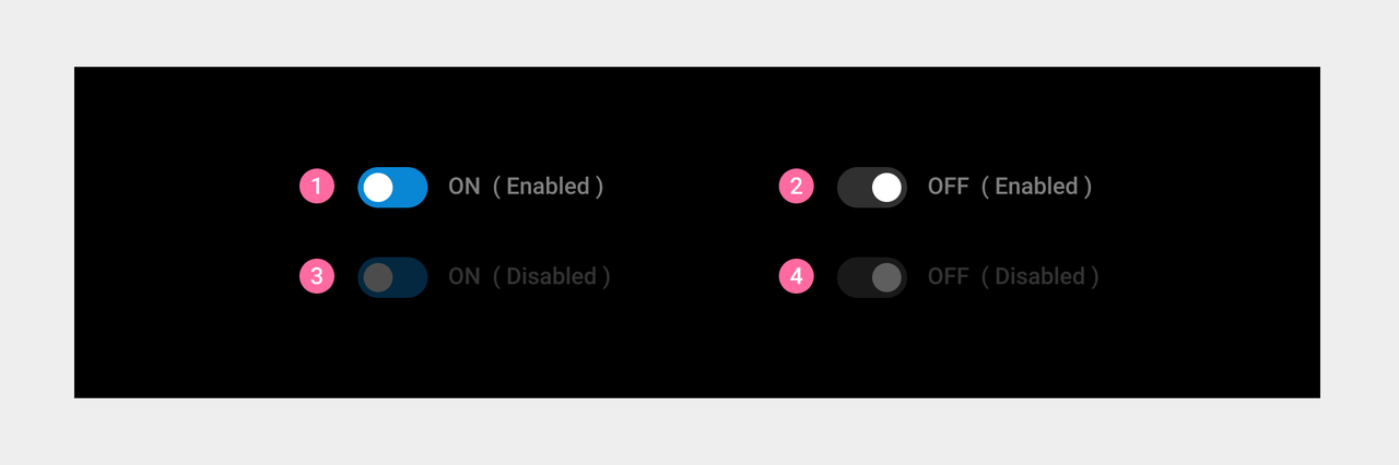
① On: switch on ② Off: switch off ③ On (disabled) ④ Off (disabled)
Button - Floating Button
Display icons side by side in mirror image.Mirror display side by side icon position
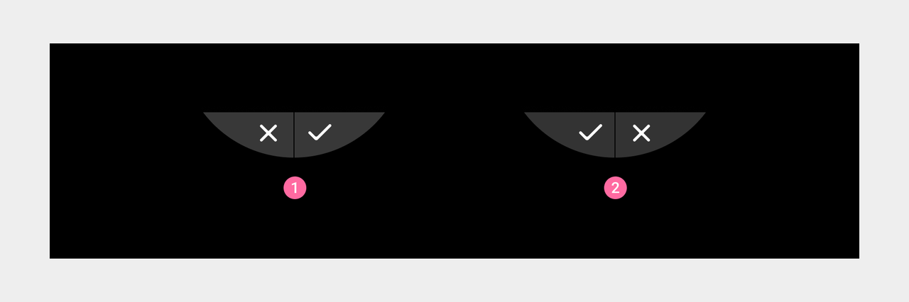
① General language icon display ② RTL language environment icon display
Scrollbar
The scrollbar is displayed on the left side of the page.
Reply Selection
The position of mirrored input direction, character cursor, and delete button in the emoji reply interface.
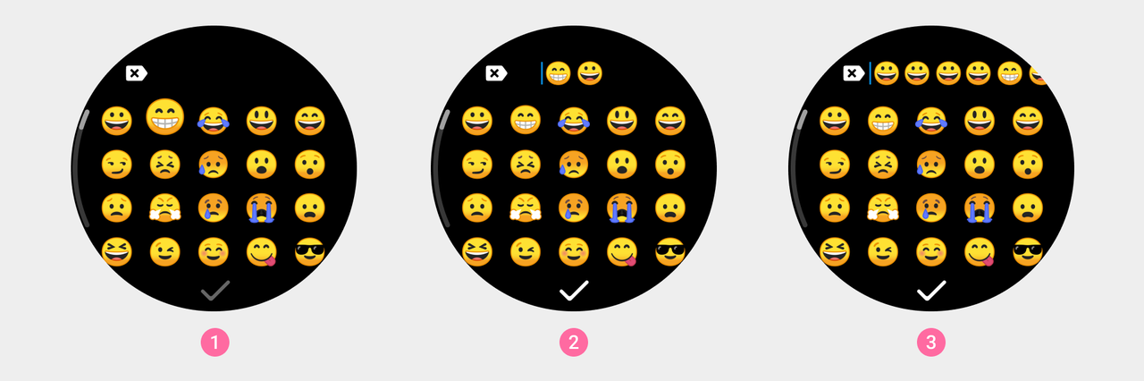
① Click on the expression ② Enter the process ③ Go beyond the screen
System status bar (for rectangular screen devices)
Mirror display time and page title text position.
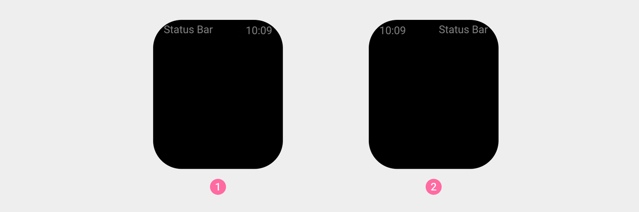
① General language display ② RTL language environment display