DIALOG
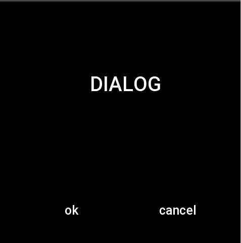
Dialog popup consists of a piece of text and two buttons. The popup box disappears when the buttons are clicked.
caution
At this stage DIALOG needs to be set twice, the first time to set the text of ok and cancel buttons, and the second time to set the properties of text and DIALOG widget alignment, please refer to the usage examples for details.
Create UI widget
const dialog = hmUI.createWidget(hmUI.widget.DIALOG, Param)
Type
Param: object
| Properties | Description | Required | Type |
|---|---|---|---|
| text | Contents of dialog. | YES | string |
| content_text_size | The text size of the dialog content. | NO | number |
| content_text_color | The text color of the dialog content. | NO | number |
| content_bg_color | The background color of the dialog content. | NO | number |
| content_text_align_h | Alignment of dialog content text.(horizontal axis) | NO | string |
| content_text_align_v | Alignment of dialog content text.(vertical axis) | NO | string |
| ok_text | Text on the confirmed button. | NO | string |
| ok_text_color | The color of the text on the confirmed button. | NO | number |
| ok_press_color | The color when the confirmed button is pressed. | NO | number |
| ok_nomal_color | The color when the confirmed button is normal. | NO | number |
| ok_press_src | Background image when the confirmed button is pressed. | NO | string |
| ok_nomal_src | Background image when the confirmed button is normal. | NO | string |
| cancel_text | Text on the canceled button. | NO | string |
| cancel_text_color | The color of the text on the canceled button. | NO | number |
| cancel_press_color | The color when the canceled button is pressed. | NO | number |
| cancel_nomal_color | The color when the canceled button is normal. | NO | number |
| cancel_press_src | Background image when the canceled button is pressed. | NO | string |
| cancel_nomal_src | Background image when the canceled button is normal. | NO | string |
| dialog_align_h | The horizontal axis of the dialog. | NO | number |
| dialog_align_v | The vertical axis of the dialog. | NO | number |
| ok_func | Click the callback of the confirmed button. | NO | (dialog: Dialog) => void |
| cancel_func | Click the callback of the canceled button. | NO | (dialog: Dialog) => void |
Dialog: object
| Property | Description | Type |
|---|---|---|
| text | The content of dialog. | string |
| ... omitted | Refer to dialog related properties in the setting field |
prop Properties
| Properties | Support get/set | Type | Notes |
|---|---|---|---|
| hmUI.prop.SHOW | set | boolean | dialog whether to display. |
Code example
Page({
  build() {
    const dialog = hmUI.createWidget(hmUI.widget.DIALOG, {
      ok_text: 'OK',
      cancel_text: 'CANCEL'
    })
    dialog.setProperty(hmUI.prop.MORE, {
      text: 'DIALOG',
      content_text_size: 40,
      content_bg_color: 0x000000,
      content_text_color: 0xffffff,
      dialog_align_h: hmUI.align.CENTER_H,
      content_text_align_h: hmUI.align.CENTER_H,
      content_text_align_v: hmUI.align.CENTER_V,
      ok_func: () => {
        console.log('OK')
      },
      cancel_func: () => {
        console.log('CANCEL')
      }
    })
    dialog.setProperty(hmUI.prop.SHOW, true)
  }
})