Widget
The widget is an entry for users to quickly view some core functions of various applications. Therefore, an application can define multiple widget, but one widget only corresponds to one specific application.
Design Principles
Focus: The design of widget should focus on one task rather than providing a complete application experience. This reduces the burden on the user and maintains a friendly user experience.
Control: The device always stays in contact with the user and should update content based on the scenario, status, and context, such as time, location, activity, and network connectivity.
Usage Rules
-
Press the physical button to return to the Watchface.
-
Users are not allowed to scroll up and down within the page.
-
Unable to pull down Notification Center or Control Center by swiping up or down.
-
Page length should not exceed the height of device screen
-
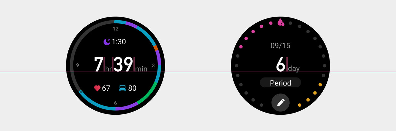
Interactive features on the widget by tapping can be divided into two categories.
Type 1: Clicking on the blank area will take you to the application homepage, such as Activity Goals, PAI.
Type 2: Clicking does not require entering the application homepage to complete: such as Stopwatch, Countdown, Alipay.
Please specify in the description of each widget whether it supports click-to-enter.
Visual Guidelines
-
Font Size
Large numbers that need to be emphasized can be displayed in a special style font, while the body text and auxiliary text should be displayed in a universal font with a corresponding font size.
Body text, prompt text, units, and minimum font size should not be smaller than the subtitle font size.
Use a uniform font size for the explanatory text of chart.
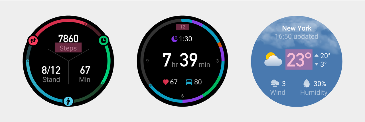
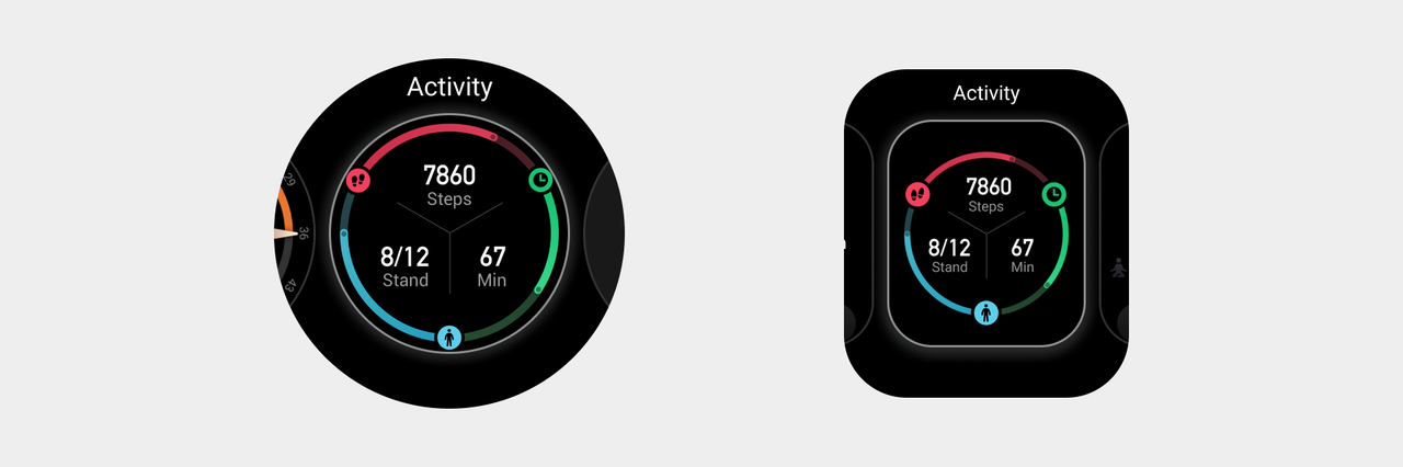
The numbers that need to be highlighted on different widget should have the same font size and baseline on the same horizontal line if the layout is similar. The spacing between the unit and the number should remain consistent and aligned with the baseline of the main numbers.
- Charts and Progress.
The progress bar used on the widget should maintain consistency in thickness and margins.
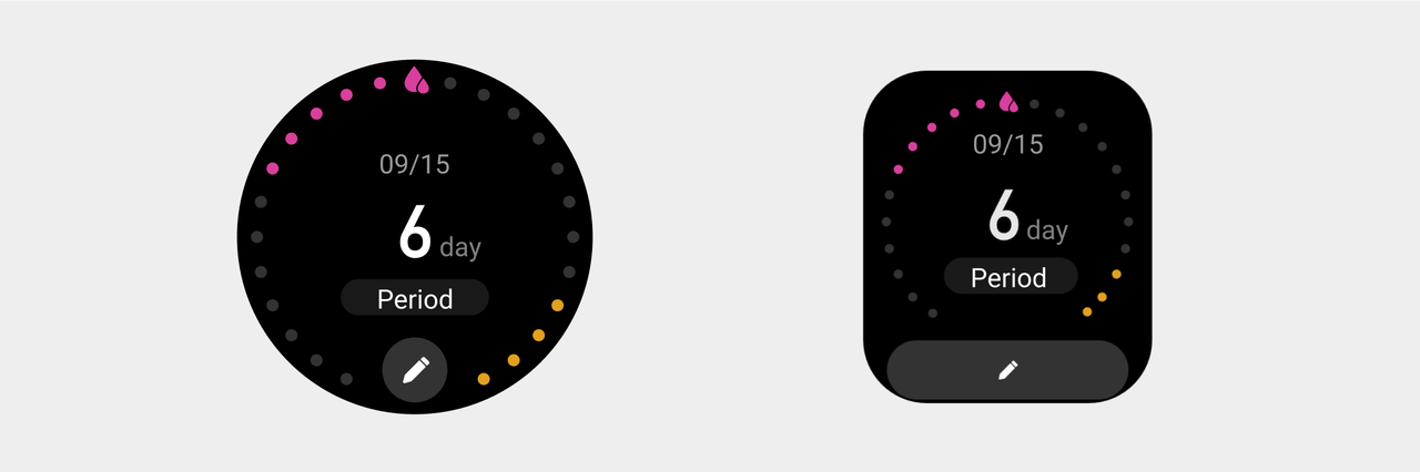
When encountering insufficient space due to button shape changes between circular and square screens, appropriate adjustments can be made.
Special state of the Widget page
Inform the current page status or the solution to change the current status only through icons and text, but the user's interaction on the current page is not supported.
-
Blank page with no content.
Display a combination of icon and text, centered on the screen as a whole, with a colored icon.
-
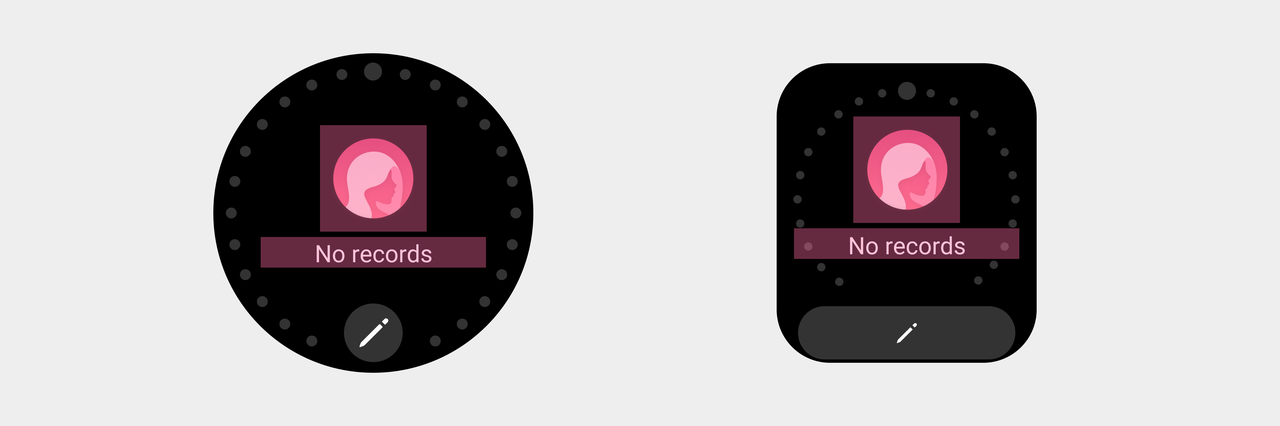
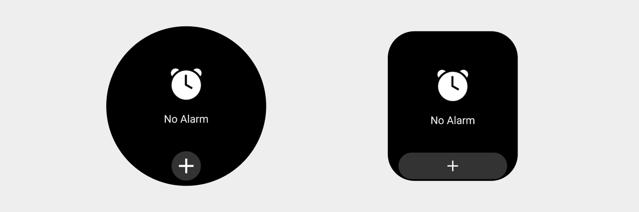
Blank page with operation function
Add a button at the bottom, align it vertically to the center and keep the top and bottom spacing consistent.
- Page requiring authorization.

-
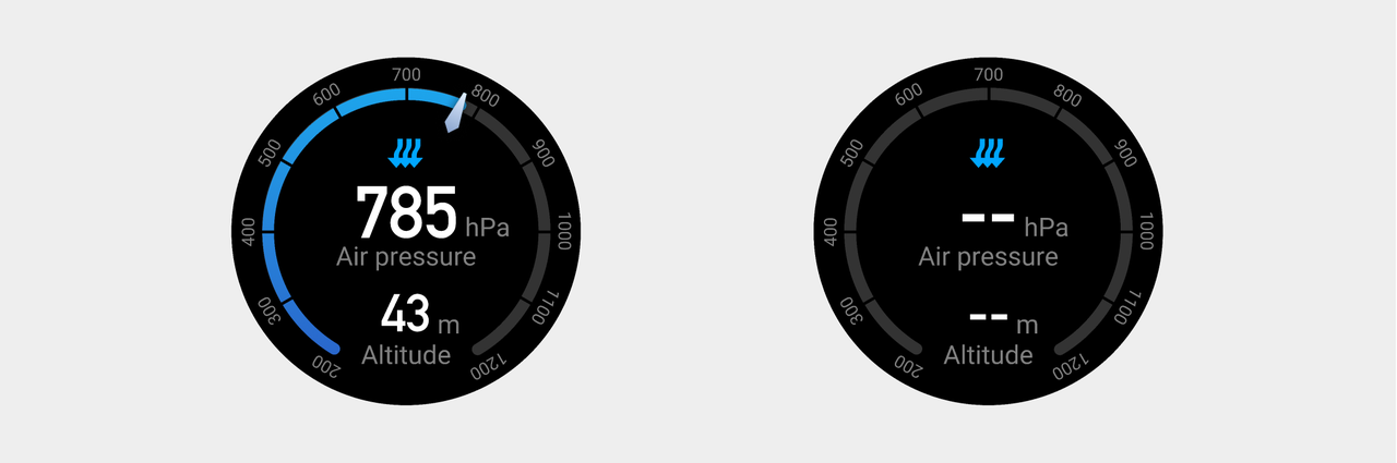
No data / Data loading.
The state of empty data is represented by "--" as a placeholder.
Preview Picture
Press and hold the Widget to enter edit mode. A static preview image must be provided. The size of the preview image is consistent with the screen resolution. If it is a square screen device, rounded corners need to be added. Please refer to Device Basic Information for screen resolution and rounded corner information.(Currently, only Zepp OS 3.0 and above support the press-and-hold-to-edit feature on the Widget.)
Figma Design Template File Link: Widget templates