Register SecondaryWidget and Shortcut Cards
Introduction of Widget and Shortcut cards
The following diagram, taken from the Zepp OS system design specification, shows some of the main Zepp OS interfaces, and the logic for switching between them.
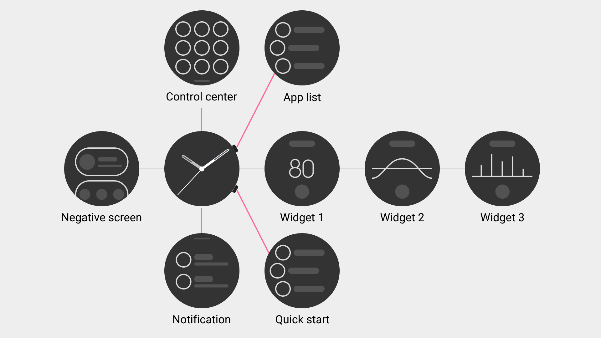
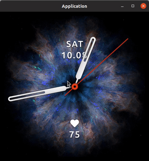
Widget
Swipe left from the Watchface page, go to Widget 1 page, the whole Widget 1 page is a "Widget", swipe left from Widget 1 page, go to Widget 2 page, Widget 2 page is also a "Widget", and so on.
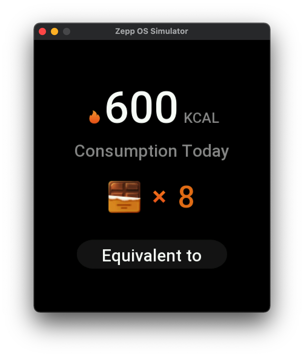
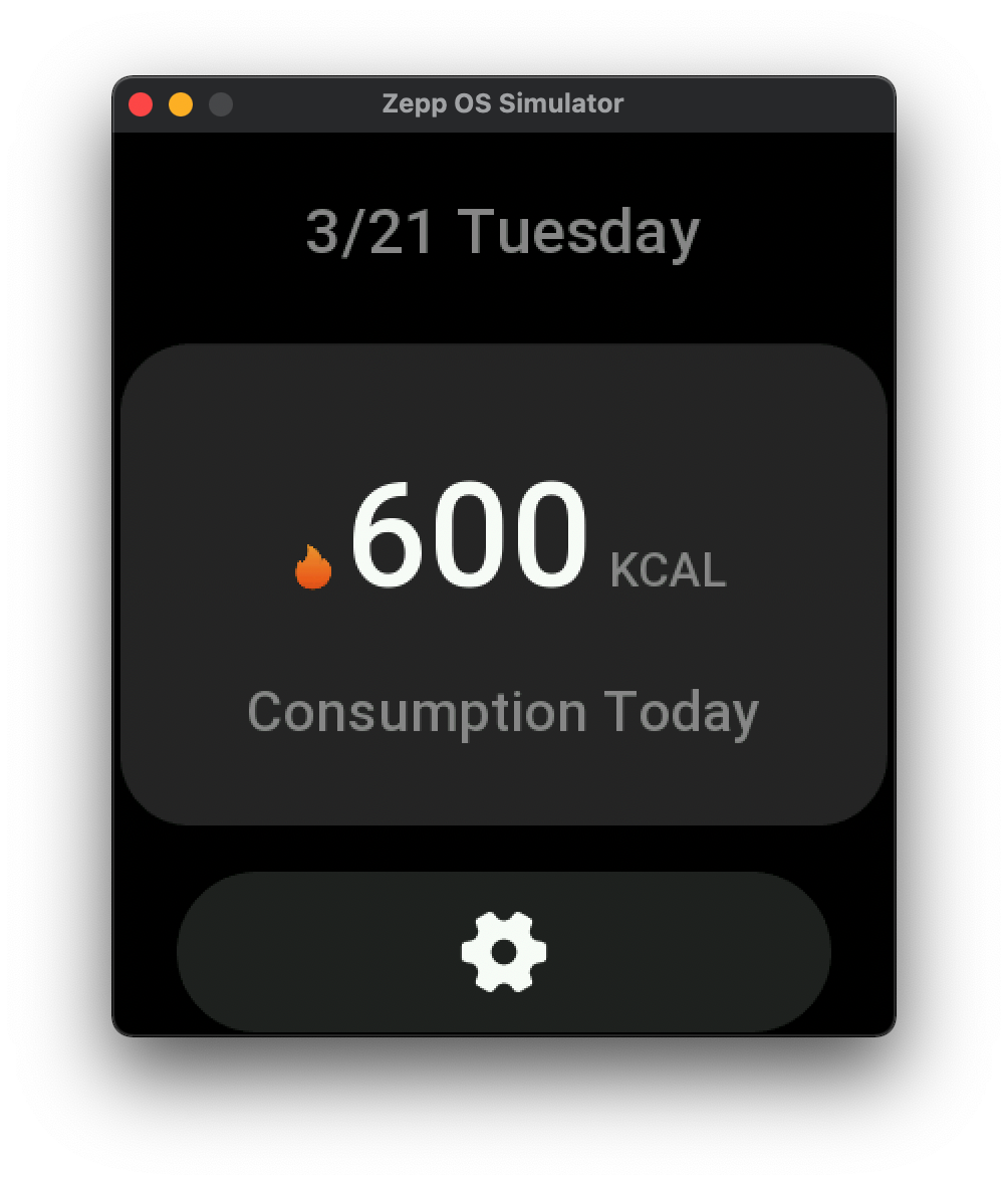
The following GIF shows the effect of the "Widget"
In the system settings, you can add, delete, sort and so on the "Widget", the specific operation path is
Settings => Preferences => Widget => Add icon at the bottom of the interface
Some devices do not support "SecondaryWidget". Check the support of SecondaryWidget in Device Basic Information.
Shortcut Cards
Swipe right on the Watchface page to enter the "Negative Screen" page, which is a long vertical list containing a series of "Shortcut Cards".
The following GIF shows the effect of the "Shorcut Cards"
In the Negative Screen settings, you can add, delete, sort and so on the "Shortcut Cards", the specific operation path is
Negative Screen page scrolls down to the bottom => Click on the settings icon => Add icon at the bottom of the interface
Comparison
- Widget
- More focus on "information display", can carry more information
- More suitable for graphical presentations
- Shortcut Cards
- More focus on quick access, for quickly starting mini programs
- The drawing area is more compact and can only hold core information
Zepp OS 2.0 Open Related JS API
This interface framework has been continued since the beginning of Zepp OS, Widget and Shortcut cards are fast and beautiful characteristics of the majority of users.
In Zepp OS 2.0, we extended the boundaries of the system's open capabilities to include Widget and Shortcut cards, which can be developed quickly through the JS API.
In the next part, we will do a quick start to create a simple Widget.
Before we start, let me introduce some relevant background.
- Widget and Shortcut card are part of the Mini Programs, similar to Settings App, and they are optional. A Mini Program can contain multiple independent Widget or Shortcut cards, up to a total of 5
- Widget and Shortcut cards are only available on devices that support API_LEVEL 2.0 and above
- The drawing area of the Widget and Shortcut cards has a boundary restriction, and you can only draw UI widgets within the given boundary. Specific restrictions are described below
- It can not respond to swipe, gesture events, key events, only respond to click events, usually a simple click will jump to the corresponding main application, for example, Clicking the weather widget will jump to the weather application
- Any UI widgets that involve scrolling, sliding, and layer stacking, such as SCROLL_LIST, VIEW_CONTAINER, can not be used here
- The GROUP widget is not available for Shortcut cards
The constructor for "Widget" is SecondaryWidget, constructor for "Shortcut Cards" isAppWidget. If SecondaryWidget appears in the following text, it stands for "Widget" and AppWidget stands for "Shortcut Cards".
Quick start: Create a Widget
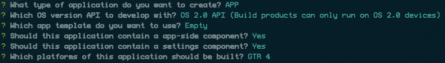
- Using the Zeus CLI tool to create a template project
zeus create widget-demo
Choose to use the OS 2.0 API, and select Empty for the template.
- Creating the directory and files related to Widget.
.
├── app-side
│   ├── i18n
│   │   └── en-US.po
│   └── index.js
├── app.js
├── app.json
├── assets
│   └── 466x466-gtr-4
│       └── icon.png
├── global.d.ts
├── jsconfig.json
├── package-lock.json
├── package.json
├── page
│   ├── i18n
│   │   └── en-US.po
│   └── index.js
├── secondary-widget // new directory
│   └── index.js
└── setting
    ├── i18n
    │   └── en-US.po
    └── index.js
The contents of the index.js file can be found below.
// index.js
import { createWidget, widget, align, text_style } from '@zos/ui'

SecondaryWidget({
  build() {
    const text = createWidget(widget.TEXT, {
      x: 96,
      y: 120,
      w: 288,
      h: 46,
      color: 0xffffff,
      text_size: 36,
      align_h: align.CENTER_H,
      align_v: align.CENTER_V,
      text_style: text_style.NONE,
      text: 'HELLO, Zepp OS'
    })
  }
})
- Add Widget related configuration in app.json.
"targets": {
    "466x466-gtr-4": {
      "module": {
        "page": {
          "pages": [
            "page/index"
          ]
        },
        "app-side": {
          "path": "app-side/index"
        },
        "setting": {
          "path": "setting/index"
        },
        // widget related configuration
        "secondary-widget": {
          "widgets": [
            {
              // widget file path
              "path": "secondary-widget/index",
              "icon": "icon.png",
              "name": "widget-demo",
              "runtime": {
                "type": "js"
              }
            }
          ]
        }
      },
- Open the simulator and run the zeus dev command from the project root directory
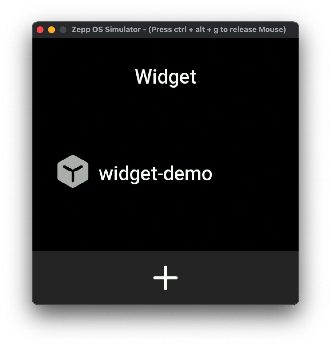
In the settings of the simulator, you can find the Widget named widget-demo, click to add it, return to the Watchface page, and swipe left to see the effect.
At this point, the Widget is created, and except for some of the restrictions mentioned in the article, the rest of the API can be used normally, and you can freely use your imagination.
Best Practice
Drawing area
The drawing area of Widget and Shortcut cards has a boundary restriction. UI widgets can only be drawn within the given boundary, and UI widgets outside the boundary will not be rendered.
- Widget
- The boundary of the drawing area is aligned with the screen boundary of the current device
- For example, the Amazfit GTR 4 has a screen resolution of 466 x 466, and the drawing area of the Widget is 466 x 466, occupying the entire screen, which can be compared to the Watchface, which also has a drawing area of 466 x 466
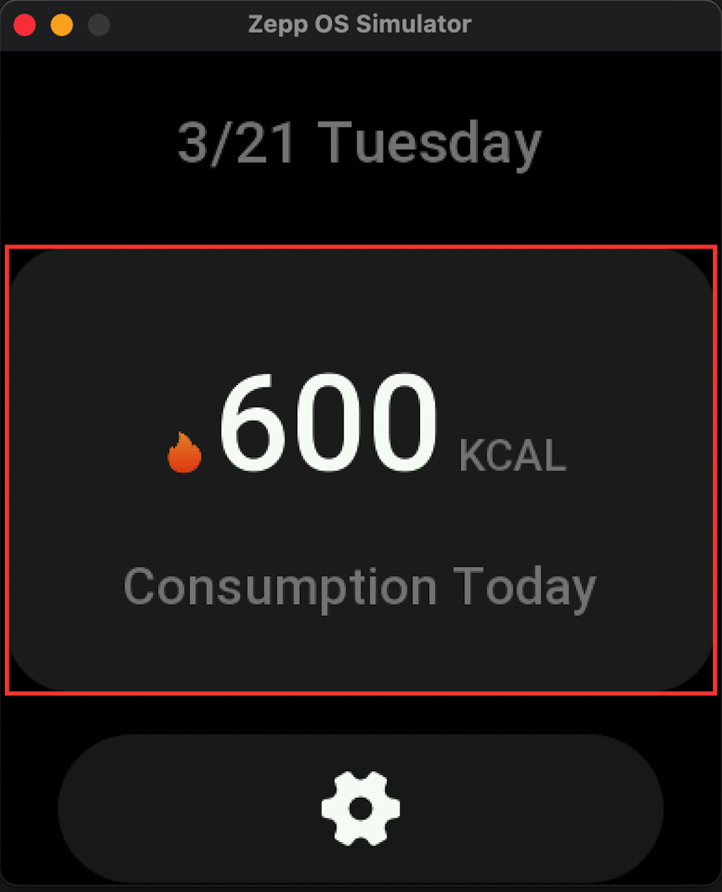
- Shortcut Cards
- The boundary of the drawing area is consistent with the size of the Shortcut card. The area marked in red in the figure below is the drawing area boundary.
- The size of the Shortcut card is device-dependent and is obtained through the getAppWidgetSize() API to get the width, rounded corners, and height information.
- The size of the Shortcut cards can be set via the setAppWidgetSize() API, but only the height can be set, the default height of the card is 50% of the device height, and can be set in the range of 20% - 60% of the device height.
- The layout of the UI widgets in Shortcut cards uses relative coordinates, which are calculated relative to the upper left corner of the card
Life Cycle
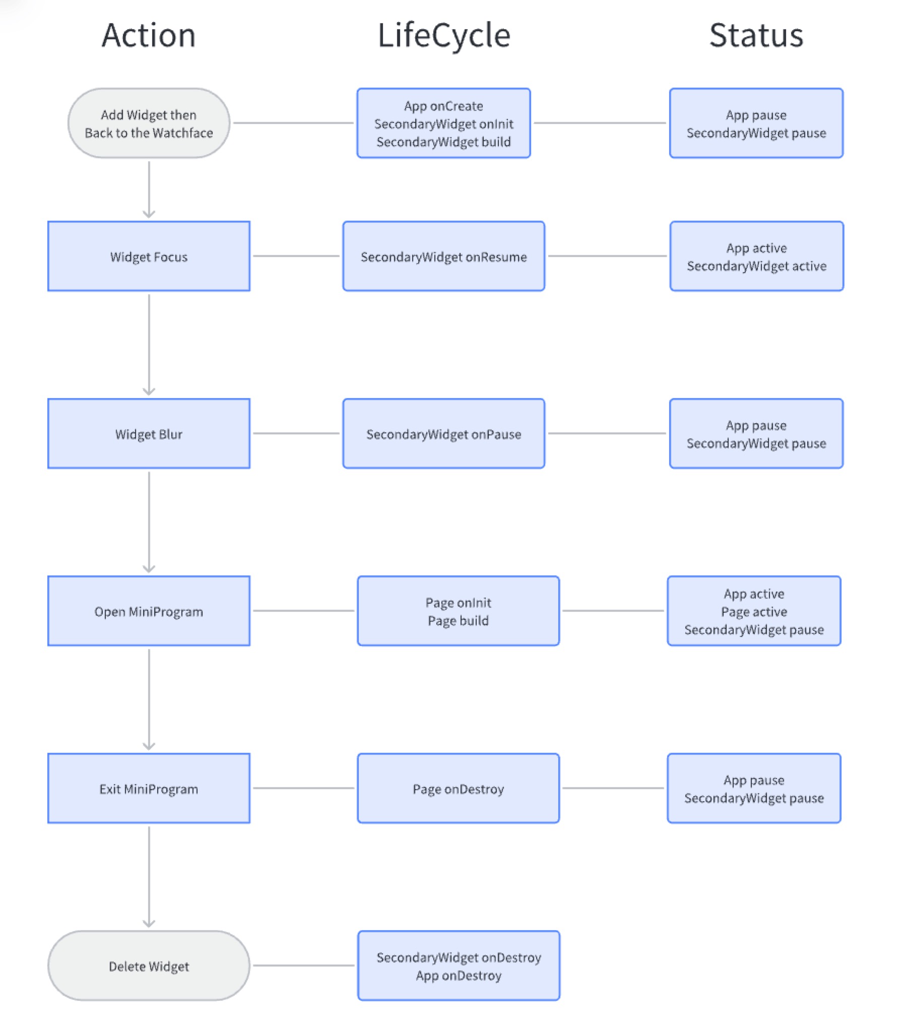
With the addition of Widget and Shortcut cards, the lifecycle of the Mini Program has changed a bit.
Before introducing the lifecycle, let's introduce a concept called "Pause" state, in which the code's contextual information is preserved, but it can not respond to the registered callback functions and the registered timers are suspended.
The onCreate lifecycle of app.js is triggered when you return to the Watchface after adding the Widget in the settings, or when you return to the negative screen page after adding the Shortcut cards in the negative screen settings.
Then the onInit and build lifecycle of the Widget or Shortcut cards is executed. After that, app.js goes into a "Pause" state until the Mini Program page opens or until the Widget or Shortcut cards get focused.
The Widget and Shortcut cards have the feature of gaining focus. When the page focuses on the Widget or Shortcut cards, it will trigger the onResume lifecycle, and when the page loses focus, it will trigger the onPause lifecycle.
When the Widget and Shortcut cards lose focus, they will enter the "Pause" state.
Let's see a complete example
Jump to main program
As mentioned above, Widget and Shortcut cards can only respond to click events, and usually jump to the corresponding main application after clicking, which can be done directly using the @router/push method, and can carry jump-related parameters.
Debugging Tips
It is recommended to add try catch statements to the life cycle of Widget and Shortcut cards to catch errors and avoid the simulator from getting stuck due to JS errors during debugging code.
Reference Error Capture
Communication with Mini Program pages
Referring to the best practices, the mentioned methods are applicable to the communication between Widget, Shortcut cards and Mini Program pages.
Reference Cross Page Communication
- The @zos/router push method jumps pages and carries parameters
- Communicating through the global app object
- With the help of @zos/storage sessionStorage
- Persistent data storage with @zos/storage localStorage or @zos/fs file system module
Refer to the data flow diagram below
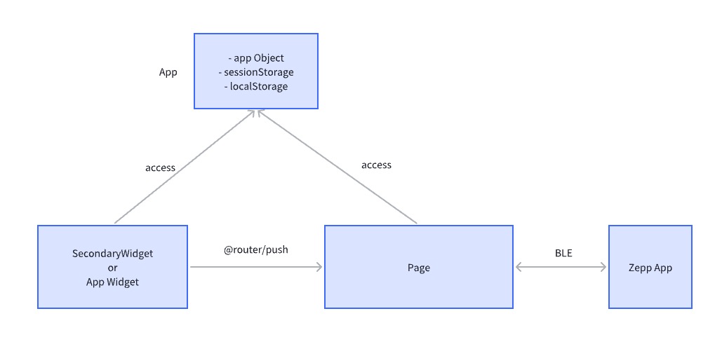
At present, the Widget and Shortcut cards cannot display some real-time data through Bluetooth connection, so we need to initialize the BLE-related connection such as MessageBuilder in Page.
i18n with and image resources
i18n is used in the same way as the Mini Program page, and the i18n files are stored together in the /page/i18n directory.
The image resource path is also consistent with the Mini Program page.
Name Internationalization
The names of the SecondaryWidget and the Shortcut cards are configured in multiple languages in app.json, here's the example.
The name of SecondaryWidget is configured in the secondary-widget field.
"secondary-widget": {
  "widgets": [
    {
      "path": "secondary-widget/index",
      "runtime": {
        "type": "js"
      },
      "name": "App Name",
      "i18n": {
        "en-US": {
          "name": "App Name"
        },
        "zh-CN": {
          "name": "应用名称"
        }
      }
    }
  ]
},
The name of Shorcut cards are configured in the root i18n field.
{
  "i18n": {
    "en-US": {
      "appName": "Calories"
    },
    "zh-CN": {
      "app-widget": {
        "widgets":[{
          "name": "卡路里"
        }]
      }
    }
  },
  "defaultLanguage": "en-US"
}
Preview Image Internationalization
When the API_LEVEL of Mini Program is greater than 3.0, a preview image needs to be passed in, and the size requirements of the preview image refer to the design specifications at the end of the article.
Configure the path of the preview image in app.json. The preview image also needs to support Internationalization. You need to prepare the preview_en-US.png and preview_zh -CN.png images.
"secondary-widget": {
  "widgets": [
    {
      "path": "secondary-widget/index",
      "runtime": {
        "type": "js"
      },
      "preview": "preview.png",
      "i18n": {
        "en-US": {
          "name": "App Name"
        },
        "zh-CN": {
          "name": "应用名称"
        }
      }
    }
  ]
},
Full example
We added a Widget and Shortcut card based on the Mini Program sample calories, and put the source code on Github for your reference. Calories