ARC
Start from API_LEVEL
2.0. Please refer to API_LEVEL.
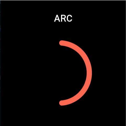
Arc widget to display arc progress. Support setting line width, color, start and end angle.
Create UI widget
import { createWidget, widget } from '@zos/ui'

const arc = createWidget(widget.ARC, Param)
Type
Param: object
| Properties | Description | Required | Type |
|---|---|---|---|
| x | The x-coordinate of widgets | YES | number |
| y | The y-coordinate of widgets | YES | number |
| w | The width of widgets | YES | number |
| h | The height of widgets | YES | number |
| radius | Radius | YES | number |
| start_angle | The angle at the beginning of the arc. (0 degrees is the positive three o'clock direction) | YES | number |
| end_angle | The angle at the end of the arc. (0 degrees is the positive three o'clock direction) | YES | number |
| line_width | Width of circular arc. | YES | number |
| color | Color of circular arc. | YES | number |
info
The ARC widget draws an ellipse within the boundaries of a rectangle of width w and height h with the (x,y) coordinates as the upper left corner, and then cuts it into an arc at a given angle
Supported Property Access List
| Property | setProperty | getProperty | setter | getter |
|---|---|---|---|---|
| x | Y | Y | Y | Y |
| y | Y | Y | Y | Y |
| w | Y | Y | Y | Y |
| h | Y | Y | Y | Y |
| start_angle | Y | Y | Y | Y |
| end_angle | Y | Y | Y | Y |
| line_width | Y | Y | Y | Y |
| color | Y | Y | Y | Y |
Code example
import { createWidget, widget, event, prop } from '@zos/ui'

Page({
  build() {
    const arc = createWidget(widget.ARC, {
      x: 100,
      y: 100,
      w: 250,
      h: 250,
      start_angle: -90,
      end_angle: 90,
      color: 0xfc6950,
      line_width: 20
    })

    arc.addEventListener(event.CLICK_DOWN, (info) => {
      arc.setProperty(prop.MORE, {
        y: 150
      })
    })
  }
})