DIALOG
Start from API_LEVEL
2.0. Please refer to API_LEVEL.
caution
This widget has been discontinued. It is recommended to replace it with the more powerful @zos/interaction createModal API
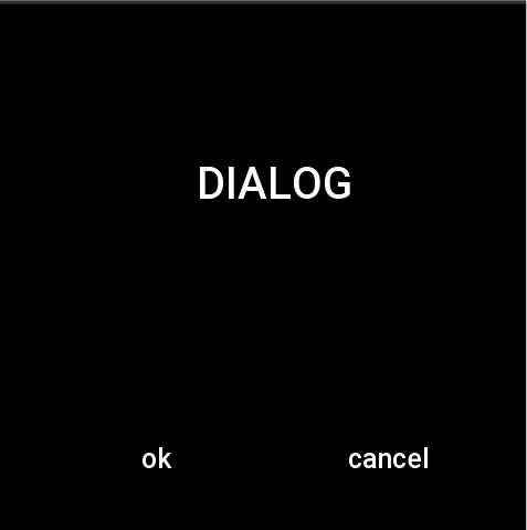
Dialog popup consists of a piece of text and two buttons. The popup box disappears when the buttons are clicked.
Create UI widget
import { createWidget, widget } from '@zos/ui'

const dialog = createWidget(widget.DIALOG, Param)
Type
Param: object
| Properties | Description | Required | Type |
|---|---|---|---|
| text | Contents of dialog. | YES | string |
| content_text_size | The text size of the dialog content. | NO | number |
| content_text_color | The text color of the dialog content. | NO | number |
| content_bg_color | The background color of the dialog content. | NO | number |
| content_text_align_h | Alignment of dialog content text.(horizontal axis) | NO | string |
| content_text_align_v | Alignment of dialog content text.(vertical axis) | NO | string |
| ok_text | Text on the confirmed button. | NO | string |
| ok_text_color | The color of the text on the confirmed button. | NO | number |
| ok_press_color | The color when the confirmed button is pressed. | NO | number |
| ok_nomal_color | The color when the confirmed button is normal. | NO | number |
| ok_press_src | Background image when the confirmed button is pressed. | NO | string |
| ok_nomal_src | Background image when the confirmed button is normal. | NO | string |
| cancel_text | Text on the canceled button. | NO | string |
| cancel_text_color | The color of the text on the canceled button. | NO | number |
| cancel_press_color | The color when the canceled button is pressed. | NO | number |
| cancel_nomal_color | The color when the canceled button is normal. | NO | number |
| cancel_press_src | Background image when the canceled button is pressed. | NO | string |
| cancel_nomal_src | Background image when the canceled button is normal. | NO | string |
| dialog_align_h | The horizontal axis of the dialog. | NO | number |
| dialog_align_v | The vertical axis of the dialog. | NO | number |
| ok_func | Click the callback of the confirmed button. | NO | (dialog: Dialog) => void |
| cancel_func | Click the callback of the canceled button. | NO | (dialog: Dialog) => void |
Dialog: object
| Property | Description | Type |
|---|---|---|
| text | The content of dialog. | string |
| ... omitted | Refer to dialog related properties in the setting field |
prop Properties
| Properties | Support get/set | Type | Notes |
|---|---|---|---|
| prop.SHOW | set | boolean | dialog whether to display. |
Code example
import { createWidget, widget, prop, align } from '@zos/ui'

Page({
  build() {
    const dialog = createWidget(widget.DIALOG, {
      ok_text: 'OK',
      cancel_text: 'CANCEL'
    })
    dialog.setProperty(prop.MORE, {
      text: 'DIALOG',
      content_text_size: 40,
      content_bg_color: 0x000000,
      content_text_color: 0xffffff,
      dialog_align_h: align.CENTER_H,
      content_text_align_h: align.CENTER_H,
      content_text_align_v: align.CENTER_V,
      ok_func: () => {
        console.log('OK')
      },
      cancel_func: () => {
        console.log('CANCEL')
      }
    })
    dialog.setProperty(prop.SHOW, true)
  }
})