BUTTON
Supported from API_LEVEL
2.0. For API compatibility, please refer to API_LEVEL.
The button widget supports setting images and colors for normal and pressed states.
Create UI Widget
import { createWidget, widget } from '@zos/ui'

const button = createWidget(widget.BUTTON, Param)
Types
Param: object
| Properties | Description | Required | Type | API_LEVEL |
|---|---|---|---|---|
| x | The x-coordinate of the widget | YES | number | 2.0 |
| y | The y-coordinate of the widget | YES | number | 2.0 |
| w | The width of the widget. Note: If set to -1, it will prioritize adapting to normal_src size, default is 100 | YES | number | 2.0 |
| h | The height of the widget. Note: If set to -1, it will prioritize adapting to normal_src size, default is 40 | YES | number | 2.0 |
| text | Text displayed on the button | NO | string | 2.0 |
| color | Text color | NO | number | 2.0 |
| text_size | Text font size | NO | number | 2.0 |
| normal_color | Background color in normal state, must be set together with press_color to take effect | NO | number | 2.0 |
| press_color | Background color when pressed, must be set together with normal_color to take effect | NO | number | 2.0 |
| radius | Corner radius when using color as button background | NO | number | 2.0 |
| normal_src | Background image in normal state, must be set together with press_src to take effect | NO | string | 2.0 |
| press_src | Background image when pressed, must be set together with normal_src to take effect | NO | string | 2.0 |
| click_func | Button click callback | NO | ClickFunc | 2.0 |
| longpress_func | Long press (700ms) button callback | NO | ClickFunc | 2.0 |
| font | Font path, refer to Directory Structure | NO | string | 3.6 |
| text_w | Button text width | NO | number | 3.6 |
caution
- When neither background nor color is set for the button, it will use the default click state background color (normal black, clicked gray)
- When both background and color are set for the button, background color takes precedence over background image
- The radius field only works after setting the background color
- Background color
normal_colorand pressed colorpress_colormust be set together to take effect - Background image
normal_srcand pressed imagepress_srcmust be set together to take effect - When using
widget.setPropertyAPI to modify BUTTON widget properties, you must pass in the required fieldsx,y,w,h(refer to code example)
ClickFunc
(button: Button) => void
The button instance created by the createWidget method
Property Access Support List
| Property Name | setProperty | getProperty | setter | getter |
|---|---|---|---|---|
| x | Y | Y | Y | Y |
| y | Y | Y | Y | Y |
| w | Y | Y | Y | Y |
| h | Y | Y | Y | Y |
| text | Y | Y | Y | Y |
| color | Y | Y | Y | Y |
| text_size | Y | Y | Y | Y |
| font | Y | Y | Y | Y |
| press_src | N | N | Y | Y |
| normal_src | N | N | Y | Y |
| press_color | N | N | Y | Y |
| normal_color | N | N | Y | Y |
| radius | Y | Y | Y | Y |
| click_func | N | N | Y | Y |
| longpress_func | N | N | Y | Y |
| text_w | N | N | Y | Y |
Code Example
tip
Please refer to Design Resources for the image resources in the code example
import { createWidget, widget, prop } from '@zos/ui'
Page({
build() {
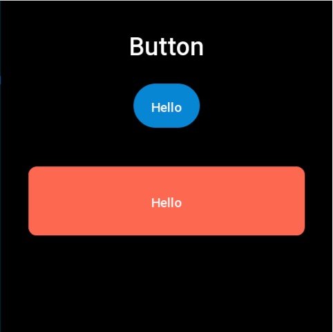
const img_button = createWidget(widget.BUTTON, {
x: (480 - 96) / 2,
y: 120,
text: 'Hello',
w: -1,
h: -1,
normal_src: 'button_normal.png',
press_src: 'button_press.png',
click_func: () => {
console.log('button click')
}
})
createWidget(widget.BUTTON, {
x: (480 - 400) / 2,
y: 240,
w: 400,
h: 100,
radius: 12,
normal_color: 0xfc6950,
press_color: 0xfeb4a8,
text: 'Hello',
click_func: (button_widget) => {
button_widget.setProperty(prop.MORE, {
x: (480 - 400) / 2,
y: 300,
w: 400,
h: 100
})
}
})
}
})
Additional Examples
Example 1
import { createWidget, widget } from '@zos/ui'

const button = createWidget(widget.BUTTON, {
  x: 0,
  y: 100,
  w: 218,
  h: 74,
  press_color: 0x1976d2,
  normal_color: 0xef5350,
  text: 'button',
  click_func: () => {
    console.log('button clicked')
  },
  longpress_func: () => {
    console.log('button long pressed')
  },
})
Example 2
Supported from API_LEVEL
4.0.
import { createWidget, widget } from '@zos/ui'

const buttonContainer = createWidget(widget.VIRTUAL_CONTAINER, {
  layout: { x: '0', y: '60vh', width: '100vw', height: '40vh' },
})

const buttonSubContainer = createWidget(widget.VIRTUAL_CONTAINER, {
  parent: buttonContainer,
  layout: {
    display: 'flex',
    'flex-flow': 'row wrap',
    'column-gap': '20',
    'row-gap': '10',
    'justify-content': 'space-evenly',
    'align-items': 'center',
    width: '100%',
    height: '100%',
  },
})

const addButton = createWidget(widget.BUTTON, {
  parent: buttonSubContainer,
  layout: { width: '25%', height: '20%', radius: '3vw' },
  press_src: 'images/test/normalbtn_h.png',
  normal_src: 'images/test/normalbtn_n.png',
  text: 'add widget',
  click_func: () => {},
})