Empty pages
When no content is displayed in the initial state and no-data state, an empty page occurs to help users understand the cause of such case. It is also a placeholder prompt for operations that can be performed.
Design goals
- Provide simple and clear prompts to help users understand the cause of the empty state and avoid misunderstanding and confusion.
- Give users a recommended operation prompt and tell them how to deal with the problem.
Types
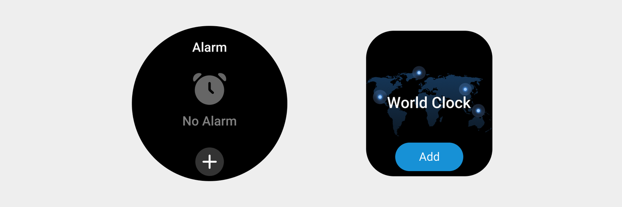
- Operable empty page: Informs the user of the current page state and guides the user to resolve the state using operable buttons.
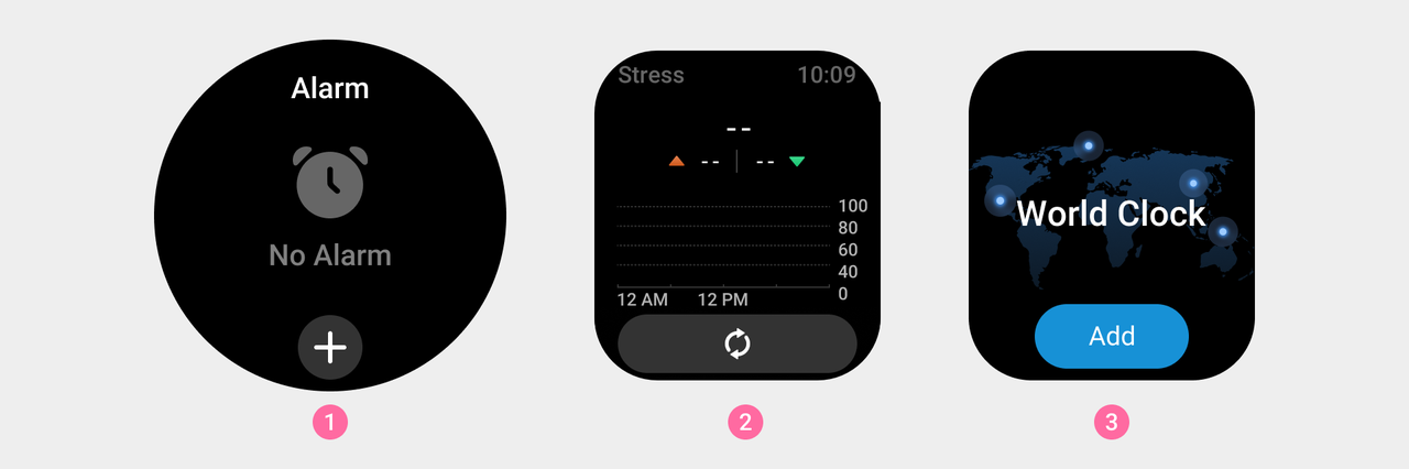
① Alarm clock application blank page and the alarm clock button.
② Stress application empty page and thee stress measurement button.
③ World clock widget empty page and the time zone button.
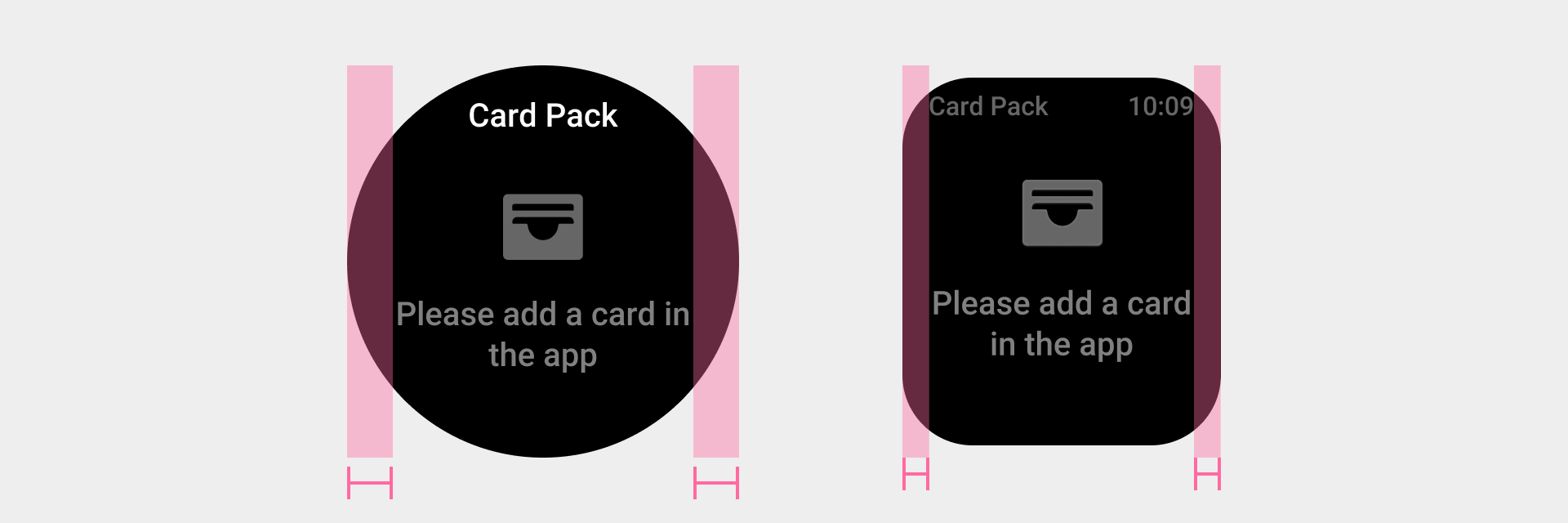
- Inoperable empty page: Only informs the user of the current page state or an operation prompt that can change the current state. Operations on the current page are not supported.
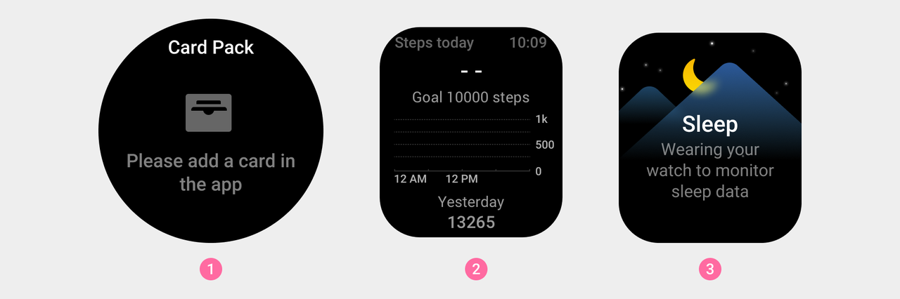
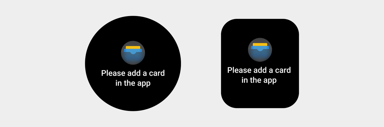
① Empty page of membership card package application, prompting to connect to the app.
② Activity uses an empty page to display empty data.
③ The sleep widget displays an empty page and prompts that there is no data.
Rules for use
-
No-data scenarios
No-data scenarios refer to scenarios where no data but a combination of elements is displayed in the content area. Four types of elements are displayed: graphics (including illustrations and icon elements), the "--" symbol, prompt text, and suggested operation elements. Whether to provide suggested operations depends on the specific usage scenario.
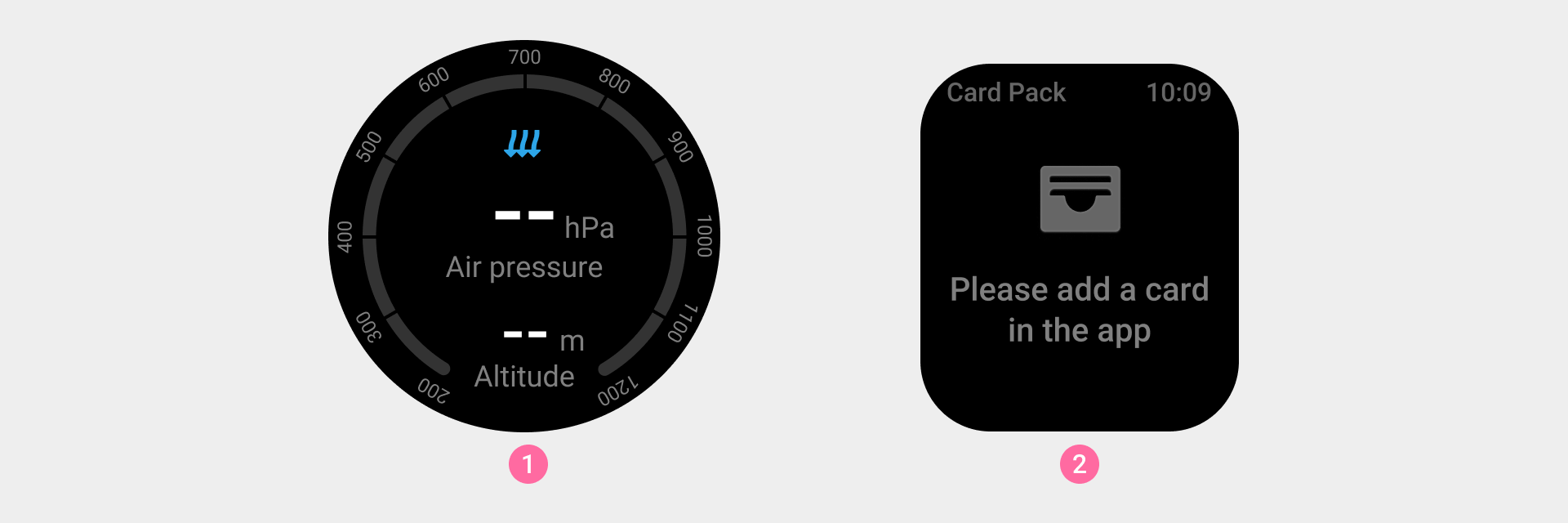
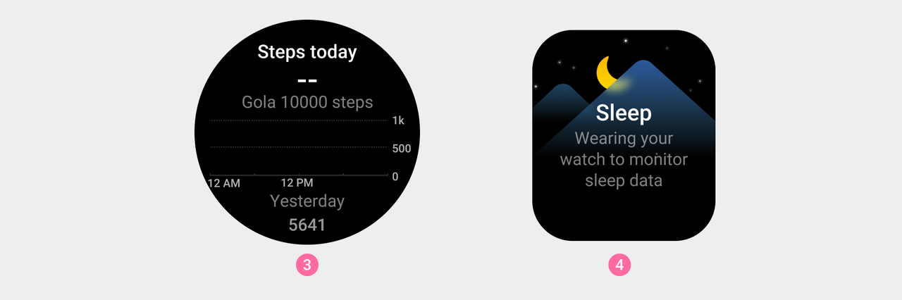
① The no-data status of a data item is represented by "--" as a placeholder.
② The text is used to clearly inform the user of status information or guide user operation.
③ For charts, no-data mode is displayed using the chart's grid lines or indicator background. Whether there is data on the time axis and scale axis determines which display elements are used based on the actual chart.
④ When there is no-data mode on the widget, illustrations can be used to help users understand important content on the current page.
- Guided operation scenarios
An empty page that is used to guide user operations consists of three parts: prompt text, graphics, and suggested operation elements. Graphics must have clear meanings, prompt text needs to offer clear descriptions, and text length cannot exceed one screen.
Visual specifications
- The initial state of the app is shown in a gray state illustration.
- Empty pages can contain up to two lines of text, which needs to be displayed on one screen.
- Leave a safe distance to the left and right.
- The initial state of the empty widget page indicates that it needs to be connected to the mobile application for operation. Please use colorful graphic styles. To ensure user understanding, the application icon is usually used.