Pop-up windows
A pop-up window is a container displayed on the user interface. It is used for user operation guidance, information presentation, and message prompts.
Design principles
Effective: Provide informative feedback to help users improve operation efficiency.
Easy to understand: The pop-up window must be brief and clear, the task must be short and focused, making it easy for users to quickly understand the information and tasks.
Restraint: Since the pop-up window will affect the user's current operation, select an appropriate reminder method according to the priority of the information, avoid excessive use, and ensure a good user experience.
Pop-up window types
Based on the usage scenarios and feature attributes, pop-up windows on wearable devices can be divided into four categories: task completion, notification display, status notification, and information prompt.
The interaction rules for pop-up windows are as follows:
| Pop-up window type | Page type name | Display time | Display after screen is off for 10 seconds | Swipe right to exit | Page operations | Long page |
|---|---|---|---|---|---|---|
| Task Completion pop-up window | Task Popup | No time limit | Display | No | Button Operation | No |
| Status notification pop-up window | Alert pop-up window | No time limit | Display | No | Button Operation | Yes |
| Notification display pop-up window | Notification pop-up window | No time limit | Follow system (return to the Watchface or the on-going page) | Yes | Button operations/None | Yes |
| Message prompt pop-up window | Global Alert | At least 2 seconds, customizable | Follow system | Yes | None | Yes |
| Drawer | Disappear after 6 seconds Disappear after pressing the UP/DOWN button | Follow system | No | None | No | |
| Toast | Disappear after 3 seconds | Follow system | No | None | No |
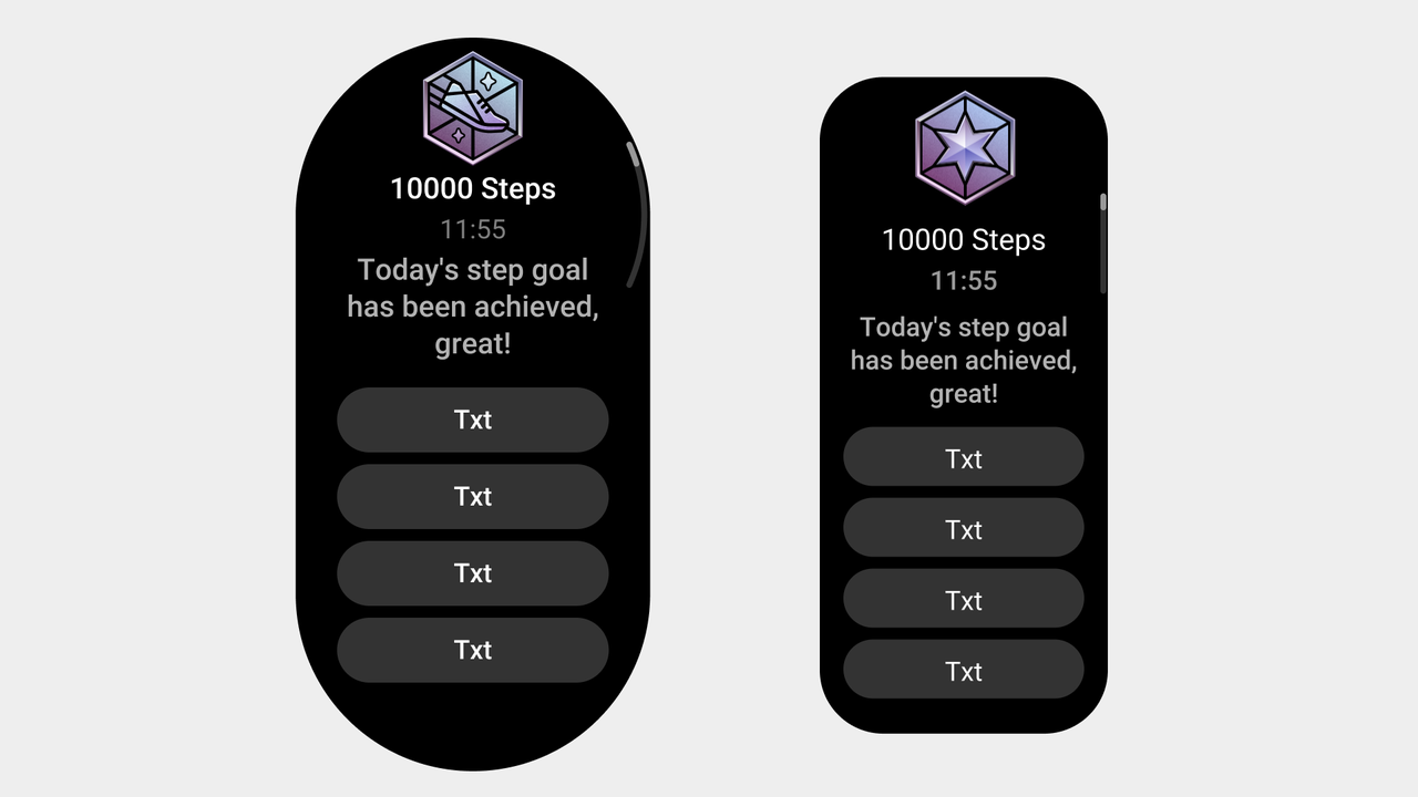
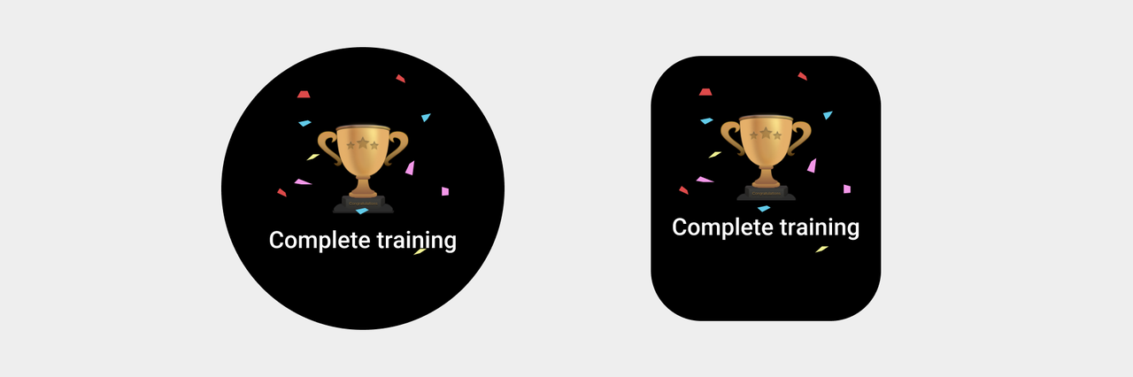
Task Popup
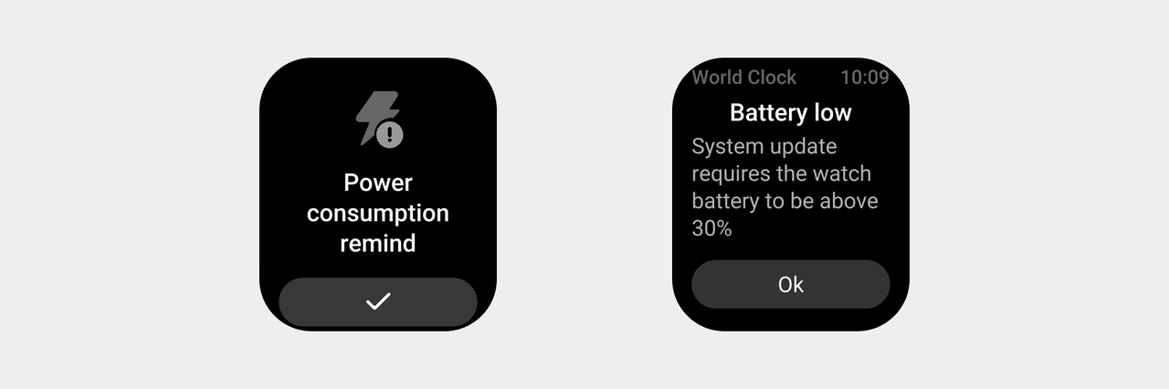
Task pop-up refers to an important task initiated by the system that requires the user to interrupt their current operation and complete the task.
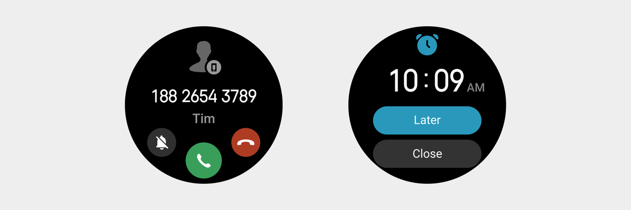
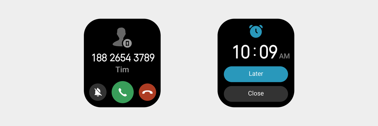
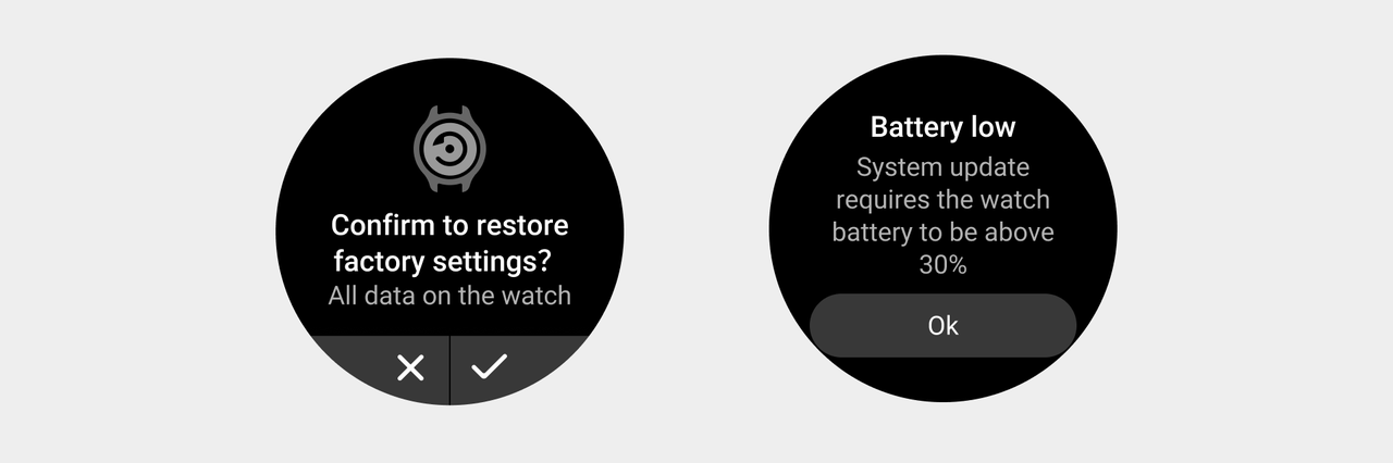
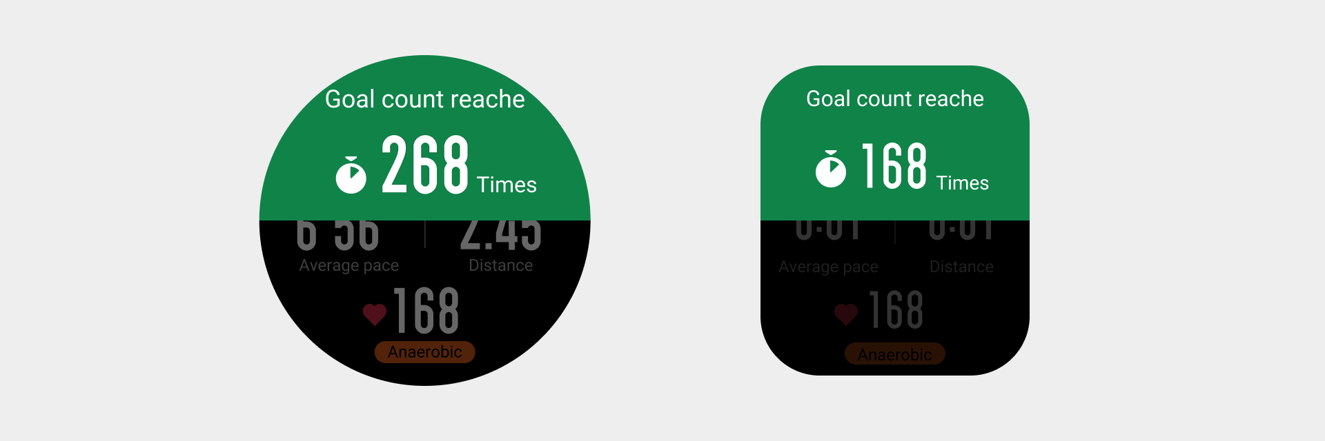
Alert pop-up windows
Based on the user's status or operation, the system needs to clearly inform the user of the feedback result and allow the user to select or confirm the information. Long page display is supported.
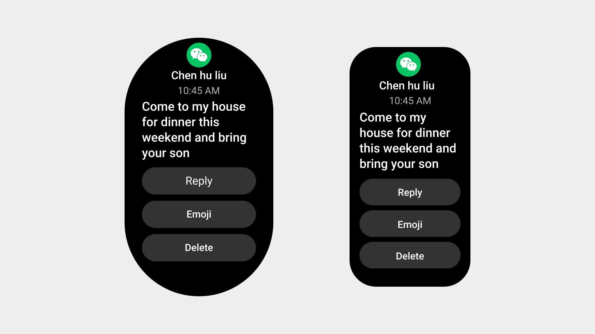
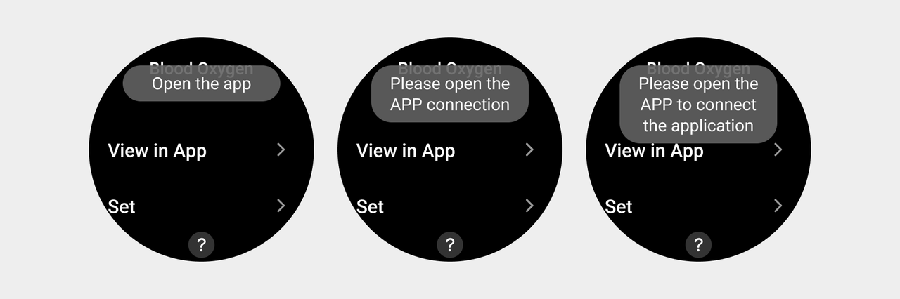
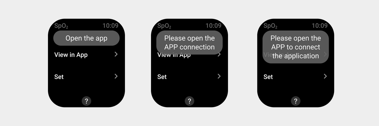
Notification pop-up windows
Notification pop-up windows navigate the user to the Notification Center, convey notification content, and inform the user of the current state of the system. The user is not forced to give feedback. Long page display is supported.
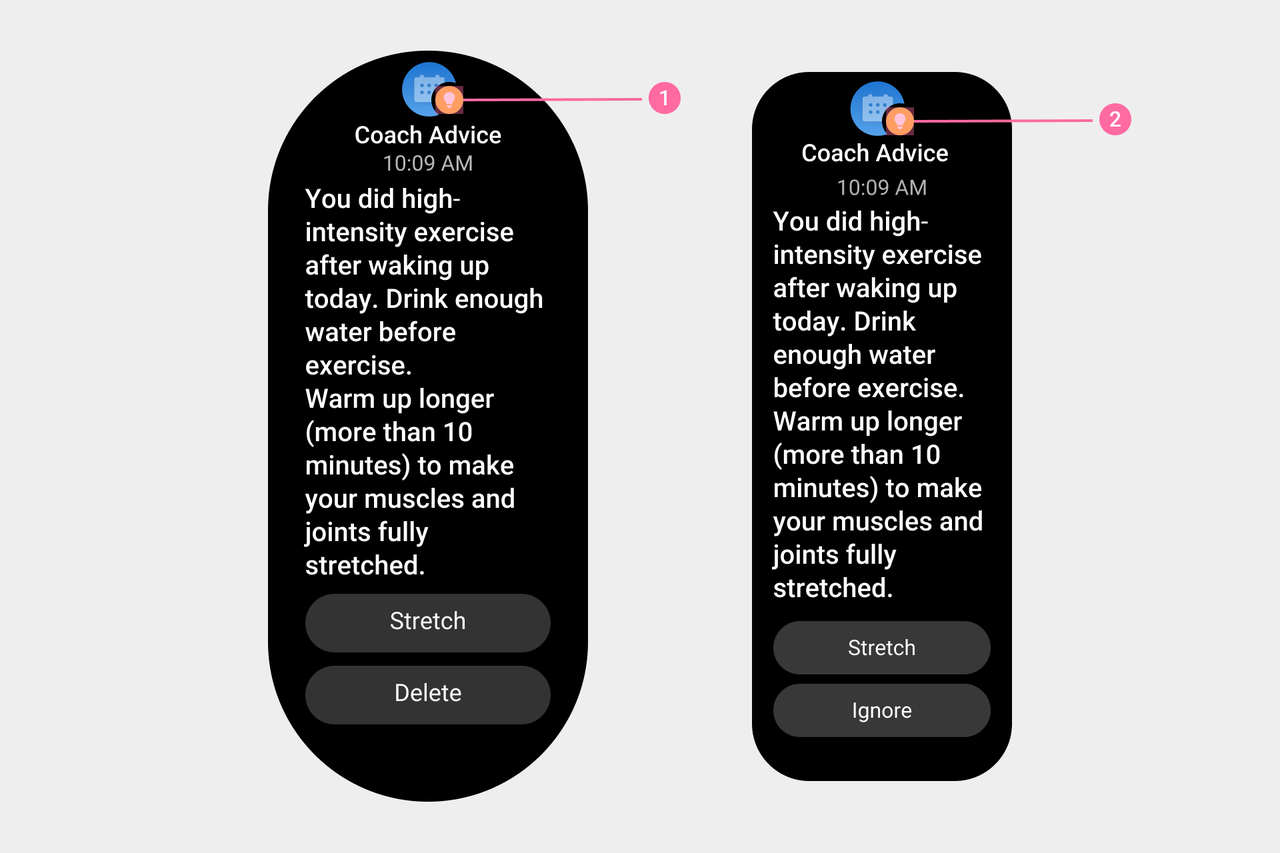
① ② Special symbols are used in OS health advice notifications to differentiate them from regular notifications.
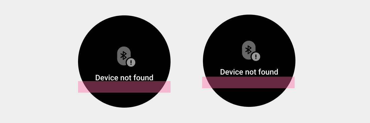
Global Alert
It refers to using a complete interface to present lightweight status information. If the user does not see it inadvertently, it will not have any impact on the result. A display time or swipe right to exit can be set to minimize the impact on the user.
Drawers
A drawer appears by sliding in from the edge of the screen. Drawers are suitable for items strongly related to the current task, and allow immediate task information prompts while the task is in progress. They significantly reduce the sense of obstruction by using a translucent background. To reduce disturbance to the user, persistence time can be set or manually turned off.
Toasts
A toast is the most lightweight feedback and does not affect the user's operations. The user can choose not to respond to a toast.
Visual specifications
- There should be no space between illustrations, titles, and text, and a safe distance should be left on both sides. The illustrations, titles, and body text are centered left and right for round devices, and left aligned for square devices.
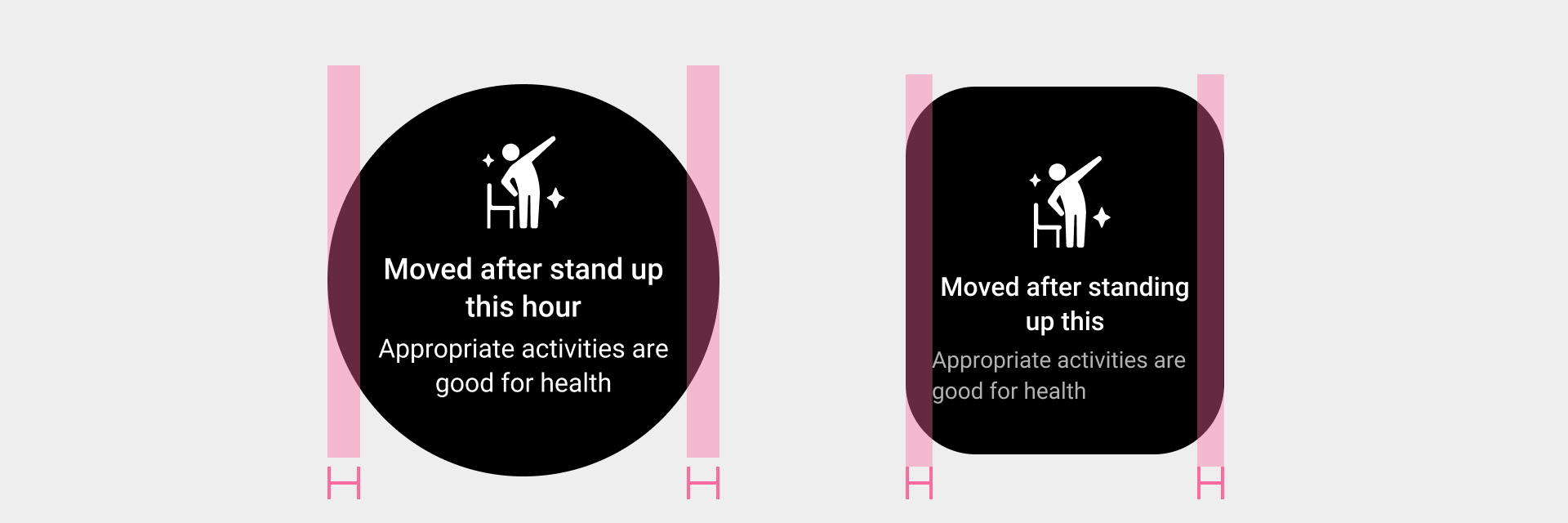
- The coordinates of the illustration and the text are arranged on the upper side of the screen, and the overall content is centered on the layout. If the content exceeds one screen, it will be treated as oversized text.
-
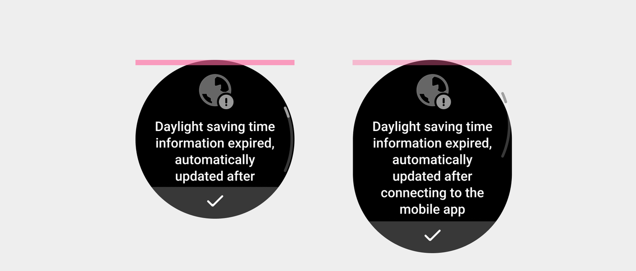
Typesetting Rules For Ultra-long Text on Circular Screen Devices:
Line break, unlimited number of lines.
Leave a safe distance from the top for the illustration, layout the overall content downwards.
Center align the text.
-
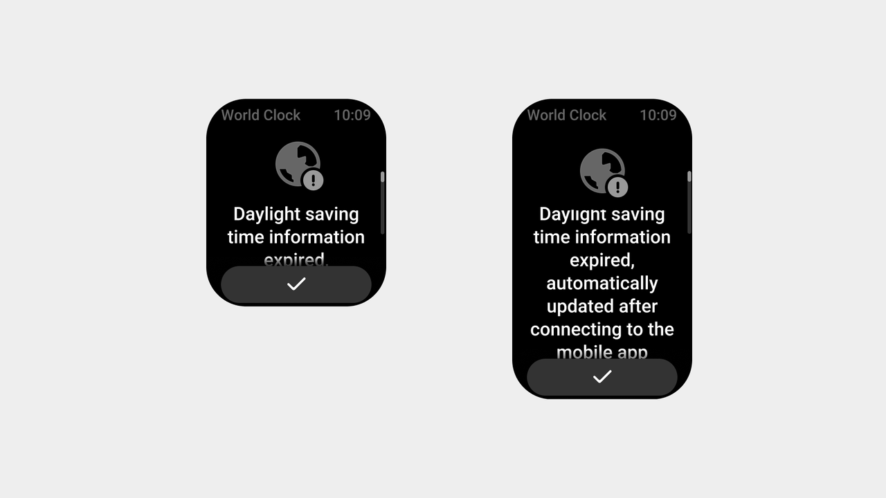
Typesetting Rules For Ultra-long Text on Landscape Devices:
Line break, unlimited number of lines.
Illustrations and titles are aligned center horizontally, layout the overall content downwards.
Left aligned text.
Since the in-app status bar is always present, any pop-up triggered within the app needs to preserve the status bar.
- When the operation buttons of the pop-up window are capsule buttons, it is recommended to use no more than 4 operation buttons.