Cards
A card is a content container that aggregates information. It contains one type or a small group of elements centered on one element.
Design principles
Keep cards simple and relatively independent. Card design should be kept minimalist, content length should be limited, and each card should only contain important information and one relevant point.
Distinguish primary and secondary hierarchies, make good use of the hierarchical structure of cards, highlight key content and information, and guide users to focus on the most important information or operations so that users can complete tasks more quickly.
Make sure that the entire card can be tapped. Generally, cards provide larger tap target areas and trigger ranges for users. Users should be able to tap any part of the card to trigger the content.
Composition
As an information container, a card can support almost all UI elements, including text, rich media, buttons, and more.
Text: Titles, subtitles, and description text.

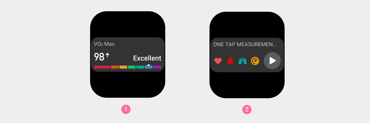
Rich media: Cards can contain a variety of rich media elements to display icons, graphs, or charts.
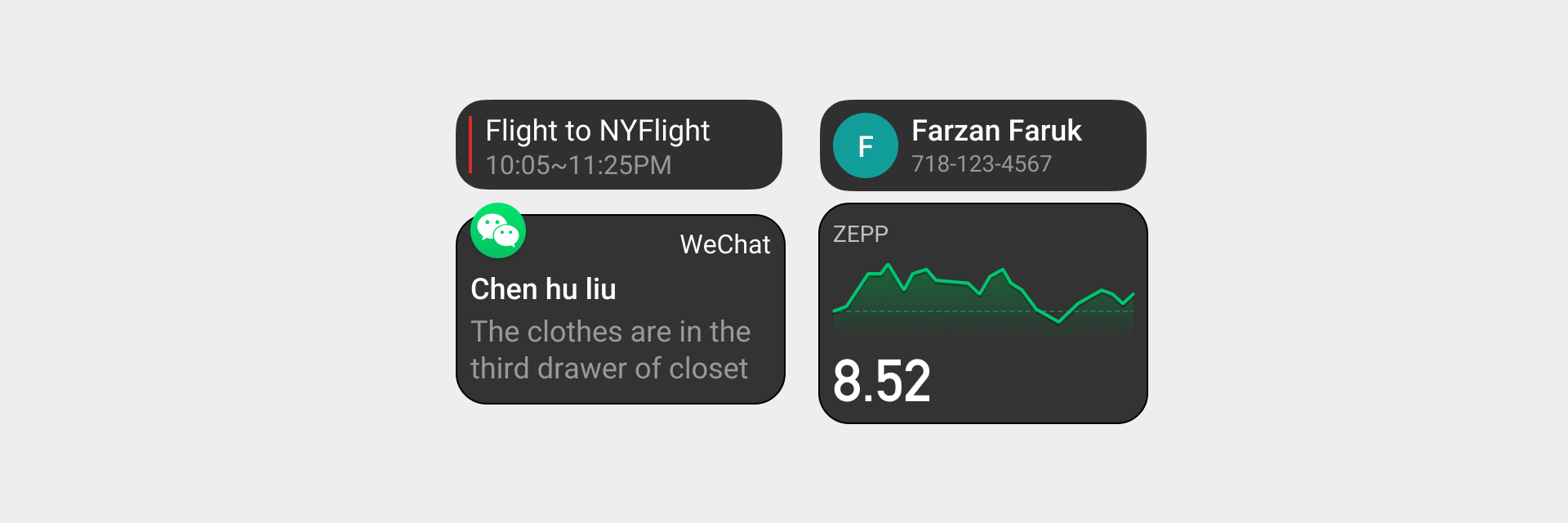
Operations: Buttons and icons for operations.

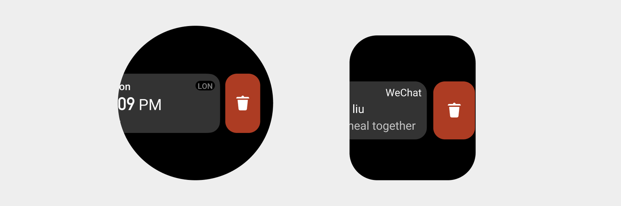
Card swipe
When the card slides to the left, a delete operation appears. The height of the button is the same as that of the card. After clicking, the current card will be deleted. For the animation effect of card sliding, please refer to: Visual animation
Visual specifications
- A single card cannot exceed one screen.
- Maintain a safe distance around the card.
- The spacing between cards must be kept uniform.
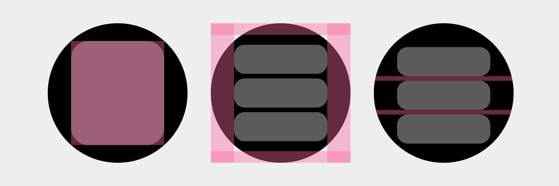
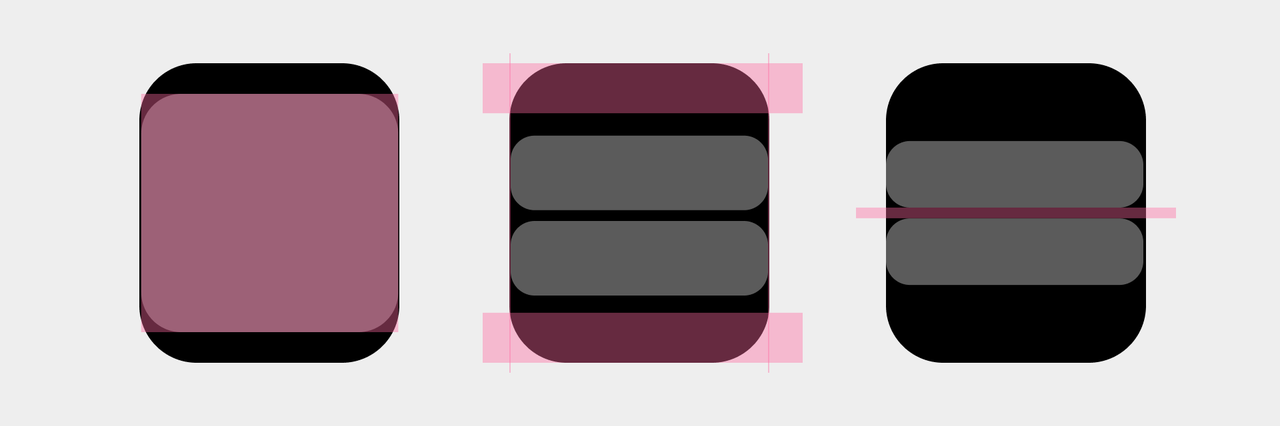
- There are no special layout restrictions within cards. If there is an operation area in the card, it should be clearly different from the content, and a safe distance should be maintained around the card.

Text content display rules
When the text content exceeds one line and the container allows line breaks, the text will be displayed in line breaks. Displays "..." after container limit exceeded.
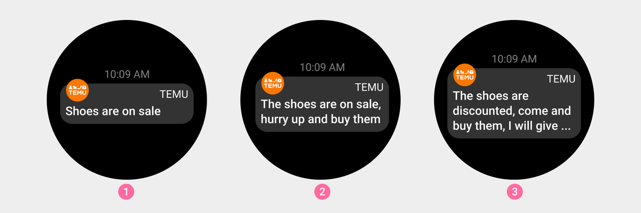
Control Center information supports up to 3 lines
① Content Line 1, normal display
② Content Line 2, normal display
③ If the content exceeds 3 lines, use "..." to display the incomplete content
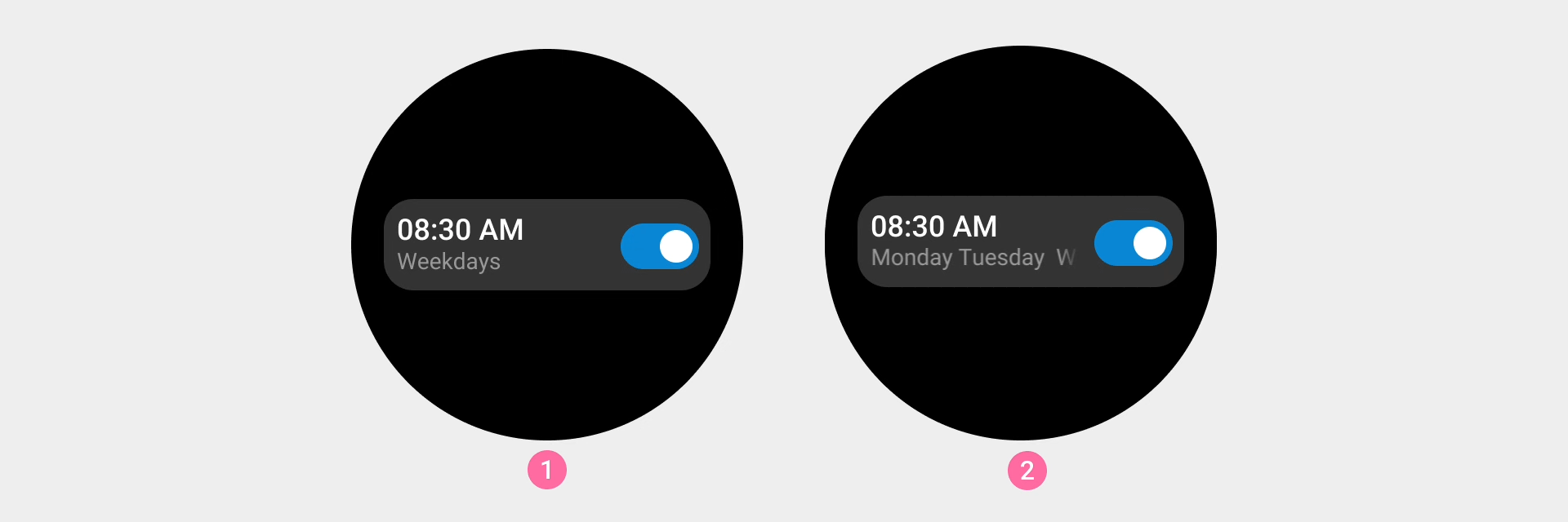
Shortcut card title supports up to 1 line
① The content does not exceed 1 line. Normal display
② If the content exceeds 2 lines, use "..." to display the incomplete content
The display content of the card exceeds the container, which is not suitable for line breaks, and can be scrolled when the text information cannot be omitted.
Alarm card supports a maximum of 1 line of display
① The content does not exceed 1 line, normal display
② If the content exceeds 1 line. Scroll when the content exceeds the container
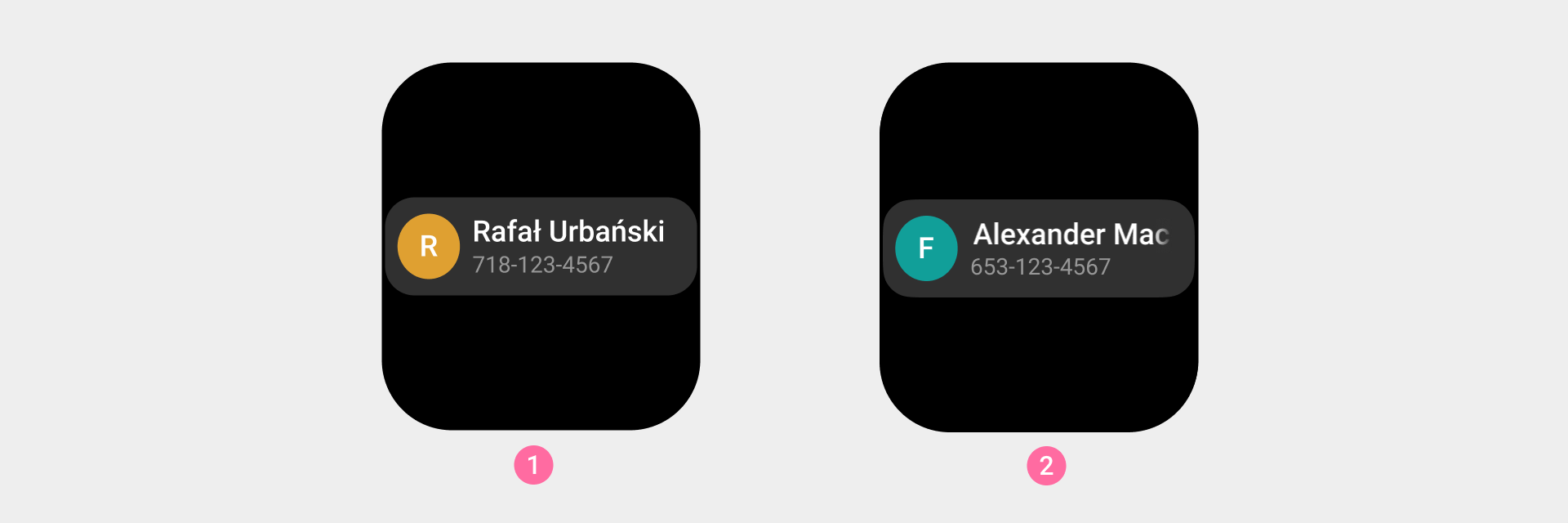
The phone contact card supports a maximum of 1 line of display
① If it does not exceed within 1 line, normal display
② Exceeded in 1 line, the content will be scrolled when the content exceeds the container