Editable Component
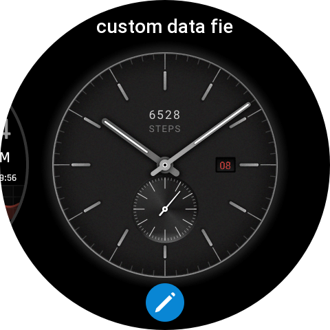
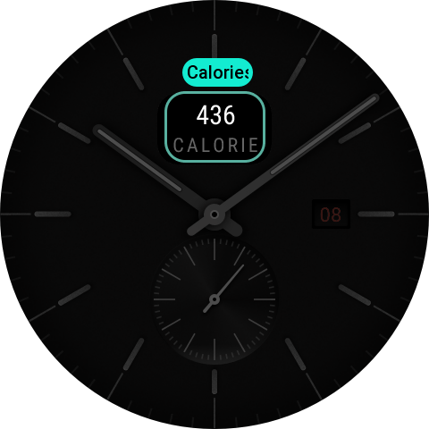
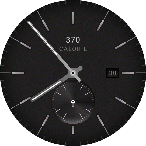
The Editable Component allows watch face data fields to be switched on the device. By long-pressing on the watch face to enter edit mode and tapping the pencil icon, users can switch between different data items (Heart Rate, Steps, Calories) by sliding or tapping on the data editing page. After exiting edit mode, the watch face displays the real data from the selected type.
Goal
Use the provided resource pack to create an editable watch face from scratch.
Final result: A round watch face that supports switching between Heart Rate, Steps, and Calories data items, including pointer clock, date, editable component, and background image.
Resource List
Resource pack: assets.zip
assets/
├── images/
│   ├── preview.png        # Watch face preview image (480×480)
│   ├── font/              # Digit images (11 images: 0-9 + default placeholder for no data)
│   ├── pointer/           # Pointer images (hour h / minute m / progress pointer_progress)
│   ├── date/              # Date number images (0-9)
│   ├── img/
│   │   └── bg.png         # Watch face background image (480×480)
│   ├── edit/
│   │   ├── select.png     # Edit mode selection state background
│   │   ├── tip.png        # Component switch tip text background
│   │   ├── mask100.png    # Mask layer - fully opaque
│   │   └── mask70.png     # Mask layer - 70% opaque
│   ├── widgetText/        # Data item icons
│   │   ├── step.png
│   │   ├── cal.png
│   │   └── heart.png
│   └── widgetPreview/     # Edit mode data item preview images
│       ├── steps.png
│       ├── cal.png
│       └── hr.png
Step 1: Create a Watch Face
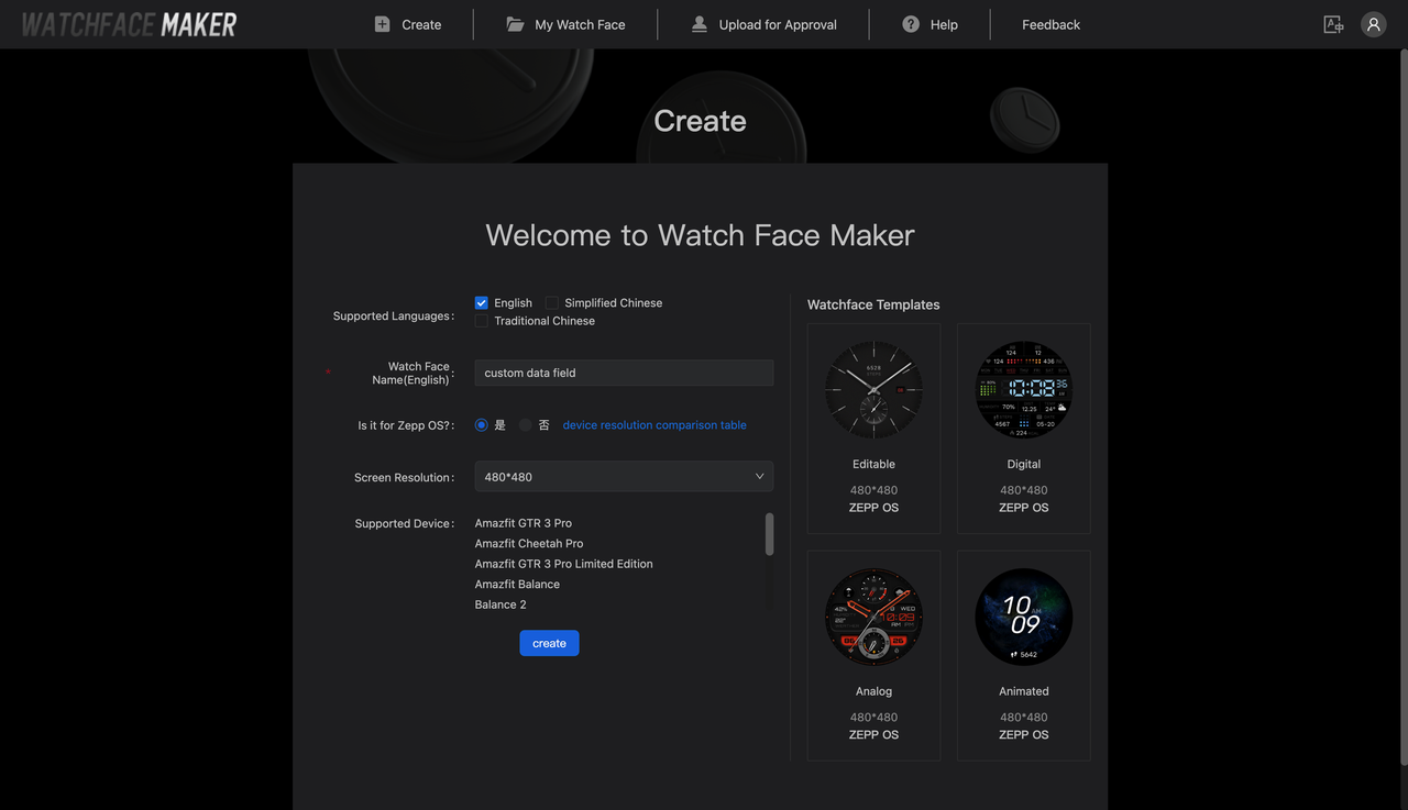
Go to the Watchface Maker and navigate to the watch face creation page.
- Fill in the watch face name, e.g. "custom data field"
- Click the Create button to enter the main designer page
Step 2: Configure Background
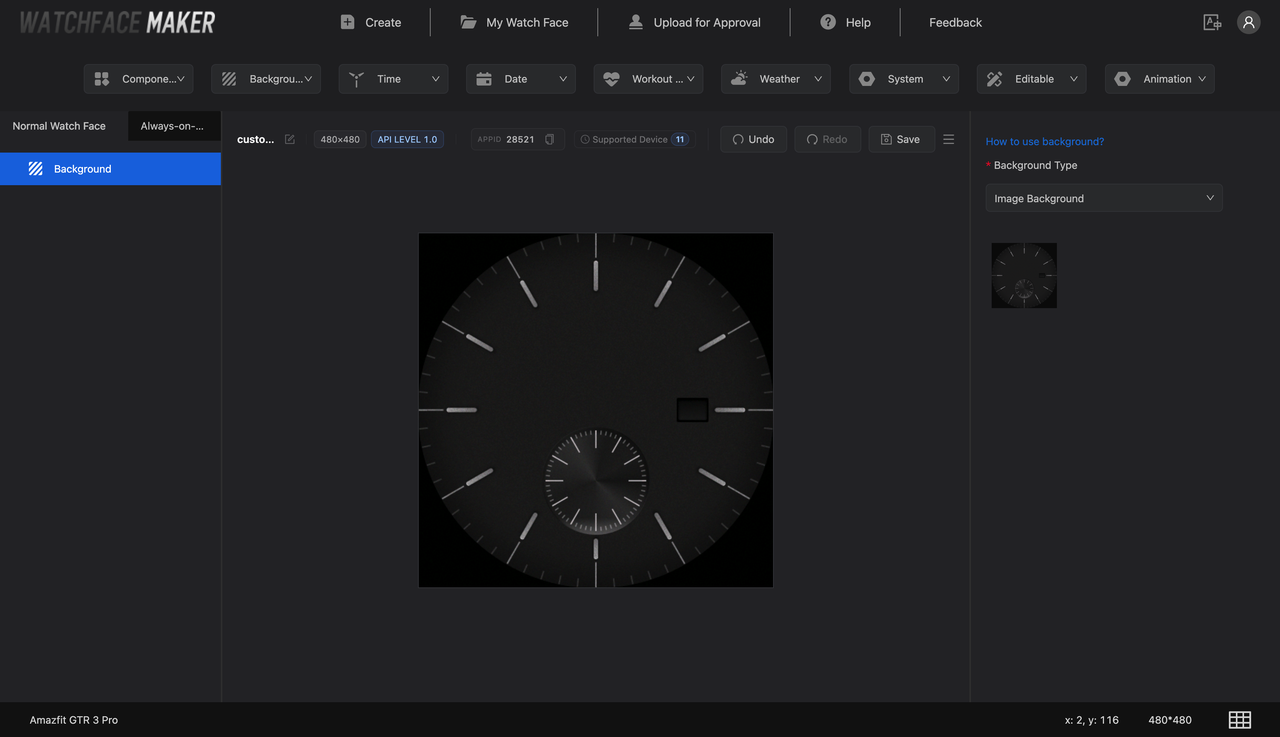
- Select the "Background" component from the component dropdown menu and add it
- In the left layer tree, click "Background" and configure in the right panel:
- Display Type: Select
Image Background - Background Image: Upload
assets/images/img/bg.png
- Display Type: Select
Step 3: Configure Date
- Select the "Date" component from the component dropdown menu and add it
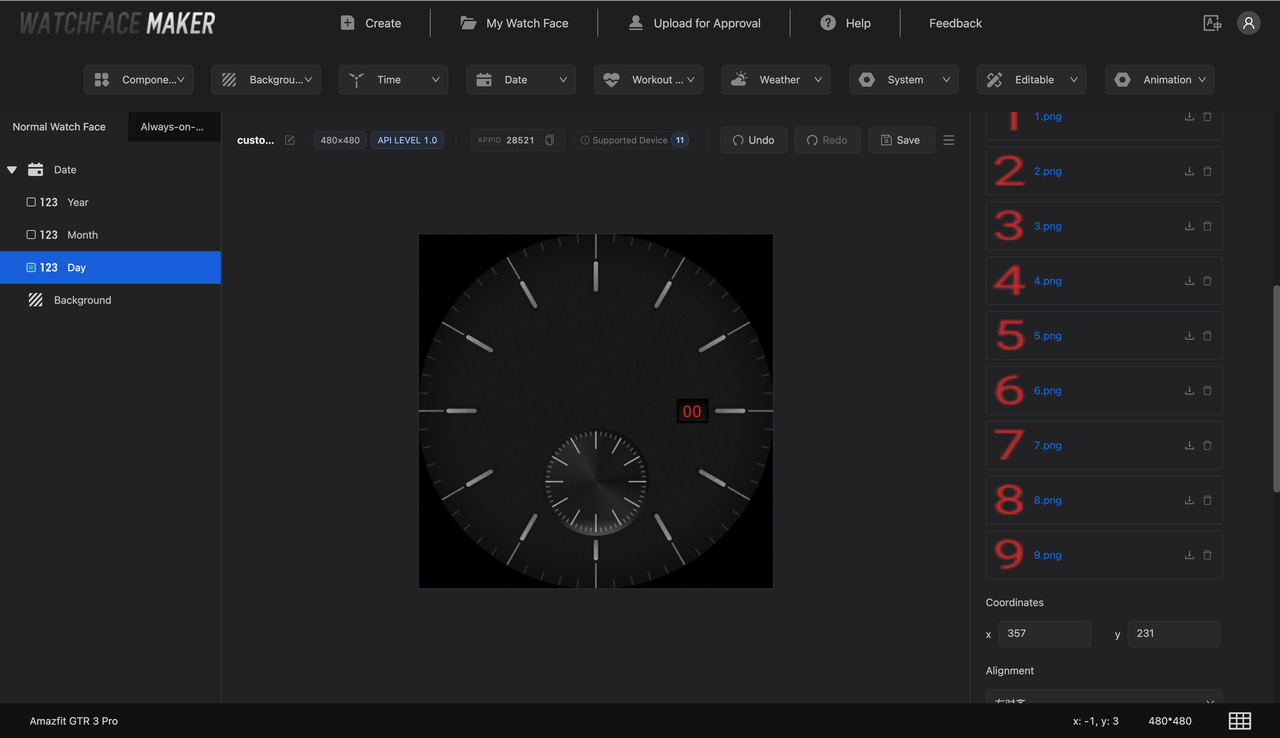
- In the left layer tree, click the added "Date", check "Day", then configure in the right panel:
- Number Images: Batch upload
assets/images/date/0.png~9.png - Display Position: x: 357, y: 231
- Number Images: Batch upload
Step 4: Configure Editable Component
Add Editable Component
Select "Editable" / "Editable Component" from the component dropdown menu and add it.
Configure Switchable Data Fields
-
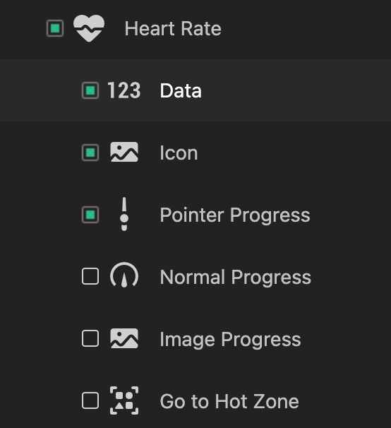
Click the "Editable Component" in the left layer area and check the sub-components to enable switching:
- Heart Rate with its display forms: Data, Icon, Pointer Progress
-
Configure the sub-component data:
Digital Text (Data)
Parameter Value No data Upload none.pngFont images Upload assets/images/font/0.png~9.pngPosition Heart Rate (216, 120) Alignment center Note: The digital text configuration for other data items (Calories, Steps) is the same as Heart Rate. The same set of digit images can be reused.
Icon
Parameter Value HEART_RATE icon assets/images/widgetText/heart.pngPosition x: 189, y: 152 Pointer Progress
Parameter Value Center X 240 Center Y 334 Pointer image Upload assets/images/pointer/pointer_progress.pngPointer image rotation anchor x: 16, y: 80 Start angle 0 End angle 360 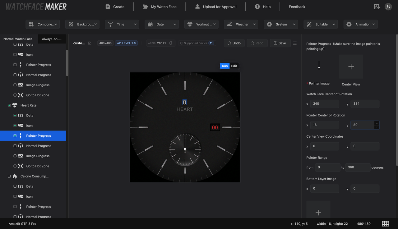
Note: All data items share the same pointer progress configuration. The same pointer image is used for all three data items.
-
Repeat the same operation for Calories and Steps. The text component coordinates differ when centered because the data items have different digit lengths:
Digital Text (Data)
Parameter Value No data Upload none.pngFont images Use the Heart Rate digit images already uploaded, or upload assets/images/font/0.png~9.pngPosition Calories (208, 120), Steps (200, 120) Alignment center 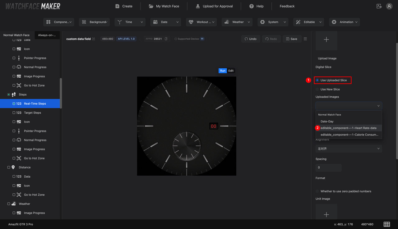
Configure Edit Mode Display Elements
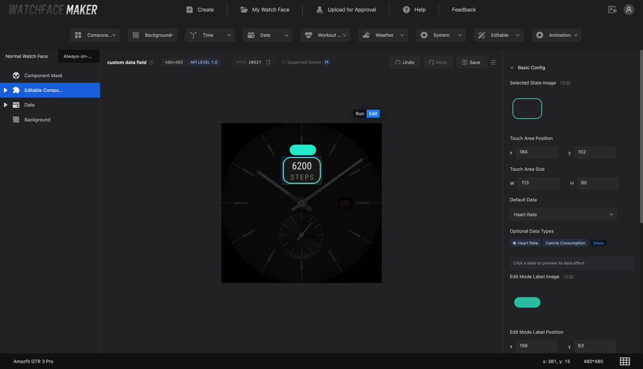
Select the top-level Editable Component in the left layer tree, then click "Edit" in the toolbar above the preview area to switch to edit preview mode. Configure the following parameters in the right panel:
-
Touch Area
Upload the data component selection state background image
assets/images/edit/select.png. Width and height are auto-filled based on the image dimensions.Parameter Value Position X 184 Position Y 102 Width (auto-detected) 113 Height (auto-detected) 80 -
Tip Label
Upload the background image for displaying the component name
assets/images/edit/tip.png.Parameter Value Label position X 199 Label position Y 63 -
Configure Default Watch-Side Data
In Watch-Side Display Configuration > Default Data, select a data item as the type initially shown on the watch (e.g. Heart Rate).
-
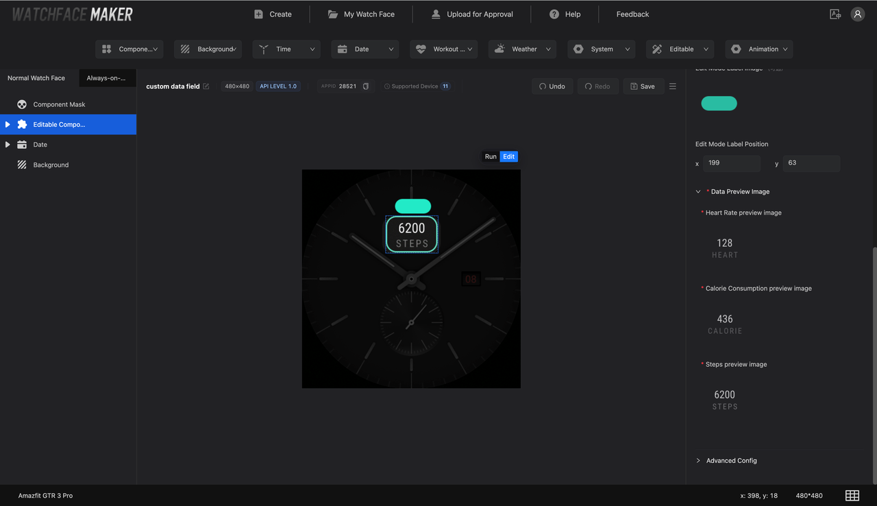
Data Preview Images
Each data item displays a preview image on the edit mode canvas. Upload the corresponding widgetPreview images:
Data Item Preview Image File STEP assets/images/widgetPreview/steps.pngCALORIE assets/images/widgetPreview/cal.pngHEART_RATE assets/images/widgetPreview/hr.png
Add Mask Layer
In the left layer tree, click "Component Mask" and configure:
| Parameter | Value |
|---|---|
| Mask layer image (fully opaque) | assets/images/edit/mask100.png |
| Mask image (70% opaque) | assets/images/edit/mask70.png |
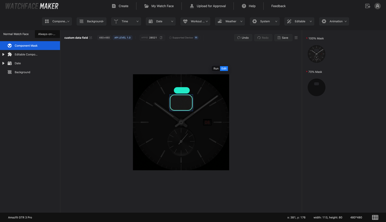
Purpose of mask layers:
- Mask layer image (mask100): Fully opaque overlay outside the editable component, with a cutout for the editable area
- Mask image (mask70): 70% opaque overlay outside the selected component, with a cutout for the editable area
Step 5: Add Pointer Clock
Click "Run" in the toolbar above the preview area to switch to run preview mode.
-
Select the "Pointer Time" component from the component dropdown menu and add it
-
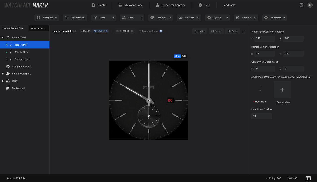
In the left layer tree, check ☑️ "Hour Hand" / "Minute Hand", then configure in the right panel:
Hour Hand
Parameter Value Center position x: 240, y: 240 Pointer image assets/images/pointer/h.pngPointer image rotation anchor x: 33, y: 240 Minute Hand
Parameter Value Center position x: 240, y: 240 Pointer image assets/images/pointer/m.pngPointer origin x: 27, y: 240
Step 6: On-Device Verification
-
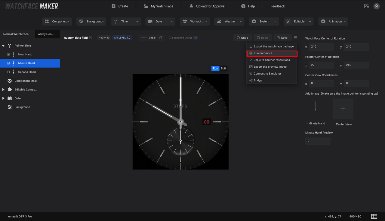
Click the "Run on device" button
-
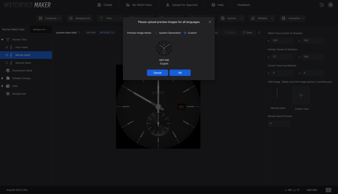
Upload the preview image
assets/images/preview.png